No products in the cart.
Music Graphic Tees
Most Artistic Music Graphic Tees: Where Sound Becomes Wearable Art
17
Mar
Mar
The most artistic music graphic tees do more than display a band name. They translate sound into visual identity — blending album art, typography, subculture, and fabric into something you can actually live in. For style-driven music fans, a tee isn’t merch. It’s a statement of taste, era, and creative alignment.
Unlike generic logo prints, today’s best designs borrow from psychedelic poster art, grunge collage, minimalist typography, and even fine art influences. The result? Shirts that feel closer to curated gallery pieces than fast-fashion graphics.
What Makes a Music Graphic Tee Truly “Artistic”?
Featured Insight: An artistic music tee combines visual storytelling, intentional composition, and quality print execution. It draws from music culture, art movements, and production technique — transforming a simple cotton shirt into a wearable canvas that holds both aesthetic and emotional weight.
Here’s the contrarian truth: not every band shirt qualifies as art. Many are simply logos placed on cotton. Artistic designs go deeper. They layer meaning, texture, and cultural context.
1. Visual Composition Over Simple Branding
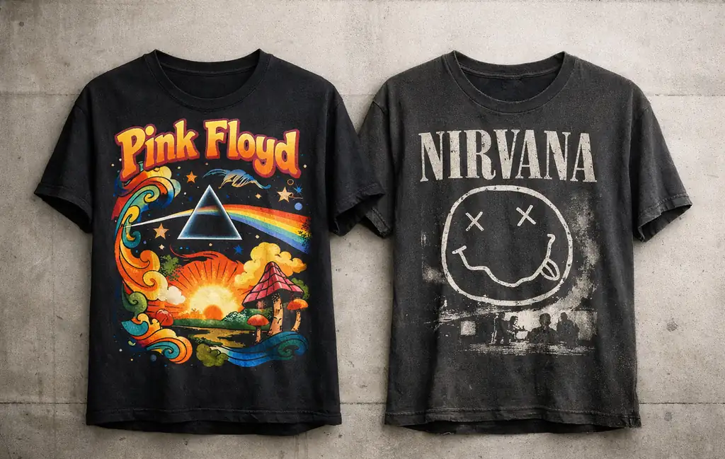
A tee featuring intricate prism artwork inspired by Pink Floyd carries more artistic intention than a flat text logo. The same applies to reinterpretations of Nirvana imagery that experiment with distortion, color wash, or layered collage rather than repeating the original mark.
2. Era-Specific Aesthetic Identity
True artistic pieces reflect the era they emerged from. Psychedelic swirls channel 70s experimentation. Raw, fragmented type captures 90s grunge rebellion. These aren’t random visuals — they’re visual timestamps.
3. Print Depth & Execution
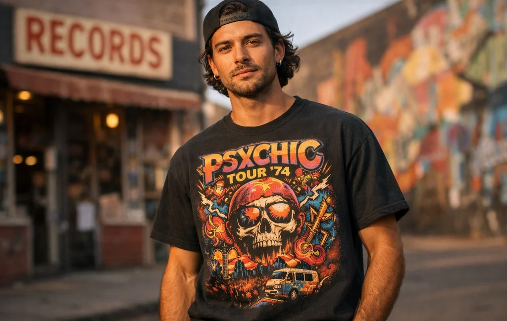
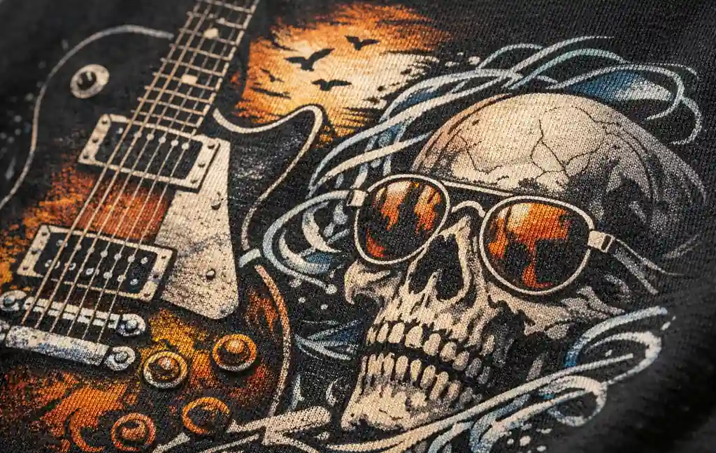
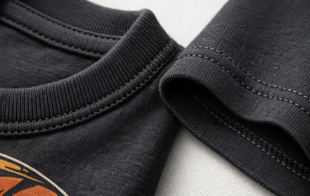
Artistic design collapses if the print feels plastic or overly glossy. High-definition methods like DIGISOFT® printing preserve fine lines and gradients while maintaining a soft-hand feel. On heavyweight 5.3 oz cotton, this matters. Texture becomes part of the experience.
Production insight: detailed artwork demands clarity. When ink sits flat and durable without heavy cracking, the artwork remains readable over time — something serious collectors notice immediately.
The Most Iconic Artistic Band Tee Design Styles
Instead of ranking random “top 10” lists, let’s break down artistic styles by design language. This gives you a framework to evaluate what you’re actually wearing.
- Psychedelic Illustration – Swirling color fields, surreal typography, layered symbolism.
- Grunge Distortion – Washed textures, broken fonts, imperfect composition.
- Minimalist Album Art – Clean layouts inspired by iconic covers.
- Tour Poster Collage – Layered dates, cities, and graphics forming chaotic harmony.
- Pop-Art Influence – High-contrast imagery reminiscent of Andy Warhol aesthetics.
Each style connects to broader culture. The Rolling Stones tongue graphic, for example, transcends merch and becomes pop iconography. Meanwhile, experimental typography seen in Kanye West tour graphics bridges music and contemporary street design.
If you want deeper context around construction and category types, our Ultimate Guide to Music T-Shirts breaks down how design and garment intersect.
Era Breakdown: 70s Psychedelic to 90s Grunge Graphics
Artistic evolution in music graphic tees mirrors shifts in sound and cultural mood.
1970s: Psychedelic Freedom
Inspired by concert posters and experimental rock, tees channeled vibrant color explosions and surrealism. Bands like Pink Floyd became visual laboratories — album art turned into wearable conversation starters.
1980s: Bold & Commercial
Graphic clarity increased. Logos became larger, more legible. The artistic edge shifted from trippy abstraction to bold iconography.
1990s: Grunge & Raw Authenticity
Nirvana and alternative rock culture introduced a DIY aesthetic — distressed textures, muted palettes, imperfect alignment. Ironically, that imperfection became the art.
Buyer psychology insight: Many shoppers gravitate toward 90s-inspired pieces today because they feel emotionally authentic rather than overly polished.
Album Art That Transformed Into Fashion
Some album covers transcend vinyl and become permanent fashion staples. Think prism imagery, stark monochrome portraits, or abstract color blocks. These designs work because they’re built on strong visual hierarchy and negative space.
Metallica graphics, for instance, often rely on sharp edges and dramatic contrast — perfect for high-definition print reproduction. The key is scale. When artwork is proportioned properly across the chest, it reads as intentional rather than crowded.
Production clarity: complex artwork performs best on structured cotton that holds shape. Lightweight fabric can distort design alignment. Heavier classic unisex tees maintain graphic integrity across repeated wear.
Vintage vs Modern Artistic Printing Techniques
There’s nostalgia around cracked ink and faded washes. But here’s the distinction: authentic aging happens over time. Artificial distressing often looks forced.
Modern printing methods allow detailed artwork without thick ink buildup. DIGISOFT® delivers high-definition clarity while keeping the surface soft — reducing heavy plastisol cracking that can overwhelm fine detail.
This matters when evaluating the most artistic music graphic tees. If a design includes gradients, micro-illustration, or layered type, execution quality directly impacts artistic credibility.
How to Style Artistic Music Graphic Tees Without Looking Costume-Like
One common hesitation: “Will this look too loud?”
Styling solves that.
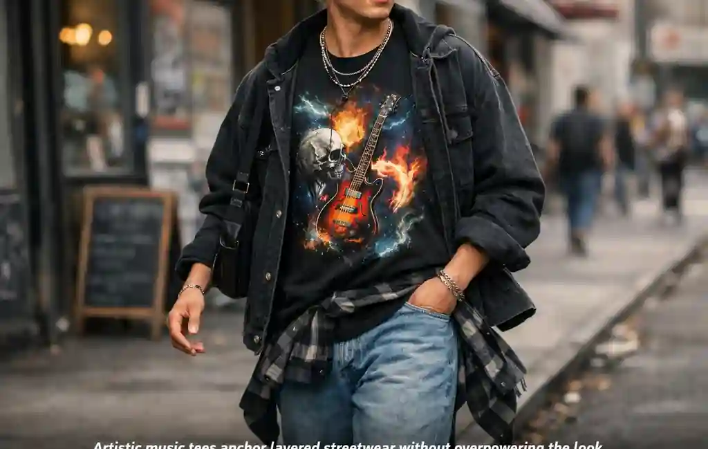
- Pair bold psychedelic prints with neutral denim.
- Layer grunge-inspired graphics under structured jackets.
- Keep accessories minimal if the artwork is complex.
- Let minimalist album art designs anchor layered streetwear.
The goal is balance. When the graphic is strong, everything else supports — not competes.
This is where high-quality cotton matters again. A structured 5.3 oz heavyweight base drapes cleanly, preventing artwork from stretching awkwardly when layered.
Why Artistic Music Tees Dominate Modern Streetwear
Streetwear thrives on narrative. Logos signal brand loyalty. Artistic tees signal cultural literacy.
Wearing a thoughtfully designed band graphic suggests deeper alignment — you appreciate the music, the era, and the visual culture around it. That layered identity resonates strongly with 18–35 creative audiences.
From skate scenes to record-store aesthetics, music graphics sit at the center of style storytelling. That’s why the category continues expanding within contemporary Music T-Shirts collections.
And if you’re exploring more design-forward options, the dedicated Music Graphic Tees section curates pieces that lean heavily into artistic direction rather than simple logos.
Soft recommendation: start with a design that reflects the era or genre you genuinely connect with. Authenticity always reads better than trend-chasing.
Where to Buy High-Quality Artistic Music Graphic Tees (Without Regret)
Here’s the uncomfortable truth: many visually impressive tees fail after five washes. Ink cracks aggressively. Fabric twists. The print loses alignment. That’s not artistic aging — that’s poor construction.
If you’re investing in the most artistic music graphic tees, evaluate three factors before clicking checkout:
- Fabric Weight & Structure – A 5.3 oz heavyweight cotton base holds graphic integrity better than ultra-thin fashion tees. Structure preserves composition.
- Print Clarity – High-definition printing maintains fine lines and tonal gradients without creating a thick plastic layer.
- Durability Over Distressing – Natural wear develops character. Artificial distressing often shortcuts authenticity.
Capital T Shirt uses classic unisex heavyweight cotton with taped neck and shoulders to support long-term structure. When detailed artwork is applied using DIGISOFT® printing, the result is sharp color retention with a soft-hand feel — reducing heavy cracking compared to older plastisol-heavy finishes.
This isn’t about turning a blog into a spec sheet. It’s about decision clarity. When design complexity meets proper construction, artistic intention survives real life.
If you’re browsing across sub-styles, collections like Rock Band Shirts lean bold and iconic, while Vintage Band Tees focus more on era nostalgia and worn-in aesthetics.
Common Buyer Questions About Artistic Music Tees
Are music graphic tees still in style?
Yes — but style has shifted from loud logo placement to curated design language. Modern buyers look for narrative-driven visuals, era authenticity, and wearable art influence rather than oversized branding alone.
What makes a band shirt look expensive?
Proportion, print detail, and fabric structure. Clean alignment across the chest, visible cotton grain, and balanced negative space elevate perception instantly.
Do high-definition prints crack over time?
All prints age, but quality methods reduce premature cracking. Softer ink application that bonds cleanly with cotton helps maintain detail longer without heavy peeling.
How do I know if a design is artistic or just trendy?
Look for layered composition, intentional typography, and era coherence. If it feels randomly assembled, it probably is.
How to Choose the Right Artistic Style for You
Buying based purely on “cool factor” often leads to closet regret. Instead, reverse-engineer your taste.
- If you appreciate surreal visuals and bold color, lean psychedelic.
- If you prefer muted tones and imperfection, grunge distortion fits.
- If you gravitate toward clean lines and balance, minimalist album reinterpretations work best.
- If you love layered storytelling, tour poster collage graphics deliver depth.
Buyer psychology insight: you’re not just choosing artwork. You’re choosing what kind of creative energy you project.
Artistic Expression vs. Overdesign: The Subtle Line
More detail doesn’t automatically equal better design. Some of the most compelling pieces rely on restraint — negative space, single focal points, balanced typography.
Consider how The Rolling Stones tongue works so effectively. It’s bold, simple, instantly recognizable. Contrast that with maximalist psychedelic prints tied to Pink Floyd aesthetics — both artistic, but radically different in visual strategy.
The key question becomes: does the artwork breathe? Or is it fighting itself?
Collector Mentality: Why Artistic Tees Age Differently
True collectors understand something casual buyers often overlook: aging can enhance artistic credibility.
When a well-constructed tee naturally softens over time, subtle fading and micro-creases add depth. This is very different from artificially pre-distressed finishes that attempt to simulate history without lived experience.
That’s why durable cotton structure matters. It allows the artwork to evolve instead of collapse.
FAQ: Most Artistic Music Graphic Tees
What are the most artistic music graphic tees right now?
Designs inspired by psychedelic rock, 90s grunge, minimalist album covers, and collage-style tour graphics are leading. The focus has shifted toward curated artwork rather than oversized logos.
Do artistic music tees work in minimal wardrobes?
Absolutely. A strong graphic can anchor neutral outfits. The key is balancing bold artwork with understated layering pieces.
Are vintage-inspired graphics better than modern ones?
Not inherently. Vintage aesthetics offer nostalgia and texture, while modern high-definition prints provide sharper detail. The better choice depends on your style preference.
How should I wash detailed graphic tees?
Machine wash cold and tumble dry low. Turning the shirt inside out helps preserve surface detail and color depth over time.
Is heavyweight cotton uncomfortable?
No. A well-constructed 5.3 oz cotton tee offers structure without stiffness, especially after a few washes when fibers soften naturally.
Final Thoughts: Turning Sound Into Visual Identity
The most artistic music graphic tees succeed because they do something subtle but powerful: they translate sound into visual form. They carry cultural memory. They signal taste. They create conversation without a single word spoken.
When choosing your next piece, evaluate composition, era authenticity, and construction quality — not just hype. A well-designed tee should feel intentional from artwork to cotton weight.
If you’re ready to explore curated options built around structure, clarity, and cultural relevance, browse the full Music T-Shirts collection to find pieces that reflect your creative alignment.
Related Posts: