No products in the cart.
Save 20% on orders over $100 with code CT20


Price range: $21.90 through $44.99
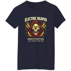
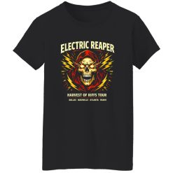
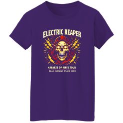
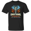
The Electric Reaper Rock Shirt is built around a visual that doesn’t fade into the background. It’s driven by contrast—dark symbolism electrified with sharp energy—creating a graphic that holds attention whether you’re in motion or standing still. In a space crowded with predictable band tees, this piece leans into intensity and clarity, delivering a print that reads instantly and lingers longer.
Within the broader world of rock band vintage tees, this design positions itself closer to statement artwork than simple merch. It’s less about referencing a single era and more about channeling the raw voltage that defines rock culture at its core.
The central graphic—an electrified reaper figure—anchors the shirt with sharp visual direction. Lightning elements cut through the composition, giving the artwork a sense of movement that feels almost kinetic. This isn’t a flat, static print. It’s layered in a way that creates depth, pulling the eye toward the center before expanding outward.
What sets this apart is how the design balances detail and readability. From a distance, the silhouette hits immediately. Up close, finer elements—energy streaks, shadow transitions, and edge highlights—add complexity without overwhelming the overall structure. That dual readability makes it effective across different settings, from crowded venues to everyday wear.
The tonal contrast is deliberate. Light elements don’t just sit on top—they interact with the darker base, creating a visual tension that feels aligned with classic rock imagery while still reading as modern.
A strong graphic only works if it holds up over time. The Electric Reaper Rock Shirt is built with print execution that prioritizes clarity retention, even after repeated wear cycles. The ink settles into the fabric in a way that avoids the overly glossy finish that can crack or distort under stress.
Instead, the surface maintains a slightly matte character, which helps preserve the original look of the artwork. Lines stay defined, and high-contrast elements don’t bleed into each other. This is especially important for designs with sharp edges and layered lighting effects—areas where weaker prints tend to degrade first.
Over time, the graphic doesn’t collapse into a dull version of itself. It evolves more subtly, developing a softened edge that enhances the vintage feel rather than diminishing the design. That controlled aging process keeps the shirt visually relevant instead of worn out.
In motion, the shirt behaves predictably. The structure allows the graphic to stay centered without distortion, meaning the design doesn’t warp awkwardly when you move. Whether layered under a jacket or worn on its own, the artwork maintains its intended shape.
There’s also a noticeable balance between structure and flexibility. The shirt doesn’t feel rigid, but it also doesn’t collapse into a shapeless form. That middle ground is what allows the print to remain visually stable while still adapting to real-world wear.
Short answer: it performs consistently across everyday use, from casual movement to extended wear situations, without losing its visual integrity.
Not every rock graphic creates a lasting impression. Many rely on repetition—skulls, flames, standard layouts—without pushing the visual language forward. The Electric Reaper Rock Shirt avoids that trap by focusing on a single dominant concept and executing it with precision.
Instead of layering unrelated elements, the design builds around one core idea and amplifies it. That clarity is what gives it presence. It doesn’t compete with itself, and it doesn’t require explanation. The message is immediate.
This combination positions the shirt as more than just another addition to a collection. It becomes a piece that anchors an outfit rather than blending into it.
There’s a difference between a shirt that looks good once and one that holds its place over time. The Electric Reaper Rock Shirt leans toward the latter. It’s built to stay visually relevant, not just through durability, but through design choices that avoid short-term trends.
It works in rotation because it doesn’t rely on novelty. The graphic has enough depth to remain interesting, and the execution ensures it doesn’t degrade into something unrecognizable. That consistency is what makes it easy to reach for again without second-guessing how it will look.
In the end, it’s a piece defined by clarity—clear concept, clear execution, and clear performance. That’s what keeps it grounded in the rock apparel space while still standing apart from the noise.
| Product | Electric Reaper Rock Shirt |
|---|---|
| SKU | cc-1049-9966-108606737-1774059712668 |
| Fabric Weight | Midweight (5.3 oz) – Heavyweight (6.0 oz Long Sleeve) |
| Material Composition | Solid Colors: 100% Cotton Ash Grey: 99% Cotton / 1% Polyester Sport Grey: 90% Cotton / 10% Polyester Dark Heather: 50% Cotton / 50% Polyester |
| Fit | Classic Unisex Fit (Ladies: Slightly Tapered Missy Fit) |
| Construction | Double-needle stitching Taped neck & shoulders Preshrunk jersey knit Tearaway label |
| Hoodie Material (G185) | 8.0 oz – 50% Cotton / 50% Polyester |
| Available Sizes | S – 5XL (6XL select colors only) |
| Origin | Made with sustainably and fairly grown USA cotton; Printed in USA |
| Print Method | DIGISOFT® Direct-to-Garment (DTG) |
| Brand | Capital T Shirt |
| Fast & Reliable Shipping | All orders are professionally printed and shipped from the USA. |
|---|---|
| Processing Time | Printed on demand within 1–3 business days. |
| Shipping Time | USA: 4–7 business days International: 7–15 business days |
| Shipping Costs | USA Standard: $5.99 International Standard: $9.99 |
| Secure Checkout | Safe & encrypted payment processing. Your information is protected at all times. |
| Returns & Exchanges | We offer a 30-day return policy. View Refunds & Returns Policy |
| Customer Guarantee | We stand behind the quality of every item we print. |


Reviews
There are no reviews yet.