No products in the cart.
Save 20% on orders over $100 with code CT20


Price range: $21.90 through $44.99
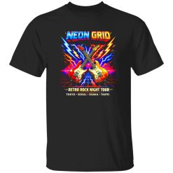
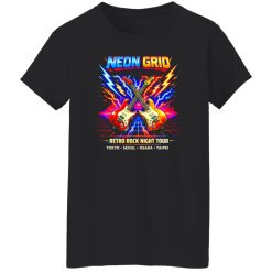
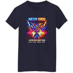
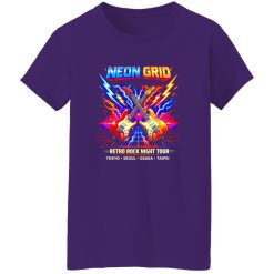
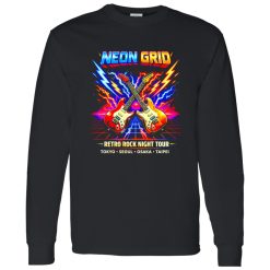
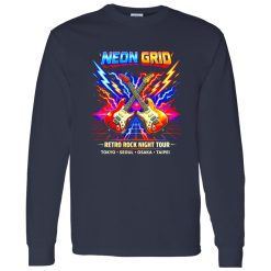
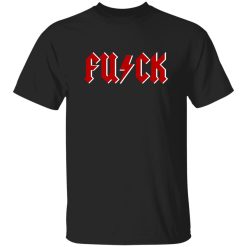
The street lights flicker against reflective pavement as neon tones echo through the city, blending digital nostalgia with modern rhythm. This is where retro arcade aesthetics meet rock culture, creating a visual language that feels both familiar and forward. The neon grid arcade rock band shirt naturally fits into this environment, translating that electric energy into something wearable and expressive.
There’s a distinct attitude embedded in this style. It doesn’t try to replicate vintage exactly—it reinterprets it. The glowing lines, geometric depth, and digital horizon visuals channel a different kind of rock identity, one that leans into synth-era influence while still grounded in guitar-driven culture.
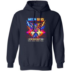
The shirt works best when it becomes the visual anchor of the outfit. Its neon grid graphic already carries enough intensity, so the surrounding pieces should support rather than compete.
Start with a relaxed silhouette through the torso, allowing the print to sit naturally without distortion. Layering should stay intentional—lightweight outerwear or an open overshirt adds structure without muting the glow of the design. Dark denim or tapered black pants create contrast, letting the neon elements stand out clearly.
Footwear should follow the same logic. Clean sneakers with minimal color interference or slightly retro-inspired trainers reinforce the aesthetic without pulling focus. The entire outfit should feel cohesive, not overbuilt.
This approach aligns well with broader browse rock music shirts collections, where statement graphics are designed to lead the outfit rather than blend into it.
Neon graphics demand control in color pairing. The grid effect typically uses high-contrast tones—electric blues, magentas, and purples—so the rest of the outfit needs to stabilize that intensity.
The goal isn’t to mute the shirt but to frame it properly. When done right, the neon grid design feels intentional and sharp instead of overwhelming.
During the day, the shirt reads as a graphic-driven streetwear piece—clean, slightly retro, and visually distinct. Under natural light, the grid lines feel structured and precise, almost architectural.
At night, everything shifts. Artificial lighting enhances the neon tones, giving the print a subtle glow effect that changes how the outfit is perceived. The same shirt suddenly feels more dynamic, more aligned with nightlife energy.
This transition is where the piece becomes versatile. It doesn’t require a full outfit change—just small adjustments like swapping outerwear or adding darker layers can shift the entire tone.
There’s a moment before stepping into a late-night spot, standing outside under neon signage, where the shirt almost mirrors its surroundings. That alignment between environment and outfit is what gives it presence.
The graphic itself is structured, so the silhouette should complement that geometry rather than fight it. A slightly relaxed fit allows the grid lines to maintain their visual integrity without stretching or warping.
Proportion matters more than layering complexity here. Cropped jackets or shorter outer layers help keep the design visible, while longer pieces can obscure the key visual elements.
Balance between top and bottom is also important. If the shirt leans oversized, keep the lower half more fitted to maintain shape. If the shirt is more standard fit, you have more freedom to play with looser pants.
This is not about strict rules—it’s about maintaining clarity. The graphic needs space to read properly.
The neon grid arcade aesthetic bridges two cultural spaces—digital nostalgia and rock expression. It references the visual language of early arcade environments while still aligning with the bold identity that rock apparel represents.
That crossover is what makes it relevant now. Instead of relying on traditional band iconography alone, it expands the definition of what a rock band shirt can look like. It feels current without losing its edge.
There’s also a subtle confidence in wearing something this visually distinct. It doesn’t depend on heavy branding or layered complexity. The impact comes from clarity and design strength.
In a space where many graphic tees follow predictable patterns, this style stands apart by leaning into visual depth and contrast. It doesn’t just sit within the outfit—it defines it.
| Product | Neon Grid Arcade Rock Band Tee Shirt |
|---|---|
| SKU | cc-1049-9953-108618440-1774495319424 |
| Fabric Weight | Midweight (5.3 oz) – Heavyweight (6.0 oz Long Sleeve) |
| Material Composition | Solid Colors: 100% Cotton Ash Grey: 99% Cotton / 1% Polyester Sport Grey: 90% Cotton / 10% Polyester Dark Heather: 50% Cotton / 50% Polyester |
| Fit | Classic Unisex Fit (Ladies: Slightly Tapered Missy Fit) |
| Construction | Double-needle stitching Taped neck & shoulders Preshrunk jersey knit Tearaway label |
| Hoodie Material (G185) | 8.0 oz – 50% Cotton / 50% Polyester |
| Available Sizes | S – 5XL (6XL select colors only) |
| Origin | Made with sustainably and fairly grown USA cotton; Printed in USA |
| Print Method | DIGISOFT® Direct-to-Garment (DTG) |
| Brand | Capital T Shirt |
| Fast & Reliable Shipping | All orders are professionally printed and shipped from the USA. |
|---|---|
| Processing Time | Printed on demand within 1–3 business days. |
| Shipping Time | USA: 4–7 business days International: 7–15 business days |
| Shipping Costs | USA Standard: $5.99 International Standard: $9.99 |
| Secure Checkout | Safe & encrypted payment processing. Your information is protected at all times. |
| Returns & Exchanges | We offer a 30-day return policy. View Refunds & Returns Policy |
| Customer Guarantee | We stand behind the quality of every item we print. |
Reviews
There are no reviews yet.