No products in the cart.
Save 20% on orders over $100 with code CT20


Price range: $21.90 through $44.99
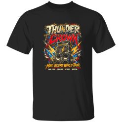
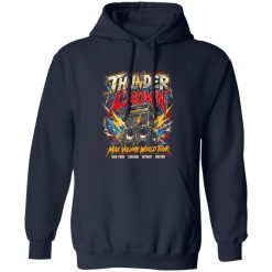
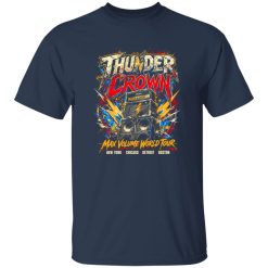
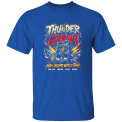
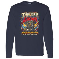
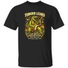
There’s a distinct moment in arena rock culture when scale becomes part of the identity. The stage grows larger, the lights hit harder, and the visuals evolve into something almost mythic. That shift—from underground grit to full-scale spectacle—is exactly where designs like the Thunder Crown Arena Rock Tour Shirt take shape. It’s not just about referencing music anymore; it’s about capturing that amplified presence in wearable form.
Within the broader landscape of rock band logo shirts, this kind of design leans into visual dominance. The crown motif, the tour-inspired layout, and the sense of motion all echo a specific era where bands didn’t just perform—they commanded space. That cultural imprint still resonates, especially for those drawn to the visual language of arena rock.
Arena rock wasn’t just a musical evolution—it was a visual one. As bands transitioned from clubs to stadiums, the need for stronger imagery became unavoidable. Logos grew sharper, symbols became more defined, and tour graphics started functioning almost like brand emblems.
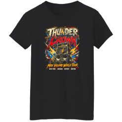
The Thunder Crown concept sits right inside that lineage. The crown itself signals dominance, but not in an abstract way—it reflects the era when bands positioned themselves as icons of scale and presence. The tour-style layout reinforces that feeling, suggesting movement, cities, and a timeline of performances rather than a single static identity.
This is where the difference lies. Instead of referencing a specific band, the design channels a broader cultural memory—the kind tied to roaring crowds, oversized backdrops, and visuals that had to reach the back row of an arena.
Designing within the space of rock band logo shirts requires more than bold typography. It demands balance between structure and chaos—between something readable and something that feels alive. The Thunder Crown Arena Rock Tour Shirt approaches this through layered composition.
The crown icon anchors the visual hierarchy, creating an immediate focal point. Around it, the supporting elements—whether text, framing lines, or subtle distressing—build a sense of depth. It doesn’t feel flat or overly polished. Instead, it carries that slightly worn, tour-poster texture that suggests movement and time.
There’s also a deliberate sense of symmetry in the layout. Arena-era graphics often relied on centered compositions because they needed to be visible from a distance. That influence carries over here, making the design feel grounded while still visually intense.
Even as music trends shift, the aesthetic language of arena rock continues to influence modern apparel. It’s not nostalgia in the usual sense—it’s more about the clarity of identity. Arena visuals were designed to be unmistakable, and that kind of clarity translates well into everyday wear.
The Thunder Crown design reflects that enduring appeal. It doesn’t rely on subtlety. Instead, it embraces a confident visual stance—something that stands out without needing explanation. That’s part of why arena-inspired rock band logo shirts continue to resonate with a younger audience as well. The symbolism feels immediate, even if the historical context isn’t fully known.
There’s also a certain universality in the design language. Crowns, bold lettering, structured layouts—these elements don’t belong to a single band or moment. They represent a broader idea of presence, making the shirt adaptable across different personal styles.
One of the defining traits of tour-era graphics is their relationship with texture. Posters were printed, handled, layered, and often worn down over time. That visual memory carries into modern interpretations, where slight distressing or tonal variation adds depth to the design.
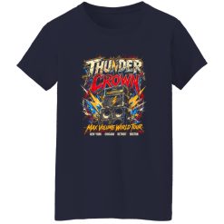
On the Thunder Crown Arena Rock Tour Shirt, that texture isn’t just decorative—it shapes how the graphic is perceived. The design feels less like a flat print and more like something that has existed before being worn. This subtle aging effect softens the intensity just enough, creating a balance between boldness and authenticity.
It also changes how the shirt interacts with light and movement. As the fabric shifts, the graphic reveals different tonal layers, reinforcing the idea that this isn’t a static image but a dynamic one.
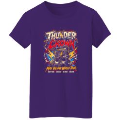
Pieces like this don’t exist in isolation—they’re part of a larger visual ecosystem. The Thunder Crown Arena Rock Tour Shirt naturally aligns with styles that lean into contrast: structured against relaxed, bold against minimal.
Paired with darker tones, the design becomes the focal point, drawing attention without overwhelming the rest of the outfit. With lighter or more neutral elements, it shifts slightly, becoming part of a layered visual narrative rather than the sole highlight.
This flexibility is part of what defines strong rock band logo shirts. They don’t dictate the entire look, but they set the tone. The rest of the outfit simply follows that direction.
There’s also a subtle connection to movement. Whether it’s walking through a city at night or standing in a crowd before a show begins, the design feels aligned with environments where energy builds gradually. It doesn’t need to be loud all the time—it just needs to be ready when the moment hits.
The most effective rock-inspired graphics aren’t locked into one timeline. They draw from specific moments—like the rise of arena rock—but remain open enough to feel relevant today. The Thunder Crown Arena Rock Tour Shirt achieves that by focusing on core visual principles rather than direct references.
It captures scale, structure, and symbolic power without tying itself to a single narrative. That makes it easier to integrate into different wardrobes, different moods, and different interpretations of style.
In a space where many designs lean heavily on repetition, this approach stands out. It doesn’t just echo the past—it reinterprets it in a way that feels current, while still grounded in the cultural DNA of rock.
Ultimately, that’s what defines its place within modern rock band logo shirts. Not just the imagery, but the way it carries forward a visual language that was built for impact—and continues to deliver it.
| Product | Thunder Crown Arena Rock Tour Shirt – Arena Energy Meets Modern Rock Style |
|---|---|
| SKU | cc-1049-9953-108621557-1774609188837 |
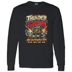
| Fabric Weight | Midweight (5.3 oz) – Heavyweight (6.0 oz Long Sleeve) |
| Material Composition | Solid Colors: 100% Cotton Ash Grey: 99% Cotton / 1% Polyester Sport Grey: 90% Cotton / 10% Polyester Dark Heather: 50% Cotton / 50% Polyester |
| Fit | Classic Unisex Fit (Ladies: Slightly Tapered Missy Fit) |
| Construction | Double-needle stitching Taped neck & shoulders Preshrunk jersey knit Tearaway label |
| Hoodie Material (G185) | 8.0 oz – 50% Cotton / 50% Polyester |
| Available Sizes | S – 5XL (6XL select colors only) |
| Origin | Made with sustainably and fairly grown USA cotton; Printed in USA |
| Print Method | DIGISOFT® Direct-to-Garment (DTG) |
| Brand | Capital T Shirt |
| Fast & Reliable Shipping | All orders are professionally printed and shipped from the USA. |
|---|---|
| Processing Time | Printed on demand within 1–3 business days. |
| Shipping Time | USA: 4–7 business days International: 7–15 business days |
| Shipping Costs | USA Standard: $5.99 International Standard: $9.99 |
| Secure Checkout | Safe & encrypted payment processing. Your information is protected at all times. |
| Returns & Exchanges | We offer a 30-day return policy. View Refunds & Returns Policy |
| Customer Guarantee | We stand behind the quality of every item we print. |


Reviews
There are no reviews yet.