No products in the cart.
Save 20% on orders over $100 with code CT20


Price range: $21.90 through $44.99
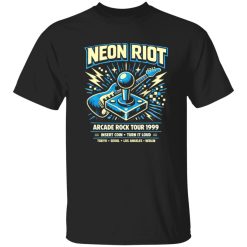
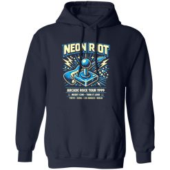
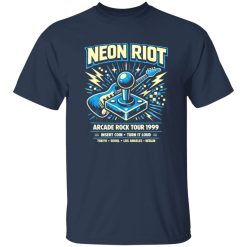
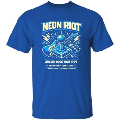
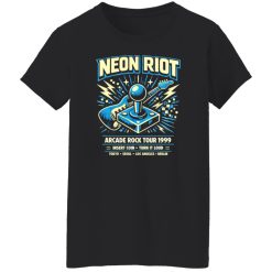
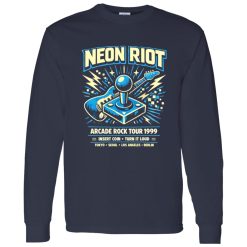
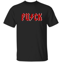
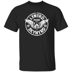
The Neon Riot Arcade Rock Tour 1999 Shirt works best for buyers who want immediate visual impact without getting stuck in overbuilt styling language or generic band-tee hype. It delivers a loud late-90s tour feel, a strong graphic presence, and the kind of retro energy that reads clearly the second it enters an outfit.
Some rock shirts rely on name recognition alone. This one earns attention through visual presence. The appeal of the Neon Riot Arcade Rock Tour 1999 Shirt starts with its graphic attitude: bright arcade-era color cues, tour-poster tension, and that familiar end-of-century concert aesthetic that feels both nostalgic and sharp. Instead of blending into the background like a safe everyday tee, it acts as the centerpiece of the look from the first second.
That matters in a commercial category like Rock Band Shirts, where many products compete on the same broad promise. A design like this separates itself by being instantly legible from a distance. It feels made for people who want their shirt to say something before they speak. The visual language is louder, cleaner, and more intentional than a generic music graphic, which gives it stronger purchase confidence for shoppers who already know they want a statement piece.
It also hits a specific seasonal sweet spot. Designs with neon contrast and tour-era energy tend to feel especially right in warmer months, festival settings, night events, travel weekends, and casual city wear when outfits get simpler and the shirt has to do more work. That seasonal relevance gives the product a clearer use case instead of leaving it as another abstract graphic option.
The strongest reason to choose this shirt is not complexity. It is clarity. The print direction carries the kind of visual confidence that helps a piece feel intentional rather than random. The retro arcade influence gives the design an electric edge, while the rock tour framing keeps it grounded in music culture instead of drifting into novelty territory.
That balance is important. A lot of bright graphics feel disposable because they lean too hard into color without enough structure. Here, the better outcome comes from contrast and focus. The artwork suggests movement, stage light, and amplified sound without becoming messy. The overall effect is bold but readable. It feels closer to a well-composed late-90s tour graphic than a cheap throwaway print trying too hard to look vintage.
There is also a practical buying advantage in a design like this: it simplifies the decision. If you are shopping for a rock shirt that has enough personality to anchor jeans, cargos, dark shorts, or layered streetwear, you do not need an overexplained wardrobe plan. The shirt already carries the visual weight. That makes it easier to wear often, and products that are easy to build around tend to earn more long-term value in a real wardrobe.
For buyers exploring related options in the same style lane, it fits naturally beside collections built around loud visual identity and music-inspired graphics, including pieces you might browse when you shop vintage band tees for a more established retro look.
A strong graphic shirt should do more than look good on a product page. It has to hold its position in an actual outfit. The Neon Riot Arcade Rock Tour 1999 Shirt succeeds because the print has enough energy to carry a simple look, but enough structure to avoid visual chaos. That gives it better everyday reliability than shirts that only work in heavily styled outfits.
Wear it with black denim and beat-up sneakers, and the shirt becomes the focal point immediately. Pair it with washed jeans and a light overshirt, and the neon elements push through just enough to keep the outfit alive. Throw it under a darker jacket at night, and the graphic still does its job without demanding extra accessories. That kind of versatility is not about being neutral. It is about being strong in multiple settings.
There is a difference.
Neutral shirts disappear into an outfit. Strong shirts organize it. This one belongs in the second category. Its graphic presence gives shape to the rest of the look, which is exactly why shoppers with high commercial intent respond to pieces like this. They are not looking for another filler item. They want a shirt that can carry the mood of the outfit with minimal effort.
Picture the real-life scenario that makes a shirt like this easy to justify: late afternoon, summer heat starting to break, music already in your headphones, and a stop downtown before meeting friends at a venue. You are not dressing for a costume moment. You just want one piece that brings the energy. That is where this kind of tour graphic feels right.
Another advantage is visual memory. Shirts that combine era-specific references with bright contrast tend to leave a stronger impression. People remember them. In a category built around expression and recognition, that matters more than small technical claims ever could. A memorable print becomes part of why the shirt gets worn again and again, especially when the rest of the wardrobe is built around dependable basics.
This shirt is a strong fit for shoppers who already know they prefer graphic-forward music apparel over minimal basics. It also works well for buyers who want a gift with immediate visual confidence, because the appeal is easy to understand without needing deep explanation. You can see the attitude right away. That reduces hesitation and makes the purchase feel clearer.
It is especially well suited to people who want one or more of these outcomes:
The commercial strength here comes from confidence, not pressure. This is not the kind of product that needs exaggerated claims to justify itself. Its value is obvious in the design language. The print carries attitude. The concept feels coherent. The use cases are clear. And the late-90s visual direction gives it enough identity to stand apart from generic music merch without becoming too narrow for repeated wear.
If your goal is to buy a shirt with stronger print presence, easier outfit impact, and a more distinctive retro-rock feel than the average graphic tee, the Neon Riot Arcade Rock Tour 1999 Shirt makes sense quickly. It offers the kind of direct purchase clarity high-intent shoppers are usually looking for: a louder look, a more memorable graphic, and a stronger reason to choose it over a basic alternative.
| Product | Neon Riot Arcade Rock Tour 1999 Shirt |
|---|---|
| SKU | cc-1049-9953-108623024-1774664979288 |
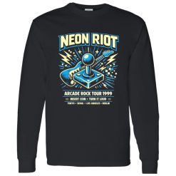
| Fabric Weight | Midweight (5.3 oz) – Heavyweight (6.0 oz Long Sleeve) |
| Material Composition | Solid Colors: 100% Cotton Ash Grey: 99% Cotton / 1% Polyester Sport Grey: 90% Cotton / 10% Polyester Dark Heather: 50% Cotton / 50% Polyester |
| Fit | Classic Unisex Fit (Ladies: Slightly Tapered Missy Fit) |
| Construction | Double-needle stitching Taped neck & shoulders Preshrunk jersey knit Tearaway label |
| Hoodie Material (G185) | 8.0 oz – 50% Cotton / 50% Polyester |
| Available Sizes | S – 5XL (6XL select colors only) |
| Origin | Made with sustainably and fairly grown USA cotton; Printed in USA |
| Print Method | DIGISOFT® Direct-to-Garment (DTG) |
| Brand | Capital T Shirt |
| Fast & Reliable Shipping | All orders are professionally printed and shipped from the USA. |
|---|---|
| Processing Time | Printed on demand within 1–3 business days. |
| Shipping Time | USA: 4–7 business days International: 7–15 business days |
| Shipping Costs | USA Standard: $5.99 International Standard: $9.99 |
| Secure Checkout | Safe & encrypted payment processing. Your information is protected at all times. |
| Returns & Exchanges | We offer a 30-day return policy. View Refunds & Returns Policy |
| Customer Guarantee | We stand behind the quality of every item we print. |
Reviews
There are no reviews yet.