No products in the cart.
Save 20% on orders over $100 with code CT20


Price range: $21.90 through $44.99
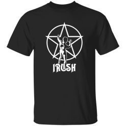
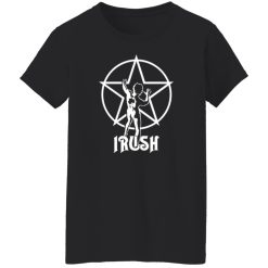
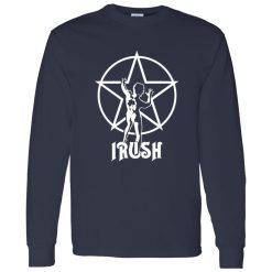
Few symbols in rock carry the same quiet authority as the Starman. Emerging from the visual identity of Rush, it represents more than album artwork—it’s a distilled expression of progressive rock thinking. Structured, deliberate, and concept-driven, the symbol mirrors the band’s approach to music: layered, intelligent, and unmistakably distinct.
Within the landscape of rock band logo shirts, the Rush Starman Irush Shirt stands apart not through loudness, but through precision. Its visual language doesn’t demand attention—it earns it through recognition.
The Starman first appeared prominently on 2112, an album that defined Rush’s place in progressive rock. But over time, the symbol evolved beyond its original narrative context. It became a visual shorthand for individuality, intellectual rebellion, and creative independence.
Unlike traditional rock iconography—often chaotic or aggressive—the Starman operates with balance. The clean geometry, the poised stance, the surrounding red star: everything feels intentional. This is visual design that reflects musical discipline.
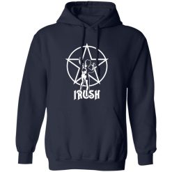
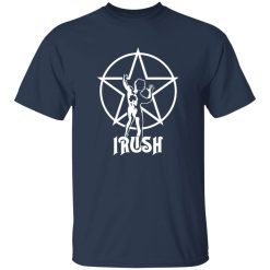
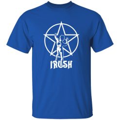
That clarity is exactly what allows the graphic to transition seamlessly into apparel. On the Rush Starman Irush Shirt, the symbol retains its sharpness, sitting centered with a sense of controlled presence rather than excess decoration.
There’s a distinct difference between wearing a band name and wearing a symbol. The latter requires familiarity—it assumes the viewer already understands the reference. That’s what makes the Starman powerful in a styling context.
For fans, it signals alignment without explanation. For observers, it introduces intrigue. This duality is what elevates the Rush Starman Irush Shirt from merchandise to identity piece.
The graphic doesn’t stretch across the fabric aggressively. Instead, it holds its space, allowing the surrounding negative space to amplify its presence. This restraint is what keeps the shirt from feeling dated or overly tied to a single era.
In motion, the shirt behaves differently than louder band graphics. The structure of the print allows it to integrate into both minimal and expressive outfits without friction.
It works in contrast. Pair it with distressed denim and the clean geometry of the Starman creates tension. Layer it under a jacket, and the centered print becomes a controlled focal point rather than visual noise.
There’s also a subtle adaptability at play. The design doesn’t lock into one subculture lane—it moves between classic rock aesthetics and modern streetwear with ease.
The print sits with a certain firmness, maintaining clarity even as the fabric shifts. As the shirt drapes naturally, the Starman remains intact—never distorted into something unrecognizable.
This stability matters. It ensures that the symbol continues to read clearly whether the shirt is worn loose, tucked, or layered. The result is a consistent visual signal regardless of styling approach.
Progressive rock has always existed slightly outside mainstream cycles, and that distance has preserved its visual language. The Starman doesn’t feel nostalgic in the traditional sense—it feels continuous.
That continuity is why the Rush Starman Irush Shirt still connects with newer audiences. It doesn’t rely on retro appeal alone. Instead, it carries a design philosophy that aligns with modern preferences for clean, intentional graphics.
There’s also a collector dimension. For longtime fans, the Starman represents a specific era of Rush’s evolution. For newer listeners, it acts as an entry point into a deeper catalog. Either way, the shirt holds meaning beyond surface-level aesthetics.
Not every band tee needs to communicate loudly. Some pieces function better as signals rather than statements. The Rush Starman Irush Shirt falls into that category.
It doesn’t rely on oversized text or heavy branding. Instead, it invites recognition from those who understand the reference. That subtlety is what gives it longevity—not just as apparel, but as part of a personal style language.
In a market saturated with graphic repetition, the Starman remains distinct because it was never designed to follow trends. It was built from concept first. And that origin still shows every time the shirt is worn.
| Product | Rush Starman Irush Shirt – Progressive Rock Symbol Meets Timeless Graphic Style |
|---|---|
| SKU | cc-1049-9953-108624955-1774751946543 |
| Fabric Weight | Midweight (5.3 oz) – Heavyweight (6.0 oz Long Sleeve) |
| Material Composition | Solid Colors: 100% Cotton Ash Grey: 99% Cotton / 1% Polyester Sport Grey: 90% Cotton / 10% Polyester Dark Heather: 50% Cotton / 50% Polyester |
| Fit | Classic Unisex Fit (Ladies: Slightly Tapered Missy Fit) |
| Construction | Double-needle stitching Taped neck & shoulders Preshrunk jersey knit Tearaway label |
| Hoodie Material (G185) | 8.0 oz – 50% Cotton / 50% Polyester |
| Available Sizes | S – 5XL (6XL select colors only) |
| Origin | Made with sustainably and fairly grown USA cotton; Printed in USA |
| Print Method | DIGISOFT® Direct-to-Garment (DTG) |
| Brand | Capital T Shirt |
| Fast & Reliable Shipping | All orders are professionally printed and shipped from the USA. |
|---|---|
| Processing Time | Printed on demand within 1–3 business days. |
| Shipping Time | USA: 4–7 business days International: 7–15 business days |
| Shipping Costs | USA Standard: $5.99 International Standard: $9.99 |
| Secure Checkout | Safe & encrypted payment processing. Your information is protected at all times. |
| Returns & Exchanges | We offer a 30-day return policy. View Refunds & Returns Policy |
| Customer Guarantee | We stand behind the quality of every item we print. |


Reviews
There are no reviews yet.