No products in the cart.
Save 20% on orders over $100 with code CT20


Price range: $21.90 through $44.99
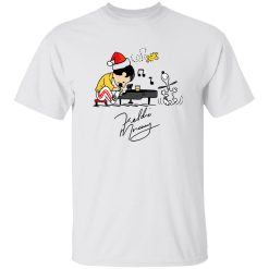
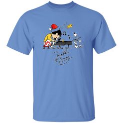
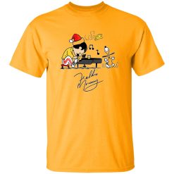
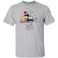
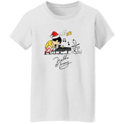
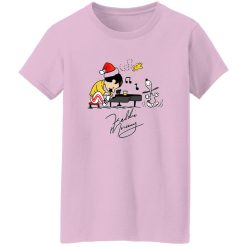
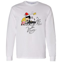
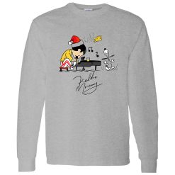
Some designs don’t just sit on a shirt—they perform. This Charlie As Freddie Mercury Playing Piano And Snoopy Woodstock Shirt captures that rare moment where two completely different cultural worlds collide and somehow amplify each other. The theatrical intensity of a Freddie Mercury-style piano performance meets the laid-back charm of Snoopy and Woodstock, creating a piece that feels instantly recognizable yet visually unexpected.
Within the landscape of rock band themed shirts, this design stands out by leaning into character reinterpretation rather than traditional band graphics. It’s not about replicating a tour poster—it’s about translating stage presence into a playful but still expressive visual language.
The strength of this piece starts with how the artwork carries itself once worn. The piano scene is not flat—it reads as movement. You can almost sense the rhythm in the posture, the way the keys stretch across the composition, and the subtle contrast between character forms and negative space.
This is where print execution matters. The lines hold their shape instead of bleeding into each other, allowing each element—Charlie as Freddie, Snoopy, Woodstock—to remain visually distinct even at a distance. That clarity keeps the design readable whether you’re up close or across a room.
The ink doesn’t sit heavy or overly glossy. Instead, it settles into the surface with a matte presence that feels integrated rather than layered on top. That subtle integration is what prevents the design from looking artificial or overly “new” after a few wears.
One of the biggest failures in graphic tees is when the design looks great on day one but fades into something lifeless over time. This shirt avoids that by focusing on controlled aging rather than resisting it entirely.
Instead of cracking in harsh, uneven ways, the print develops a softer, worn-in texture. Edges relax slightly, tones become more cohesive, and the overall graphic starts to feel like it belongs to the fabric rather than sitting on top of it.
This kind of fade behavior actually works in favor of the design. Because it pulls from a mix of rock iconography and cartoon nostalgia, a slightly aged look reinforces the cultural crossover instead of diminishing it. It starts to feel like something you’ve owned for years—even if you haven’t.
A graphic this expressive needs a base that doesn’t fight against it. The shirt holds its shape without becoming rigid, allowing the artwork to stay centered and proportionate even as the fabric moves throughout the day.
That balance matters more than most people realize. If the structure collapses too easily, the design distorts. If it’s too stiff, it feels disconnected from the body. Here, the fabric moves naturally, keeping the print aligned without pulling or warping.
In practical terms, that means the piano scene remains visually intact whether you’re standing, sitting, or in motion. It’s a small detail, but it’s what separates a display piece from something you actually want to wear regularly.
This isn’t just a mashup for the sake of novelty. There’s a reason the combination works. Freddie Mercury’s stage presence is about expression, exaggeration, and control of space. Snoopy and Woodstock, in contrast, bring a lighter, almost effortless sense of character.
When those elements merge, the result is something that feels both energetic and approachable. It carries the visual language of performance without becoming overly serious or aggressive.
That balance makes the shirt flexible across different environments. It doesn’t rely on people recognizing every reference to work. The composition itself carries enough personality to stand on its own.
This piece naturally positions itself as a focal point rather than a background layer. You don’t need to build an outfit around it—it does most of the work by default.
The versatility here isn’t about blending in. It’s about adapting while still maintaining presence. You can wear it in quieter settings without it feeling out of place, but it also holds up in louder, more expressive environments.
There’s a specific kind of moment where this shirt clicks—standing in line before a show, hearing someone test a piano or run a quick soundcheck. It’s not the full performance yet, just a glimpse of what’s about to happen. That anticipation, that quiet build-up, is exactly what this design captures.
It doesn’t try to recreate the entire concert. It locks into a single expressive frame and lets that moment carry the energy.
At a glance, it’s easy to assume this is just a novelty crossover. But the reason it works long-term is because it respects both sides of its influence without leaning too far into either.
The composition stays balanced. The print holds up over time. The structure supports consistent wear. And most importantly, the design doesn’t rely on trends to stay relevant.
That combination is what gives it staying power inside the broader category of rock band themed shirts. It’s not trying to compete with traditional band merch—it’s operating on a different axis entirely, where character, performance, and visual storytelling intersect.
And that’s exactly why it continues to stand out long after the first wear.
| Product | Charlie As Freddie Mercury Playing Piano And Snoopy Woodstock Shirt |
|---|---|
| SKU | cc-1049-9974-108628755-1774868310344 |
| Fabric Weight | Midweight (5.3 oz) – Heavyweight (6.0 oz Long Sleeve) |
| Material Composition | Solid Colors: 100% Cotton Ash Grey: 99% Cotton / 1% Polyester Sport Grey: 90% Cotton / 10% Polyester Dark Heather: 50% Cotton / 50% Polyester |
| Fit | Classic Unisex Fit (Ladies: Slightly Tapered Missy Fit) |
| Construction | Double-needle stitching Taped neck & shoulders Preshrunk jersey knit Tearaway label |
| Hoodie Material (G185) | 8.0 oz – 50% Cotton / 50% Polyester |
| Available Sizes | S – 5XL (6XL select colors only) |
| Origin | Made with sustainably and fairly grown USA cotton; Printed in USA |
| Print Method | DIGISOFT® Direct-to-Garment (DTG) |
| Brand | Capital T Shirt |
| Fast & Reliable Shipping | All orders are professionally printed and shipped from the USA. |
|---|---|
| Processing Time | Printed on demand within 1–3 business days. |
| Shipping Time | USA: 4–7 business days International: 7–15 business days |
| Shipping Costs | USA Standard: $5.99 International Standard: $9.99 |
| Secure Checkout | Safe & encrypted payment processing. Your information is protected at all times. |
| Returns & Exchanges | We offer a 30-day return policy. View Refunds & Returns Policy |
| Customer Guarantee | We stand behind the quality of every item we print. |

Reviews
There are no reviews yet.