No products in the cart.
Save 20% on orders over $100 with code CT20


Price range: $21.90 through $44.99
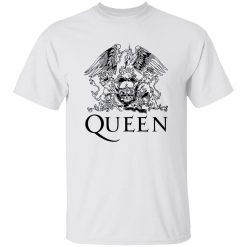
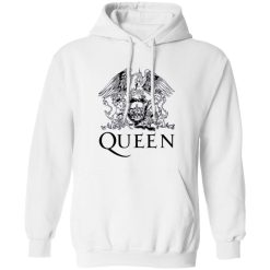
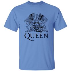
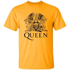
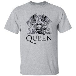
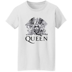
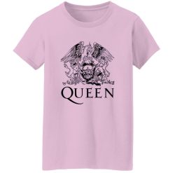
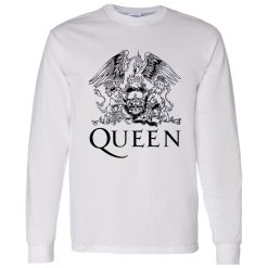
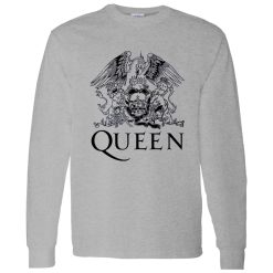
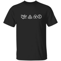
Few symbols in rock history carry the same weight as the Queen royal crest. It’s not just a logo—it’s a visual language that compresses identity, power, and theatrical legacy into a single emblem. The Queen Band Royal Crest Shirt draws directly from that lineage, translating one of music’s most recognizable insignias into something wearable, immediate, and culturally alive.
Within the broader landscape of band t shirts, this design stands apart—not because it tries harder, but because it doesn’t need to. The crest already carries decades of meaning. The shirt simply lets it speak.
There’s a reason the Queen crest continues to appear across generations of fans. It was never designed as a disposable graphic. Instead, it operates like a visual manifesto—combining zodiac elements, regal structure, and theatrical symmetry into something unmistakably bold.
This shirt doesn’t reinterpret the crest—it respects it. The structure remains centered, balanced, and authoritative. That symmetry matters. It creates a sense of stability in the design, allowing it to hold attention without relying on excess decoration or noise.
In a market saturated with over-designed graphics, restraint becomes the differentiator. The Queen Band Royal Crest Shirt understands that. It doesn’t compete visually—it anchors.
The first thing you notice isn’t the detail—it’s the presence. The crest sits with intention, creating a focal point that doesn’t shift or collapse when worn. It holds its structure whether layered under a jacket or worn on its own.
Up close, the print reveals depth—subtle texture variations, slightly distressed edges, and a finish that avoids the overly glossy look common in lower-tier prints. It feels integrated into the fabric rather than sitting on top of it.
As the shirt moves, the design doesn’t distort awkwardly. Instead, it adapts with the drape, maintaining its clarity without losing its sharpness. That balance between flexibility and visual integrity is what separates a strong graphic from a forgettable one.
Queen’s visual identity was never secondary to their sound. From stage costumes to album art, everything carried a sense of scale and intention. The crest became a shorthand for that philosophy—bold, theatrical, and unapologetically grand.
Wearing this shirt isn’t about nostalgia alone. It’s about alignment with that same mindset. The design doesn’t ask for subtlety—it embraces presence. That’s why it continues to resonate across different eras and audiences.
It works whether you’re deeply embedded in rock culture or simply drawn to strong visual symbolism. The meaning is layered, but the impact is immediate.
What makes the Queen Band Royal Crest Shirt versatile isn’t that it blends in—it’s that it anchors an outfit without overwhelming it. The graphic does the heavy lifting, which means the rest of your styling can stay clean and intentional.
Pair it with dark denim and minimal footwear, and it becomes the focal point. Layer it under a structured jacket, and it transitions into something sharper without losing its edge.
The key is balance. The crest brings visual weight, so everything around it can remain understated. That contrast is what keeps the look from feeling forced.
There’s also a timeless quality in how it sits within an outfit. It doesn’t follow seasonal trends or rely on temporary styling cues. It operates on a different timeline—one defined by cultural permanence rather than fashion cycles.
Beyond the visual, the experience of wearing the shirt matters. The fabric has a natural softness that avoids stiffness without feeling thin. It drapes cleanly, allowing the design to sit properly without pulling or warping.
Over time, the shirt doesn’t lose character—it gains it. The print settles slightly into the fabric, creating a more integrated look with each wear. Instead of fading into irrelevance, it evolves subtly, maintaining its identity while becoming more personal.
This isn’t about technical specs or material breakdowns. It’s about how the shirt behaves in real life—how it feels after hours of wear, how it moves throughout the day, how it holds up without demanding attention.
Not every band shirt needs to say something. Some exist purely as merchandise. This one doesn’t.
The Queen Band Royal Crest Shirt speaks to people who recognize the difference between a graphic and a symbol. It resonates with those who understand that certain visuals carry weight beyond design—they carry history, intention, and identity.
It also works for those who want a single piece to define an outfit without overthinking the rest. The crest handles that. It creates a center point that everything else can orbit around.
There’s confidence in that simplicity. No excess, no filler—just a design that holds its ground.
In a space where many rock shirts rely on loud color palettes or overly complex compositions, this one takes a different approach. It leans into clarity. Into structure. Into meaning.
That’s what gives it longevity. It doesn’t depend on novelty or trend cycles. It’s anchored in something more stable—recognition, symbolism, and cultural continuity.
And that’s ultimately what makes it a stronger choice. Not because it tries to stand out, but because it already does.
When a design carries its own history, it doesn’t need to explain itself. It simply shows up—and holds attention.
The Queen Band Royal Crest Shirt isn’t about reinventing anything. It doesn’t need to. Its strength comes from preserving what already works—then translating it into a format that fits seamlessly into modern wear.
It’s a piece that balances visual authority with everyday usability. One that feels just as relevant now as it did decades ago. And in a category where repetition is common, that kind of consistency becomes rare.
If you’re looking for something that carries more than just surface-level design, this is it. Not louder—just stronger.
| Product | Queen Band Royal Crest Shirt – Iconic Rock Symbol Reimagined |
|---|---|
| SKU | cc-1049-9974-108628764-1774868396532 |
| Fabric Weight | Midweight (5.3 oz) – Heavyweight (6.0 oz Long Sleeve) |
| Material Composition | Solid Colors: 100% Cotton Ash Grey: 99% Cotton / 1% Polyester Sport Grey: 90% Cotton / 10% Polyester Dark Heather: 50% Cotton / 50% Polyester |
| Fit | Classic Unisex Fit (Ladies: Slightly Tapered Missy Fit) |
| Construction | Double-needle stitching Taped neck & shoulders Preshrunk jersey knit Tearaway label |
| Hoodie Material (G185) | 8.0 oz – 50% Cotton / 50% Polyester |
| Available Sizes | S – 5XL (6XL select colors only) |
| Origin | Made with sustainably and fairly grown USA cotton; Printed in USA |
| Print Method | DIGISOFT® Direct-to-Garment (DTG) |
| Brand | Capital T Shirt |
| Fast & Reliable Shipping | All orders are professionally printed and shipped from the USA. |
|---|---|
| Processing Time | Printed on demand within 1–3 business days. |
| Shipping Time | USA: 4–7 business days International: 7–15 business days |
| Shipping Costs | USA Standard: $5.99 International Standard: $9.99 |
| Secure Checkout | Safe & encrypted payment processing. Your information is protected at all times. |
| Returns & Exchanges | We offer a 30-day return policy. View Refunds & Returns Policy |
| Customer Guarantee | We stand behind the quality of every item we print. |

Reviews
There are no reviews yet.