No products in the cart.
Save 20% on orders over $100 with code CT20


Price range: $21.90 through $44.99
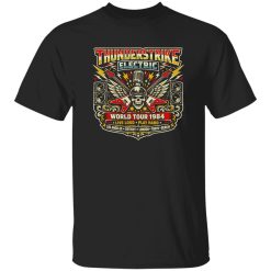
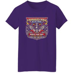
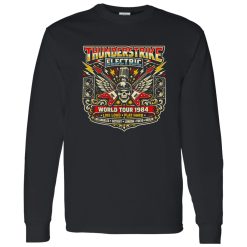
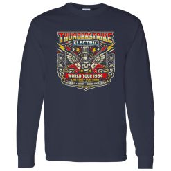
There’s a specific visual language tied to mid-80s arena rock—electric light, oversized stages, and graphics that felt as loud as the sound itself. The Thunderstrike Electric World Tour 1984 Shirt sits directly inside that world, not as a retro imitation, but as a continuation of that visual intensity. It reflects a moment when tour graphics weren’t subtle—they were designed to be seen from the back row.
Within the broader space of rock band apparel, designs like this carry more than nostalgia. They hold structure, color tension, and symbolic cues that defined how rock presented itself at scale. This isn’t just a shirt—it’s a compressed version of an entire stage experience.
By 1984, rock had fully transitioned into spectacle. Tour posters and merchandise were no longer simple identifiers—they became extensions of the performance. Typography stretched, lightning motifs sharpened, and color palettes leaned into contrast-heavy combinations designed for maximum visibility under stage lights.
The Thunderstrike Electric World Tour 1984 Shirt draws directly from that lineage. You can see it in the way the layout centers energy—often through symmetrical compositions or radiating elements that mimic sound waves or stage lighting bursts. These weren’t random design choices. They were engineered to feel powerful at a glance.
Even the structure of the text itself reflects that era. Bold, angular lettering wasn’t just stylistic—it was functional. It needed to cut through distance, darkness, and movement. That’s why these designs still feel strong today. They were built with impact as the primary goal.
What makes a design like this endure is its ability to move from stage to street without losing intensity. The original context—live performance, massive crowds, amplified sound—gets translated into something wearable, but not diluted.
The shirt doesn’t try to recreate the concert. Instead, it captures its essence. The sense of scale, the electric energy, the feeling of being surrounded by sound—it all gets distilled into visual form.
This is where Visual Iconography becomes the core of the piece. It’s not about the band name alone. It’s about the symbols, the layout, and the visual rhythm that communicates something instantly recognizable, even without context.
That’s why designs from this era continue to resonate. They don’t depend on explanation. They communicate through form.
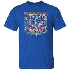
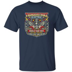
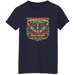
There’s a tactile quality to how these designs present themselves. The print doesn’t feel flat—it carries a sense of depth, as if the graphic has been layered over time. Slight distressing, subtle fade patterns, and tonal shifts give the impression of something lived-in rather than newly applied.
When worn, the shirt doesn’t sit stiffly. It moves naturally with the body, allowing the graphic to shift slightly with each movement. That movement matters—it keeps the design from feeling static, reinforcing the idea that it belongs to something dynamic.
Under different lighting conditions, the graphic reacts differently. In brighter environments, the contrast sharpens, making the details more pronounced. In lower light, it softens, blending into a more atmospheric presence. This adaptability is part of what gives it long-term wearability.
Modern designs often reference this period, but rarely match its clarity. The 1984 era didn’t overcomplicate things. It focused on impact, readability, and emotional immediacy.
The Thunderstrike Electric World Tour 1984 Shirt follows that same principle. It doesn’t try to layer multiple ideas into one space. It commits to a single visual direction and executes it fully.
This clarity is what makes it versatile. It can anchor an outfit without requiring additional elements to justify it. The graphic carries enough weight on its own.
At the same time, it doesn’t feel locked into the past. The structure is timeless because it was built around visual fundamentals—contrast, symmetry, and scale.
There’s a reason designs like this don’t fade into obscurity. They represent a moment when music culture and visual design were fully aligned. Everything was built to amplify the same message: bigger, louder, more visible.
The Thunderstrike Electric World Tour 1984 Shirt holds onto that alignment. It doesn’t reinterpret it—it preserves it. And that preservation is what gives it relevance today.
Standing in front of a mirror before heading out, there’s a brief moment where the graphic catches your eye differently depending on how the light hits it. It’s subtle, but it reinforces the same idea the original design was built on—presence.
Not forced, not exaggerated. Just clear, direct, and unmistakably rooted in the visual culture of rock at its peak scale.
| Product | Thunderstrike Electric World Tour 1984 Shirt – A Visual Icon of Arena Rock Energy |
|---|---|
| SKU | cc-1049-9971-108634515-1775040099038 |
| Fabric Weight | Midweight (5.3 oz) – Heavyweight (6.0 oz Long Sleeve) |
| Material Composition | Solid Colors: 100% Cotton Ash Grey: 99% Cotton / 1% Polyester Sport Grey: 90% Cotton / 10% Polyester Dark Heather: 50% Cotton / 50% Polyester |
| Fit | Classic Unisex Fit (Ladies: Slightly Tapered Missy Fit) |
| Construction | Double-needle stitching Taped neck & shoulders Preshrunk jersey knit Tearaway label |
| Hoodie Material (G185) | 8.0 oz – 50% Cotton / 50% Polyester |
| Available Sizes | S – 5XL (6XL select colors only) |
| Origin | Made with sustainably and fairly grown USA cotton; Printed in USA |
| Print Method | DIGISOFT® Direct-to-Garment (DTG) |
| Brand | Capital T Shirt |
| Fast & Reliable Shipping | All orders are professionally printed and shipped from the USA. |
|---|---|
| Processing Time | Printed on demand within 1–3 business days. |
| Shipping Time | USA: 4–7 business days International: 7–15 business days |
| Shipping Costs | USA Standard: $5.99 International Standard: $9.99 |
| Secure Checkout | Safe & encrypted payment processing. Your information is protected at all times. |
| Returns & Exchanges | We offer a 30-day return policy. View Refunds & Returns Policy |
| Customer Guarantee | We stand behind the quality of every item we print. |


Reviews
There are no reviews yet.