No products in the cart.
Save 20% on orders over $100 with code CT20


Price range: $21.90 through $44.99
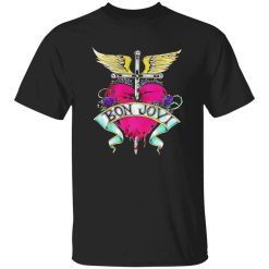
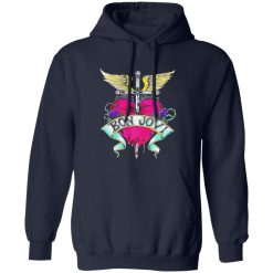
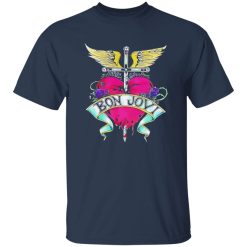
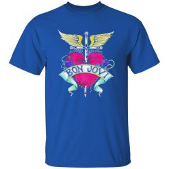
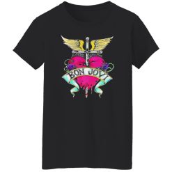
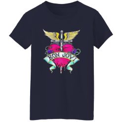
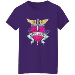
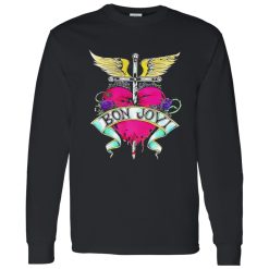
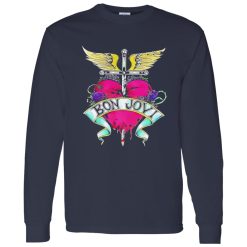
Some music shirts work as quick impulse buys, but others earn attention because the print, feel, and overall build make the design worth wearing long after the first wash. The Bon Jovi Heart Dagger Wings Vintage Rock Artwork Shirt lands in that second category. For shoppers comparing rock band pieces on more than artwork alone, this design stands out through print character, day-to-day comfort, and the kind of structure that feels dependable instead of disposable.
That matters in a crowded rock apparel space. A strong graphic can pull someone in, but the real difference shows up later in how the shirt wears through repeat use, how the image settles into the garment, and whether the overall shape still looks intentional after regular rotation. Within the world of band inspired shirts, performance is what turns a visually strong piece into one people keep reaching for.
With a design built around the heart, dagger, and wings motif, print execution is not a minor detail. This type of artwork depends on contrast, edge definition, and controlled visual aging. If the ink sits too heavily, the graphic can feel stiff and overly new. If the finish is too weak, the artwork loses presence too quickly. The sweet spot is a print that delivers enough saturation to make the design feel bold on first wear while still allowing the vintage character to come through naturally over time.
That is where performance becomes visible. A well-executed music graphic should not read like a glossy poster pressed flat onto a shirt body. It should feel integrated into the garment, with a finish that supports the artwork rather than overpowering it. On a piece like this, the right ink behavior helps the dagger and wing details stay legible, keeps the heart motif visually anchored, and preserves the classic rock attitude that buyers expect from vintage-styled band apparel.
The result is a shirt that looks strong from a distance and still holds up when viewed close. Instead of collapsing into blur after wear, the artwork keeps enough definition to remain recognizable while developing the softened character that vintage-inspired buyers usually want. That balance gives the design longer relevance in a wardrobe, especially for anyone who prefers rock graphics that age with character rather than simply wear out.
Print quality is often the first thing noticed, but it also affects comfort, flexibility, and how often a shirt actually gets worn. When the graphic sits well on the fabric, movement feels easier and the front panel does not become rigid or awkward. That makes a real difference for shirts meant to be worn casually, layered under outerwear, or styled as part of an everyday music-driven wardrobe instead of saved for occasional novelty use.
Not every rock graphic tee needs to feel ultra-light or overly soft right out of the package to perform well. What matters more is whether the shirt feels comfortable across repeated wear and whether that comfort translates into reliable everyday use. The Bon Jovi Heart Dagger Wings Vintage Rock Artwork Shirt works best when the fabric feel supports the graphic instead of competing with it. That means enough body to hold the silhouette, enough softness to keep it easy to wear, and enough flexibility to avoid that cardboard-flat feeling that can make printed shirts less appealing after the first try-on.
A strong performance shirt also behaves well across different settings. It should feel natural when worn on its own, but it also needs to layer cleanly under a flannel, denim jacket, leather jacket, or casual overshirt without bunching awkwardly around the print. The fabric should drape with some structure rather than collapsing instantly, because vintage rock artwork tends to look better when the shirt has presence on the body. A limp garment can weaken the visual impact of even a good design.
There is also a practical side to comfort performance that gets overlooked. People buying band apparel in this category are rarely looking for a one-time event shirt. They want something that fits into repeat weekly use: weekend wear, casual nights out, travel days, concerts, record-store runs, or simply throwing on something with more personality than a blank tee. In those situations, comfort is not abstract. It affects whether the shirt stays in rotation or gets pushed to the back of the drawer.
That is why balance matters more than hype language. A good music shirt does not need to feel exaggeratedly delicate to be impressive. It needs to feel lived-in without feeling flimsy, and structured without feeling stiff. When that balance is right, the piece starts to earn trust. Someone can wear it for the artwork at first, but they keep choosing it because the shirt itself performs the way a premium casual piece should.
There is a familiar moment with a good band tee: you throw it on for something simple, maybe heading out in the evening or stopping by a record shop, and it ends up being the shirt you stay in for the rest of the day because it never starts feeling restrictive. That kind of ease is a performance signal too.
For transactional buyers, one of the biggest concerns is not whether a shirt looks good on day one. It is whether the shirt still looks right after several wears and washes. A piece like this has to maintain enough structure that the neckline does not feel sloppy too early, the body does not twist into an off-balance shape, and the printed front does not pull the garment out of proportion. Shape retention is a quiet quality marker, but it has a direct effect on satisfaction.
Vintage-inspired rock apparel benefits from controlled aging, not uncontrolled breakdown. Buyers usually want the artwork to soften a little and the overall shirt to become more natural with wear, but they do not want the garment to lose its outline. When the structure holds, the shirt keeps that reliable rock-tee profile that works with denim, black jeans, cargos, or shorts. When the structure fails, the look shifts from intentionally vintage to prematurely worn out.
This distinction becomes even more important for people buying within high-volume rock band shirt categories, where many options can appear similar at first glance. Construction behavior is often what separates a shirt that feels worth the purchase from one that gets mentally filed as another generic graphic tee. If the shape stays stable, the shoulders sit better, the body hangs cleaner, and the print remains centered visually rather than becoming distorted by fabric fatigue.
That stability also supports styling flexibility. Shirts with decent shape retention are easier to wear tucked, half-tucked, or loose. They work better under outer layers because the body keeps its line. They photograph better, wear better over time, and create less of the slouch that can flatten the impact of a vintage rock design. For shoppers who care about getting more than one-season value from a graphic shirt, that kind of dependability matters.
A shopper does not need a full technical breakdown to recognize stronger product performance. The signals are usually simple:
The Bon Jovi Heart Dagger Wings Vintage Rock Artwork Shirt works best for shoppers who want a piece that combines visual recognition with dependable wear performance. The design itself carries strong rock symbolism, but the buying decision does not rest on imagery alone. In a competitive category with high search volume and strong intent, people are also looking for signs that the shirt will feel good, wear well, and keep its impact beyond the first impression.
That is where this style earns its place. The vintage treatment gives the artwork enough character to avoid feeling flat or overly polished. The print-focused performance gives the design better staying power. The structure-oriented wear experience makes it more useful as an actual wardrobe piece instead of a novelty purchase. All of that adds up to a more confident product decision for someone who wants both music identity and practical value in the same shirt.
It also fits how modern buyers approach band apparel now. They are not only buying for fandom. They are buying for versatility, repeat wear, and visual credibility. A shirt like this needs to function across those expectations. It should carry the right rock mood, but it also needs enough print integrity, comfort balance, and shape stability to justify being chosen over countless generic alternatives.
For that reason, the strongest appeal here is not loud sales language. It is confidence. Confidence that the artwork holds its own. Confidence that the shirt feels right in regular use. Confidence that the vintage look develops character instead of simply losing quality. When a rock graphic piece delivers on those points, it stops being just another product page option and becomes a shirt people actually want to keep wearing.
| Product | Bon Jovi Heart Dagger Wings Vintage Rock Artwork Shirt |
|---|---|
| SKU | cc-1049-9953-108650490-1775611272263 |
| Fabric Weight | Midweight (5.3 oz) – Heavyweight (6.0 oz Long Sleeve) |
| Material Composition | Solid Colors: 100% Cotton Ash Grey: 99% Cotton / 1% Polyester Sport Grey: 90% Cotton / 10% Polyester Dark Heather: 50% Cotton / 50% Polyester |
| Fit | Classic Unisex Fit (Ladies: Slightly Tapered Missy Fit) |
| Construction | Double-needle stitching Taped neck & shoulders Preshrunk jersey knit Tearaway label |
| Hoodie Material (G185) | 8.0 oz – 50% Cotton / 50% Polyester |
| Available Sizes | S – 5XL (6XL select colors only) |
| Origin | Made with sustainably and fairly grown USA cotton; Printed in USA |
| Print Method | DIGISOFT® Direct-to-Garment (DTG) |
| Brand | Capital T Shirt |
| Fast & Reliable Shipping | All orders are professionally printed and shipped from the USA. |
|---|---|
| Processing Time | Printed on demand within 1–3 business days. |
| Shipping Time | USA: 4–7 business days International: 7–15 business days |
| Shipping Costs | USA Standard: $5.99 International Standard: $9.99 |
| Secure Checkout | Safe & encrypted payment processing. Your information is protected at all times. |
| Returns & Exchanges | We offer a 30-day return policy. View Refunds & Returns Policy |
| Customer Guarantee | We stand behind the quality of every item we print. |
Reviews
There are no reviews yet.