No products in the cart.

Music Graphic Tees
Best Music Graphic Designs by Genre (The Complete Style Breakdown)
19
Mar
Mar
In this guide, we break down how genre influences layout, typography, color psychology, print complexity, and even fabric presence. If you’ve ever wondered why a rock tee feels different from a hip-hop graphic or what separates vintage from modern aesthetics, this is your deep dive.
What Defines a Music Graphic by Genre?
Featured Snippet: The best music graphic designs by genre differ in typography, artwork density, color palette, and cultural symbolism. Rock leans distressed and tour-based, metal emphasizes intricate illustration, hip-hop prioritizes bold portrait graphics, while vintage-inspired designs use faded ink and muted tones to signal authenticity.
Most shoppers think genre differences are purely artistic. They’re not. They’re psychological.
Designers intentionally use:
- Typography weight – blocky, jagged, script, or minimalist
- Artwork density – negative space vs full-front saturation
- Color contrast – neon vs monochrome vs faded
- Cultural symbolism – tour dates, skulls, portraits, abstract art
- Print aging style – distressed vs crisp saturation
These elements determine whether a shirt feels authentic to its genre or commercially watered down. The difference matters — especially in a market flooded with mass-produced graphics.
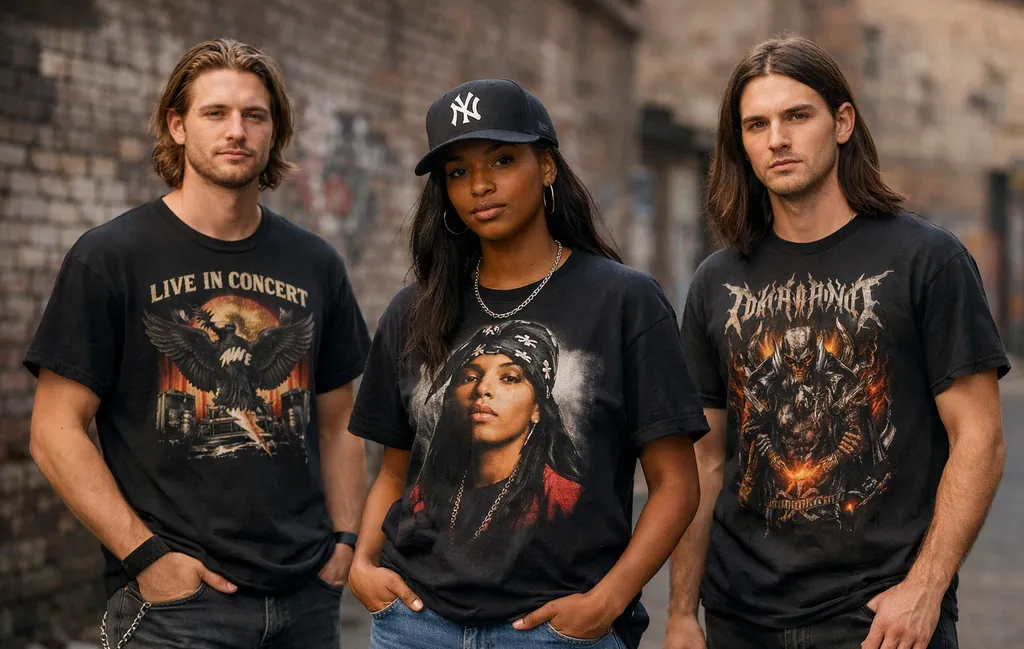
Rock Graphic Tee Designs
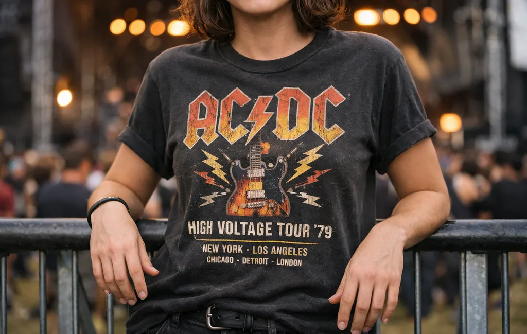
Rock graphics are rooted in performance history. Think stage lighting, tour lists, bold band logos, and artwork that looks like it survived decades of amplifiers and sweat.
Classic rock icons like Led Zeppelin, Pink Floyd, and The Rolling Stones popularized large front graphics with heavy typography and symbolic imagery. Flames, winged creatures, prism art, and gritty textures weren’t decorative — they represented scale and spectacle.
Contrarian insight: A perfectly clean rock print often looks less authentic. Slight distressing or muted ink gives the design credibility.
Modern rock graphics often blend:
- Oversized chest prints
- Tour date back graphics
- Faded monochrome palettes
- High-contrast white-on-black layouts
If you’re evaluating quality, look for clarity in the distressed areas. High-definition printing ensures cracks appear intentional — not accidental. On a 5.3 oz heavyweight cotton base, the artwork holds structure instead of clinging thinly to the body.
For deeper exploration of genre-driven artistry, see our breakdown of the most artistic music graphic tees.
Punk Graphic Tee Designs
Punk rejects polish. That’s the point.
Bands like Ramones and the Sex Pistols embraced raw layouts, collage typography, ransom-note lettering, and photocopied aesthetics. Punk graphics often appear intentionally chaotic — overlapping layers, asymmetrical alignment, harsh black-and-white contrasts.
Buyer psychology insight: Punk designs feel personal. They communicate anti-establishment identity more than band loyalty.
Key characteristics:
- Minimal color use
- DIY visual energy
- Handwritten fonts
- Subversive iconography
Clean stitching and durable cotton matter here because punk shirts often become daily rotation staples. The structure prevents excessive collar warping — a common issue with thin fast-fashion alternatives.
Metal Graphic Tee Designs
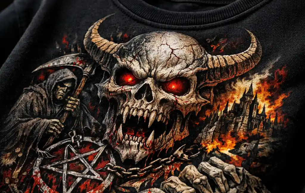
Metal design is illustration-driven. Complexity is the language.
Bands like Metallica and Iron Maiden elevated album art into wearable canvases. Skulls, mythical creatures, dystopian landscapes — metal graphics lean into storytelling and dense composition.
Production insight: Fine-line artwork demands precision printing. High-definition processes reduce color bleeding and maintain line clarity, especially across dark garments.
What defines metal aesthetics?
- High-detail illustrations
- Sharp contrast palettes
- Layered shading
- Angular typography
Here’s where quality becomes obvious: inferior prints flatten intricate art into muddy shapes. On properly executed graphics, even micro-lines stay distinct.
Common question: Do metal shirts crack faster? Not necessarily. Durability depends more on print method and cotton density than genre. Structured heavyweight cotton resists distortion, helping the artwork age evenly.
Hip-Hop Graphic Tee Designs
Hip-hop graphics are statement pieces.
Artists like Tupac Shakur and groups such as Wu-Tang Clan made portrait graphics iconic. The aesthetic leans bold, confident, and highly visible — often oversized.
Styling psychology: Hip-hop tees are meant to anchor an outfit. They’re not subtle background pieces.
Design markers include:
- Large photographic prints
- High-contrast color blocking
- Bold logo placement
- Minimal negative space
Fit matters here. A slightly relaxed silhouette enhances authenticity. Structured cotton ensures the shirt drapes instead of clinging, preserving graphic proportions.
Many shoppers ask: Are oversized music tees still in style? Yes — particularly in hip-hop and streetwear contexts. Proportion communicates cultural alignment.
Pop Graphic Tee Designs
Pop graphics are theatrical.
From Michael Jackson to Madonna, pop design celebrates spectacle, movement, and glamour. Expect vibrant palettes, dynamic poses, and era-defining typography.
Comparative breakdown: Where rock leans gritty, pop leans polished. Where metal emphasizes darkness, pop often amplifies brightness.
Common elements:
- High-saturation color
- Stage photography
- Retro typography revival
- Tour-based nostalgia layouts
Because pop designs often feature vibrant color, quality printing becomes critical for maintaining long-term brightness without harsh texture.
Up next: alternative, indie, country, electronic, and vintage-inspired aesthetics — and how to choose the right one for your personal style.
Indie & Alternative Graphic Tee Designs
Indie and alternative graphics thrive in understatement. Where metal overwhelms and hip-hop dominates visually, alternative aesthetics often lean introspective — subtle color palettes, abstract artwork, minimalist typography, or lo-fi photography.
Bands like Nirvana and Arctic Monkeys helped popularize graphics that feel less commercial and more art-driven. The emphasis isn’t spectacle. It’s mood.
Cultural analysis: Indie graphics often reject over-branding. Smaller logos and intentionally imperfect alignment signal authenticity over mass appeal.
- Muted earth tones or washed black
- Hand-drawn or collage-inspired art
- Minimal front placement
- Abstract symbolism instead of literal portraits
Common PAA question: Are minimalist band tees still popular? Yes — especially in indie circles where subtlety communicates deeper fandom. The absence of oversized branding can feel more exclusive.
From a production standpoint, understated graphics benefit from soft-hand printing methods that preserve fabric feel. When ink doesn’t sit heavily on top of the cotton, the shirt drapes naturally without stiffness.
Country Graphic Tee Designs
Country music graphics blend nostalgia with rugged simplicity.
Artists like Johnny Cash inspired bold monochrome portraits, western typography, and heritage-style layouts. Country designs often balance masculinity and storytelling — less urban, more Americana.
Decision clarity logic: Country tees work best when typography feels weathered, not trendy. Overly modern fonts disrupt authenticity.
Expect:
- Distressed serif lettering
- Black-and-white portrait art
- Vintage tour date backs
- Muted, earthy color palettes
Shoppers frequently ask: Do vintage-style country shirts look outdated? No — when executed properly, they feel heritage-driven, not old-fashioned. The key difference lies in intentional distressing versus random fading.
Heavier cotton construction supports this aesthetic. Lightweight, thin shirts can undermine the rugged perception that country designs aim to convey.
Electronic & EDM Graphic Tee Designs
Electronic music visuals prioritize futurism and abstraction.
Duos like Daft Punk pushed graphic culture toward neon gradients, helmet iconography, glitch effects, and bold geometric symmetry. EDM shirts frequently incorporate digital aesthetics — high saturation, vibrant contrasts, synthetic visual cues.
Comparative insight: Where rock celebrates analog nostalgia, electronic graphics celebrate digital futurism.
- Neon color schemes
- Symmetrical layouts
- Minimal typography
- High-contrast black bases
Common question: Are bright graphic tees harder to maintain? Not inherently. Color longevity depends on print quality and care. High-definition printing with durable color retention helps prevent premature dulling when washed properly.
Because electronic graphics often rely on vibrancy, clarity of ink saturation matters more than texture aging. Crisp edges separate premium prints from flat imitations.
Vintage-Inspired Genre Graphics
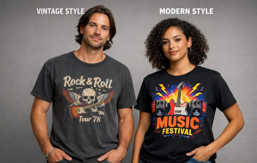
Vintage-inspired music designs deserve their own category because they transcend genre. You’ll find rock, pop, country, and hip-hop all reinterpreted through faded inks and retro layouts.
Key distinction: Vintage-inspired is not the same as poorly printed. Authentic-looking fade requires controlled ink application — not low saturation mistakes.
Differences between vintage and modern designs:
- Vintage: muted colors, softer edges, subtle cracking
- Modern: high saturation, clean lines, bold contrast
- Vintage: heritage typography
- Modern: contemporary layout structure
Buyers often ask: How can you tell if a vintage tee is authentic or just new? Fabric feel, stitching integrity, and print consistency reveal more than surface fading. Modern production can replicate visual aging while maintaining structural quality.
If your style leans nostalgic but you want durability, vintage-inspired graphics printed on heavyweight cotton provide the best balance.
How to Choose the Right Genre Graphic for Your Style
Choosing the best music graphic designs by genre isn’t about trend — it’s about alignment.
Ask yourself:
- Do I prefer bold statement pieces or subtle designs?
- Is my wardrobe oversized streetwear or structured minimalism?
- Do I value nostalgia or modern aesthetics?
- Will I layer this shirt or wear it as a focal piece?
Buyer psychology insight: People regret buying graphics that feel disconnected from their lifestyle. A metal shirt worn in a minimalist wardrobe can feel forced. A subtle indie design may feel underwhelming in a streetwear rotation.
If you want versatility, start with rock or vintage-inspired layouts. They transition easiest across styling contexts.
To explore a wide range of options curated by genre, you can browse our music graphic tees collection, which consolidates rock, vintage, and contemporary designs under one category.
Where to Buy High-Quality Music Graphic Tees
Genre aesthetics matter — but construction quality determines longevity.
When evaluating music shirts, consider:
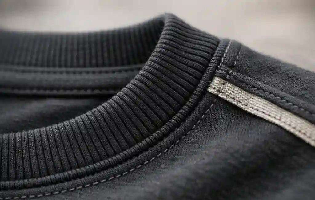
- Fabric weight (5.3 oz heavyweight cotton provides structure)
- Reinforced collar stitching
- Taped neck and shoulders for durability
- Print clarity and soft-hand feel
High-definition DIGISOFT® printing delivers durable color retention with reduced cracking compared to heavier plastisol layers. The result feels integrated into the fabric instead of sitting thickly on top.
Objection handling: “Won’t heavyweight cotton feel stiff?” Not when properly constructed. Quality cotton softens naturally over time while maintaining shape.
If you want to explore the full range of genre-driven designs, visit our primary Music T-Shirts category to see structured collections organized by style and era.
FAQ: Best Music Graphic Designs by Genre
Which genre has the most detailed graphic designs?
Metal typically features the most intricate illustration work, with layered shading and complex imagery. However, hip-hop portrait designs can also involve high-detail photographic prints depending on the artwork source.
Are vintage-inspired music tees lower quality?
No. Modern production can intentionally recreate faded aesthetics while using durable cotton and high-definition printing. The visual aging does not necessarily indicate structural weakness.
Do heavier shirts hold graphics better?
Yes. Structured heavyweight cotton resists distortion and stretching, which helps maintain graphic alignment and reduce premature cracking.
Can music graphic tees be dressed up?
Absolutely. Minimalist indie or vintage rock designs pair well with tailored outerwear. Fit and color coordination determine how elevated the look feels.
Are oversized fits required for hip-hop graphics?
Not required — but proportion contributes to authenticity. Relaxed silhouettes tend to complement bold portrait artwork more naturally than slim cuts.
The best music graphic designs by genre don’t just represent sound — they represent you. Choose with intention, prioritize construction quality, and align aesthetics with lifestyle. That’s how a graphic tee becomes a long-term staple instead of a one-season impulse buy.
Related Posts: