No products in the cart.
Save 20% on orders over $100 with code CT20


Price range: $21.90 through $44.99
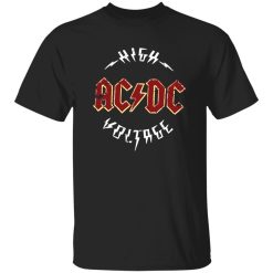
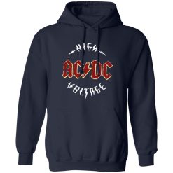
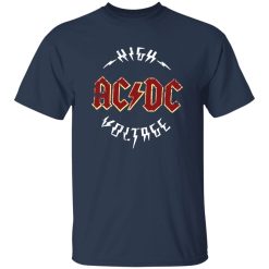
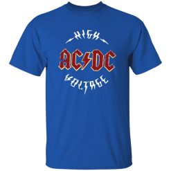
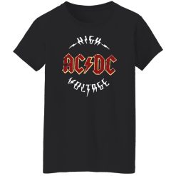
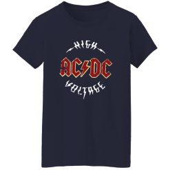
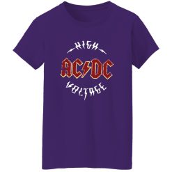
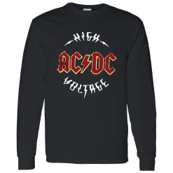
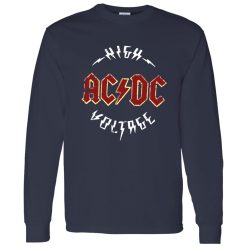
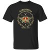
The moment you see the lightning strike, you already know what it represents. The ACDC Lightning Logo Classic Rock Band Artwork Shirt doesn’t need explanation—it delivers instant recognition, built around one of the most iconic visual marks in rock culture. If you’re choosing based on presence alone, this piece already checks that box.
This isn’t about subtle styling. It’s about owning a graphic that carries weight without effort.
Some designs fade with time. This one doesn’t. The lightning bolt cuts through the center with sharp clarity, creating a visual anchor that holds attention from a distance and up close. That balance—bold but clean—is what makes it wearable beyond just concerts or nostalgia-driven moments.
The artwork sits with intention. It doesn’t feel oversized or forced, and it avoids the clutter that often weakens graphic shirts. Instead, it delivers a focused hit: high contrast, immediate readability, and strong identity alignment.
In a market full of overworked prints, this design wins by doing less—but doing it better.
This is where the shirt becomes more than just a graphic. It integrates easily into daily rotation without losing its edge. Pair it with worn denim or structured black jeans and the look stays grounded. Add a jacket, and the lightning still cuts through layers without getting lost.
Even in simpler setups, it holds presence. Clean sneakers soften the look. Boots push it toward a heavier rock stance. Either way, the shirt remains the focal point without forcing the rest of the outfit to compete.
That flexibility is what keeps it relevant—not just as merch, but as a reliable go-to piece.
It’s straightforward. You don’t need to overthink it.
There’s a difference between a shirt that references rock and one that actually carries its identity. This piece leans into authenticity through simplicity. No unnecessary overlays, no artificial distressing trying to mimic age—just a clean execution of a symbol that already has cultural weight.
That matters when you’re deciding what to wear repeatedly. A design like this doesn’t rely on trend cycles or seasonal styling tricks. It stays consistent because the foundation is strong.
And consistency is what turns a shirt from a one-time wear into something you keep reaching for.
When browsing options like see more rock band tour shirts, the difference becomes clear quickly. Many designs try to compete with complexity. This one stands out by staying direct.
If you’re looking for a graphic that delivers instant recognition, strong visual impact, and zero styling friction, this is the right call. It doesn’t ask you to build an outfit around it—it fits into what you already wear and elevates it.
There’s no guesswork here. The identity is clear, the design holds, and the wearability is proven.
You either want that kind of clarity—or you don’t.
| Product | ACDC Lightning Logo Classic Rock Band Artwork Shirt – Bold Statement Design Breakdown |
|---|---|
| SKU | cc-1049-9953-108650419-1775610623804 |
| Fabric Weight | Midweight (5.3 oz) – Heavyweight (6.0 oz Long Sleeve) |
| Material Composition | Solid Colors: 100% Cotton Ash Grey: 99% Cotton / 1% Polyester Sport Grey: 90% Cotton / 10% Polyester Dark Heather: 50% Cotton / 50% Polyester |
| Fit | Classic Unisex Fit (Ladies: Slightly Tapered Missy Fit) |
| Construction | Double-needle stitching Taped neck & shoulders Preshrunk jersey knit Tearaway label |
| Hoodie Material (G185) | 8.0 oz – 50% Cotton / 50% Polyester |
| Available Sizes | S – 5XL (6XL select colors only) |
| Origin | Made with sustainably and fairly grown USA cotton; Printed in USA |
| Print Method | DIGISOFT® Direct-to-Garment (DTG) |
| Brand | Capital T Shirt |
| Fast & Reliable Shipping | All orders are professionally printed and shipped from the USA. |
|---|---|
| Processing Time | Printed on demand within 1–3 business days. |
| Shipping Time | USA: 4–7 business days International: 7–15 business days |
| Shipping Costs | USA Standard: $5.99 International Standard: $9.99 |
| Secure Checkout | Safe & encrypted payment processing. Your information is protected at all times. |
| Returns & Exchanges | We offer a 30-day return policy. View Refunds & Returns Policy |
| Customer Guarantee | We stand behind the quality of every item we print. |

Reviews
There are no reviews yet.