No products in the cart.
Save 20% on orders over $100 with code CT20


Price range: $21.90 through $44.99
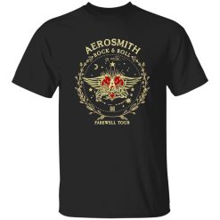
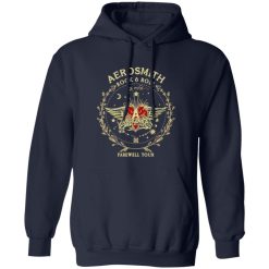
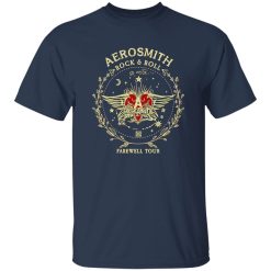
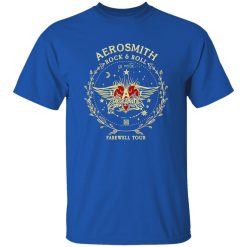
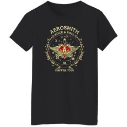
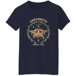
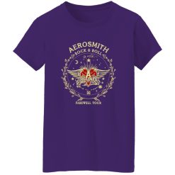
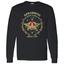
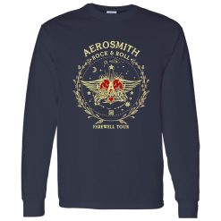
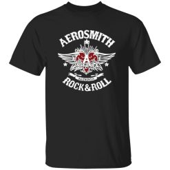
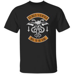
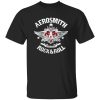
Some shirts stay in the drawer until the right occasion shows up. Others immediately set the tone for the rest of the outfit. The Aerosmith Farewell Tour Vintage Rock And Roll Heart Wings Badge Shirt belongs to the second group because the artwork already carries enough energy to lead the look. A winged heart badge, vintage rock and roll attitude, and farewell-tour framing give it the kind of visual authority that does not need heavy styling to feel complete.
That matters inside Rock Band Shirts, where the strongest pieces are not just graphic tops but anchors for personal style. When a design leans into classic-rock symbolism instead of feeling flat or overworked, it becomes easier to wear in everyday settings without losing the pulse of band culture. The appeal here is not only nostalgic. It is also about how the print reads from a few steps away, how it shapes proportions, and how it pulls simple layers into something more expressive.
A strong band shirt needs a focal point, and this one gets there with a familiar rock vocabulary that still feels sharp: heart, wings, badge structure, and a farewell-tour frame that suggests legacy instead of random decoration. The badge format gives the print contained shape, which is useful from a styling perspective because it creates visual order on the chest rather than letting the graphic spread too loosely across the shirt. That makes the piece feel intentional, especially with darker denim, washed black layers, or a broken-in leather jacket.
The vintage direction also changes how the shirt behaves in an outfit. Clean modern graphics often want everything around them to stay minimal. A vintage-style rock print does the opposite. It invites texture, age, and contrast. Faded denim looks better with it. Silver jewelry makes more sense beside it. Boots, beat-up sneakers, and thrifted outerwear all feel more coherent because the shirt already speaks the language of classic rock visual culture.
For shoppers browsing discover classic rock band shirts, this is the kind of design that earns attention quickly because it does not depend on a wall of text or oversized branding to communicate identity. The shape does the work. The mood does the rest.
It also lands in a sweet spot between tribute energy and wearable styling value. Some farewell-tour graphics feel like memorabilia first and clothing second. This one is easier to style because the artwork reads as a badge emblem, not just a date-stamped souvenir print.
The easiest mistake with a graphic like this is over-explaining it through the rest of the outfit. When the shirt already has wings, a heart motif, and that classic rock-and-roll charge, the smartest move is to let the surrounding pieces support silhouette rather than compete with the print.
Start with shape. A slightly relaxed fit works best because vintage-inspired graphics need a little room to drape naturally rather than sitting too tight and looking overly polished. If the shirt falls with some ease through the body, the badge graphic feels more authentic and less like a costume piece. That relaxed structure also gives you options. Tuck only the front into dark jeans for a sharper line, leave it loose over straight-leg denim for a more laid-back read, or wear it under an open overshirt when you want the graphic to break through the outfit instead of dominating it.
There are two especially strong directions here. The first is a stripped-back classic rock look: black or charcoal denim, worn belt, low-profile boots, and maybe one metal accessory. The second is more styled but still grounded: faded blue jeans, a cropped jacket with a little texture, and footwear that keeps the outfit balanced rather than bulky. Both approaches work because the shirt does not need trendy framing. It needs believable framing.
Late afternoon, music in your headphones, walking downtown before meeting friends for a show, this is the kind of shirt that looks better once the outfit stops trying too hard. That small real-world ease matters more than perfect coordination.
Color also plays a practical role. Because the artwork suggests vintage rock iconography, it pairs best with washed neutrals, muted blues, off-black layers, dusty gray, and weathered metallic accents. Bright modern colors can pull the shirt out of its lane. Rich but worn-looking tones keep the mood intact.
The key is not copying a stage costume. It is translating classic rock symbolism into daily wear. That is where the shirt becomes stronger, because it starts reading as style intelligence rather than merch nostalgia alone.
One reason this design has commercial strength is that the farewell-tour angle adds emotional weight without making the shirt feel too seasonal or narrowly event-based. “Farewell” implies history, finality, and collector energy, but the vintage badge layout keeps the graphic wearable long after the tour framing itself stops being the first thing people notice. In styling terms, that gives the shirt more lifespan than novelty-driven band graphics that lose power once the moment passes.
During the day, the shirt works best as the clean focal point in a simple layered look. Think open flannel, washed overshirt, or a light jacket with enough texture to support the vintage direction. You do not need much else because the print already delivers movement and structure. The wings widen the visual footprint of the chest area, while the badge shape keeps the composition centered, so the shirt naturally supports balanced proportions even when the rest of the outfit is minimal.
At night, the same shirt becomes sharper. Swap the softer daytime layer for black denim or leather, reduce extra color, and let the print read with more contrast. That is where the heart-and-wings motif feels closest to classic arena-rock attitude. It carries a little flash, but the distressed styling keeps it from feeling too polished. That balance is important. A true rock shirt should not look fragile. It should look lived in, like it belongs in movement, under venue lights, in crowded lines, and in those in-between hours after the set ends when the outfit still has energy.
This is also where the farewell-tour concept helps with emotional styling. People do not just wear legacy-band graphics for decoration. They wear them because they want the outfit to say something about what kind of music history they recognize and what kind of visual culture they still respond to. In a category full of generic music graphics, a design like this has a clearer point of view. It communicates reverence for classic rock without needing to become overly literal or costume-heavy.
That is the difference between a shirt that gets noticed once and a shirt that stays in rotation. One is a novelty. The other keeps solving the same wardrobe problem: you want the outfit to feel stronger, more specific, and more connected to rock culture without building the whole look from scratch every time.
The strongest Rock Band Shirts carry visual identity beyond the logo. They create atmosphere. This one does that through badge composition, winged symbolism, vintage surface character, and a farewell-tour idea that adds story without making the shirt feel cluttered. It has enough print presence to act as the centerpiece, but it still leaves room for personal styling choices.
That makes it useful whether your wardrobe leans rugged, minimal, or slightly dressed-up with a rock edge. You can wear it loose with old denim and let the graphic do the work. You can sharpen it with a jacket and cleaner proportions. You can keep the outfit quiet and let the print carry the attitude. That kind of flexibility is not generic versatility. It is a sign that the design has real shape and real visual confidence.
For fans of classic rock aesthetics, farewell-tour symbolism, and vintage-minded band graphics, the shirt makes sense because it feels emotionally familiar while still fitting modern casual styling. It does not ask for a costume. It asks for conviction.
And that is usually the best sign. When a graphic shirt looks right the moment you build the outfit around it, you are not just buying another print. You are choosing the piece that gives the rest of the wardrobe a clearer voice.
| Product | Aerosmith Farewell Tour Vintage Rock And Roll Heart Wings Badge Shirt |
|---|---|
| SKU | cc-1049-9953-108650429-1775610728129 |
| Fabric Weight | Midweight (5.3 oz) – Heavyweight (6.0 oz Long Sleeve) |
| Material Composition | Solid Colors: 100% Cotton Ash Grey: 99% Cotton / 1% Polyester Sport Grey: 90% Cotton / 10% Polyester Dark Heather: 50% Cotton / 50% Polyester |
| Fit | Classic Unisex Fit (Ladies: Slightly Tapered Missy Fit) |
| Construction | Double-needle stitching Taped neck & shoulders Preshrunk jersey knit Tearaway label |
| Hoodie Material (G185) | 8.0 oz – 50% Cotton / 50% Polyester |
| Available Sizes | S – 5XL (6XL select colors only) |
| Origin | Made with sustainably and fairly grown USA cotton; Printed in USA |
| Print Method | DIGISOFT® Direct-to-Garment (DTG) |
| Brand | Capital T Shirt |
| Fast & Reliable Shipping | All orders are professionally printed and shipped from the USA. |
|---|---|
| Processing Time | Printed on demand within 1–3 business days. |
| Shipping Time | USA: 4–7 business days International: 7–15 business days |
| Shipping Costs | USA Standard: $5.99 International Standard: $9.99 |
| Secure Checkout | Safe & encrypted payment processing. Your information is protected at all times. |
| Returns & Exchanges | We offer a 30-day return policy. View Refunds & Returns Policy |
| Customer Guarantee | We stand behind the quality of every item we print. |
Reviews
There are no reviews yet.