No products in the cart.
Save 20% on orders over $100 with code CT20


Price range: $21.90 through $44.99
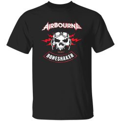
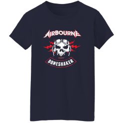
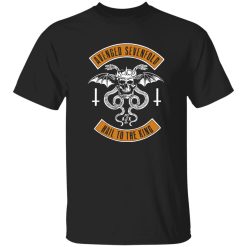
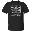
The visual language of hard rock has always leaned toward extremes—louder, sharper, more aggressive than anything surrounding it. When a design like the Airbourne Boneshaker Skull Lightning Vintage Rock Band Artwork Shirt comes into view, it doesn’t ask for subtle interpretation. It declares itself immediately, built on symbols that carry decades of amplified energy.
Within the landscape of rock band merch shirts, this kind of artwork doesn’t exist as decoration. It operates as a signal—something that connects directly to the raw, unfiltered side of rock culture. The skull, the lightning, the motion—they’re not random choices. They’re part of a visual system that has been refined across stages, album covers, and underground scenes.
There’s a reason certain symbols repeat across generations of rock imagery. The skull represents more than rebellion—it captures the idea of permanence in a genre built on intensity. Lightning, on the other hand, is about impact. Instant, unpredictable, impossible to ignore.
When those elements combine in a single composition, the result becomes something more than aesthetic. It turns into a compressed form of energy, almost like the visual equivalent of a guitar riff hitting at full volume.
This is where the Airbourne Boneshaker Skull Lightning Vintage Rock Band Artwork Shirt operates differently from generic designs. It doesn’t soften the edges. It leans into them. The lines feel sharp, the contrast feels deliberate, and the entire structure mirrors the kind of sound that doesn’t sit quietly in the background.
That alignment between sound and visual identity is what keeps designs like this relevant. They aren’t trying to reinterpret rock—they’re continuing it.
Hard rock has always blurred the line between performance and everyday life. What happens on stage doesn’t stay there—it carries into how people move, dress, and present themselves outside of it.
This shirt reflects that transition. It takes the visual aggression of live performance—flashing lights, distorted sound, raw presence—and compresses it into something wearable. Not toned down, just translated.
There’s a moment before a show starts—standing outside, the low hum of anticipation in the air, people shifting, checking tickets, adjusting jackets. In that space, clothing like this becomes part of the environment. It blends in, but it also stands out in the way only shared culture can.
The shirt doesn’t need explanation in that setting. It’s understood instantly.
And that’s the point. It functions as both expression and recognition—something you wear for yourself, but also something others read without words.
Trends in fashion change quickly, but certain visual codes resist that cycle. Skull and lightning imagery has survived because it isn’t tied to a specific era—it adapts while keeping its core meaning intact.
In the 70s and 80s, these symbols were tied to shock value and rebellion. Over time, they evolved into something more refined, but no less powerful. Today, they sit somewhere between nostalgia and active identity—familiar, but still effective.
The Airbourne Boneshaker Skull Lightning Vintage Rock Band Artwork Shirt uses that lineage without overcomplicating it. It doesn’t try to modernize the symbols beyond recognition. Instead, it sharpens them, making them feel immediate again.
This approach matters. Over-designed graphics often lose impact because they dilute the original intent. Here, the clarity of the imagery keeps the message intact.
It’s not about being retro. It’s about being consistent with what the culture has always been.
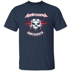
On a hanger, a design can look controlled. On the body, it changes. Movement, light, and distance all affect how the artwork reads.
This shirt benefits from that shift. The contrast in the graphic allows it to stay visible even as the fabric moves, while the composition holds its structure without collapsing into noise.
From a distance, the silhouette of the design stays clear—recognizable shapes, strong lines. Up close, the details start to emerge, giving the piece more depth than it first suggests.
This dual-layer effect is what separates stronger band-inspired designs from flatter ones. It creates engagement at different levels—first glance, then closer inspection.
These aren’t technical specs—they’re visual behaviors. And they directly influence how the shirt performs in real-world environments.
There’s a difference between wearing something because it’s available and wearing something because it aligns. This piece sits firmly in the second category.
It doesn’t rely on branding alone to carry its weight. The design itself communicates enough to stand independently. That’s what gives it longevity—not just in durability, but in relevance.
The Airbourne Boneshaker Skull Lightning Vintage Rock Band Artwork Shirt works because it stays within the boundaries of what rock has always represented, while still feeling current in how it’s executed.
It doesn’t try to reinvent the language. It speaks it fluently.
And for anyone who understands that language, that’s more than enough.
| Product | Airbourne Boneshaker Skull Lightning Vintage Rock Band Artwork Shirt – Culture & Visual Breakdown |
|---|---|
| SKU | cc-1049-9953-108650441-1775610879550 |
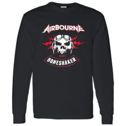
| Fabric Weight | Midweight (5.3 oz) – Heavyweight (6.0 oz Long Sleeve) |
| Material Composition | Solid Colors: 100% Cotton Ash Grey: 99% Cotton / 1% Polyester Sport Grey: 90% Cotton / 10% Polyester Dark Heather: 50% Cotton / 50% Polyester |
| Fit | Classic Unisex Fit (Ladies: Slightly Tapered Missy Fit) |
| Construction | Double-needle stitching Taped neck & shoulders Preshrunk jersey knit Tearaway label |
| Hoodie Material (G185) | 8.0 oz – 50% Cotton / 50% Polyester |
| Available Sizes | S – 5XL (6XL select colors only) |
| Origin | Made with sustainably and fairly grown USA cotton; Printed in USA |
| Print Method | DIGISOFT® Direct-to-Garment (DTG) |
| Brand | Capital T Shirt |
| Fast & Reliable Shipping | All orders are professionally printed and shipped from the USA. |
|---|---|
| Processing Time | Printed on demand within 1–3 business days. |
| Shipping Time | USA: 4–7 business days International: 7–15 business days |
| Shipping Costs | USA Standard: $5.99 International Standard: $9.99 |
| Secure Checkout | Safe & encrypted payment processing. Your information is protected at all times. |
| Returns & Exchanges | We offer a 30-day return policy. View Refunds & Returns Policy |
| Customer Guarantee | We stand behind the quality of every item we print. |
Reviews
There are no reviews yet.