No products in the cart.
Save 20% on orders over $100 with code CT20


Price range: $21.90 through $44.99
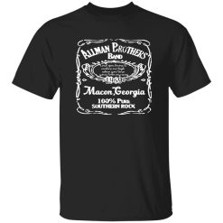
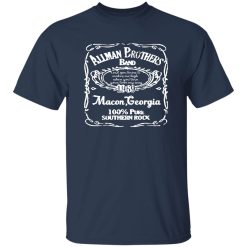
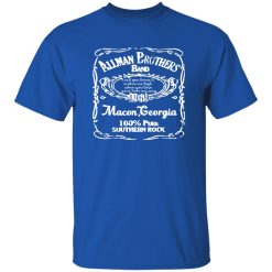
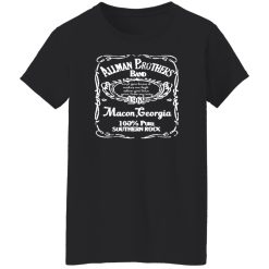
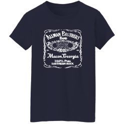
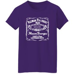
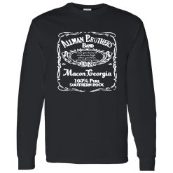
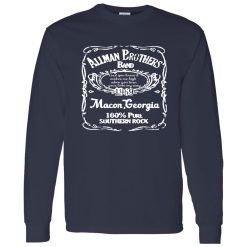
Some shirts work as casual music merch, and some carry the weight of a place, a year, and a sound that changed how rock felt in America. The Allman Brothers Band 1969 Macon Georgia Vintage Southern Rock Typography Shirt lands in the second category. It speaks to listeners who do not just want a famous band name across the chest. They want a visual marker tied to roots, grit, and a specific lineage inside rock history.
That is what makes this design more than a nostalgic graphic. Macon, Georgia is not decorative background material here. It anchors the shirt to the beginning of a movement that blended blues phrasing, improvisational freedom, road-worn soul, and a Southern sense of musical identity into something unmistakable. For anyone browsing Capital T Shirt rock band apparel, this kind of piece stands out because it carries cultural direction instead of generic retro styling.
There is a difference between wearing a band shirt because the logo looks cool and wearing one because the reference means something. A 1969 Macon Georgia design immediately signals that the appeal is not surface-level. It points back to origin, not just popularity. In rock culture, origin stories matter because they separate trend-driven graphics from shirts that feel connected to the formation of a sound.
The Allman Brothers Band emerged at a moment when American rock was opening outward. Psychedelia had already stretched the edges of the genre, British blues-rock had made its impact, and heavier guitar-driven music was taking shape. Yet Southern rock added its own identity to that broader field. It was not only about geography. It was about emotional temperature. The music had looseness without losing precision, toughness without losing feeling, and an improvisational spirit that made live performance central to its reputation.
A shirt that names Macon and 1969 taps into that foundation. It frames the wearer as someone who recognizes the roots of the culture rather than only its most commercial symbols. That matters in a crowded rock band shirts category, where many designs rely on obvious iconography or overused layouts. This one has a more grounded kind of credibility.
It also carries a certain confidence. You do not need oversized visual noise when the reference itself already has weight. The typography-led approach lets the era and location do the work, which is often what makes vintage-inspired music apparel feel stronger. It trusts the history.
Band shirts have always done more than advertise taste. They help people signal allegiance, memory, and belonging. In that sense, this shirt works especially well because the message is layered. It tells other fans that you know the difference between general classic rock appreciation and deeper scene awareness. It suggests you understand why the Southern rock story matters and why a band tied to Macon carries a different resonance than a design built only around a chart-era image.
That identity layer becomes even more important now, when rock fashion is often absorbed into broader vintage streetwear. A lot of people want the silhouette, the faded look, or the borrowed attitude of old band merch. Fewer want the substance behind it. The appeal of this design is that it keeps both. It can live comfortably in modern style, but it still feels connected to music history rather than detached from it.
The typography focus reinforces that identity in a subtle way. Instead of depending on a busy illustration, it leans on naming, placement, and era-coded visual language. That gives the piece a more archival mood, almost like a shirt discovered after years of real wear rather than created to imitate a vintage mood from a distance. The result is cleaner, more deliberate, and often more timeless.
There is also a certain kind of fan this appeals to immediately. Not the person chasing novelty. Not the shopper who wants the loudest graphic in the room. This shirt belongs to someone who values legacy, atmosphere, and musical roots. It has collector energy without becoming costume-like.
Picture the shirt off the product page and into real life. Late afternoon light, a pair of broken-in jeans, old leather on the wrist, and a graphic that does not shout but carries its own gravity. That is where this design works best. The visual effect is less about flash and more about tone.
Because the concept is anchored in vintage Southern rock typography, the shirt naturally brings texture to an outfit even before you start layering around it. The print reads with the kind of worn-in authority people look for in heritage-inspired music apparel. It suggests dust, amps, highway miles, club posters, and records played enough times to soften at the edges. That kind of visual atmosphere is exactly what helps image-driven search performance, because the piece is easy to imagine on body and in context. It has drape that feels relaxed rather than stiff, and the graphic presence sits with the ease of something that belongs in a lived-in wardrobe instead of a one-time statement fit.
It also performs well across different styling directions. Keep it simple with faded denim and boots, and it leans into Southern rock authenticity. Pair it with darker layers and cleaner lines, and it becomes more of a heritage graphic centerpiece inside a modern casual look. The key is that the shirt never loses its anchor. Even as the styling changes, the identity remains intact.
One of the strongest things about a typography-forward vintage band shirt is that it avoids becoming visually exhausting. You can wear it more often because it feels rooted, not gimmicky. That matters for buyers who want a shirt they will actually reach for instead of admire once and leave folded away.
Not every classic rock shirt earns the same level of trust from serious fans. Many designs lean too hard on generic “retro” treatment without any real sense of why the reference should matter. They use distressing as a shortcut. They borrow the mood of old music culture without understanding what gave that culture its staying power in the first place.
This design avoids that trap because it is centered on a credible historical anchor: band, year, and place. That three-part structure gives the shirt real narrative density. You are not looking at a floating slogan or anonymous vintage styling. You are looking at a piece that implies a musical origin story. That immediately gives it more substance inside a transactional search environment where buyers are comparing many visually similar products.
It also benefits from being specific without becoming overcomplicated. The name carries recognition. The year establishes era. Macon grounds the identity geographically and culturally. Together, those elements create the kind of shirt that appeals to both longtime listeners and younger buyers who want classic rock apparel with more meaning behind it.
There is a practical side to that appeal too. When a shirt communicates clearly, the purchase decision becomes easier. You know what it stands for at a glance. You know the world it belongs to. You know whether it fits your taste or the taste of the person you are buying for. That clarity matters.
And then there is the emotional side. Great rock apparel gives people a way to hold onto a feeling they do not want flattened into generic nostalgia. Southern rock, at its best, was never polished in the sterile sense. It had looseness, depth, friction, and soul. A shirt that reflects that world should feel similarly grounded. This one does.
In the end, the Allman Brothers Band 1969 Macon Georgia Vintage Southern Rock Typography Shirt works because it understands that rock identity is built through details that actually mean something. It offers heritage without looking theatrical, nostalgia without feeling hollow, and a vintage music signal that still feels personal when you put it on.
| Product | Allman Brothers Band 1969 Macon Georgia Vintage Southern Rock Typography Shirt |
|---|---|
| SKU | cc-1049-9953-108650452-1775610990048 |
| Fabric Weight | Midweight (5.3 oz) – Heavyweight (6.0 oz Long Sleeve) |
| Material Composition | Solid Colors: 100% Cotton Ash Grey: 99% Cotton / 1% Polyester Sport Grey: 90% Cotton / 10% Polyester Dark Heather: 50% Cotton / 50% Polyester |
| Fit | Classic Unisex Fit (Ladies: Slightly Tapered Missy Fit) |
| Construction | Double-needle stitching Taped neck & shoulders Preshrunk jersey knit Tearaway label |
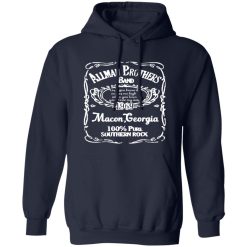
| Hoodie Material (G185) | 8.0 oz – 50% Cotton / 50% Polyester |
| Available Sizes | S – 5XL (6XL select colors only) |
| Origin | Made with sustainably and fairly grown USA cotton; Printed in USA |
| Print Method | DIGISOFT® Direct-to-Garment (DTG) |
| Brand | Capital T Shirt |
| Fast & Reliable Shipping | All orders are professionally printed and shipped from the USA. |
|---|---|
| Processing Time | Printed on demand within 1–3 business days. |
| Shipping Time | USA: 4–7 business days International: 7–15 business days |
| Shipping Costs | USA Standard: $5.99 International Standard: $9.99 |
| Secure Checkout | Safe & encrypted payment processing. Your information is protected at all times. |
| Returns & Exchanges | We offer a 30-day return policy. View Refunds & Returns Policy |
| Customer Guarantee | We stand behind the quality of every item we print. |
Reviews
There are no reviews yet.