No products in the cart.
Save 20% on orders over $100 with code CT20
New Customer Discount 10% OFF. Enter Coupon Code: CP10


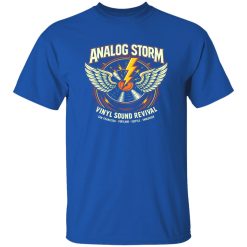
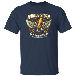
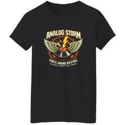
Price range: $21.90 through $44.99
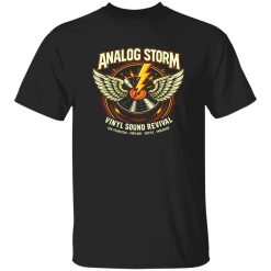
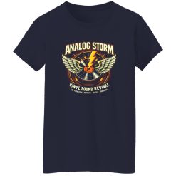
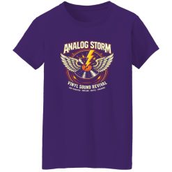
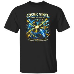
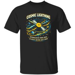
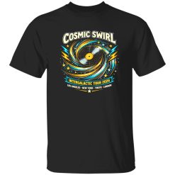
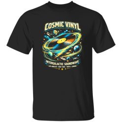
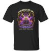
The Analog Storm Vinyl Revival Rock Shirt works because it does more than place a graphic on a tee. It captures a specific feeling tied to crate-digging culture, old amplifiers, dim venue lights, and the kind of rock style that never needed permission to stand out. For shoppers looking at music apparel with stronger identity value, this piece lands early as both a visual statement and a wearable part of daily rotation.
That matters in a category where plenty of products look loud but feel interchangeable. A shirt like this has to communicate something clearer: taste, reference point, and a real connection to rock culture rather than generic vintage imitation. That is where the design earns attention. It reads like something chosen on purpose, not thrown on as filler.
Rock-inspired apparel has always carried more weight than standard casualwear. People wear it to signal what they listen to, what they value, and which side of polished fashion they do not care to join. The Analog Storm Vinyl Revival Rock Shirt sits inside that tradition, but it does it with enough restraint to stay wearable beyond a single look or single occasion.
Its identity comes from the tension between nostalgia and presence. The “vinyl revival” angle gives the shirt a sense of analog credibility, pulling from the tactile side of music culture rather than the disposable speed of trend-driven graphics. That creates a more grounded impression. It feels closer to records stacked beside a turntable, gig flyers taped to old walls, and the visual roughness that made classic rock merchandise memorable in the first place.
For buyers browsing Capital T Shirt rock band clothing, that distinction helps separate an intentional piece from a generic music tee. This shirt is not just about being “rock-inspired.” It suggests a more specific loyalty to texture, sound memory, and scene attitude.
There is also a difference between rebellion that looks forced and rebellion that looks lived in. This shirt leans toward the second. It does not need exaggerated styling language to create that effect. The visual direction already points toward subculture recognition, which gives it an edge that feels more authentic than overworked.
In an Image Pack-driven search environment, visual description matters because shoppers often decide with their eyes before they ever compare details. The Analog Storm Vinyl Revival Rock Shirt has the kind of graphic presence that translates well on product pages, social posts, and layered outfit shots. The best rock tees do not just show a print. They create atmosphere.
This one suggests worn speakers, analog distortion, and revival-era poster energy rather than glossy modern polish. That aesthetic choice gives the shirt texture at a glance. Even before someone thinks about styling, the design can read as heavier in mood, more rooted in music history, and more expressive than ordinary band-adjacent apparel.
The shirt also benefits from visual balance. A strong rock graphic can fail when it overwhelms the body of the garment or feels too crowded. Here, the appeal comes from contrast: enough design intensity to make the piece recognizable, enough openness to keep it wearable. That balance makes a difference in real use. The shirt can work at a show, in a casual weekend outfit, or under a jacket without looking like costume dressing.
There is a specific kind of confidence that comes from wearing something visually assertive but not chaotic. This shirt lives in that zone. It gives off the energy of someone who still cares about album art, still notices the difference between digital convenience and physical format, and still sees rock style as an extension of taste rather than nostalgia theater.
Picture the shirt under soft daylight with the graphic carrying a slightly broken-in attitude rather than a flat, lifeless finish. The silhouette reads clean, while the print adds edge without making the whole piece feel stiff. That combination works well in product photography because it gives the eye two things at once: immediate visual character and easy wardrobe readability.
The best identity-driven shirts are not difficult to wear. They hold their own without forcing the rest of the outfit into a performance. That is one of the practical advantages here. The Analog Storm Vinyl Revival Rock Shirt can be the focal point of a look, but it does not trap the wearer into one formula.
With black denim, it reads sharper and more direct. With faded jeans, it leans into the revival aspect and feels more lived-in. Under an overshirt or leather jacket, the graphic becomes part of a layered rock silhouette instead of the whole story. That flexibility matters for commercial intent because buyers are not only asking whether a shirt looks good on a product page. They are asking whether it will actually enter regular rotation.
Late at night after a small venue set, when the crowd has thinned and the sound is still ringing a little, this is the kind of shirt that makes sense with almost no effort. That subtle real-world usability supports the identity angle instead of weakening it. It feels natural in motion, not staged for one perfect photo.
Fit discussion also matters more for commercial shoppers, even when exact measurements are not the focus. A shirt like this works best when it sits clean through the body and lets the print stay visible without pulling awkwardly. The appeal is stronger when the shape feels easy and intentional rather than overly slim or unnecessarily oversized. Since the graphic already carries personality, the overall look usually benefits from keeping the fit balanced.
This is also where the product gains value beyond novelty. Some graphic tees deliver one good wear and then become hard to style. This one has more staying power because the concept is rooted in a lasting visual language. Rock iconography, analog references, and revival aesthetics are easier to revisit over time than fleeting trend prints.
Not every shopper in this category wants the loudest design available. Many want something that still feels expressive but more selective. The Analog Storm Vinyl Revival Rock Shirt answers that by presenting rock identity through atmosphere and reference, not just noise. That makes it appealing to buyers who want authenticity without looking like they grabbed the first graphic tee in the stack.
It also fits a broader premium-casual expectation. Mid-tier to premium music apparel has to justify itself through sharper point of view, better visual restraint, and stronger emotional positioning. This shirt does that by giving the wearer a recognizable identity signal without crossing into parody. It feels connected to music culture in a way that is easy to understand but not overly literal.
For commercial shoppers, that combination supports purchase confidence. The shirt gives a clear visual proposition, slots naturally into everyday styling, and reflects a version of rock culture with enough specificity to feel credible. It is expressive, but it does not overplay the statement.
In the end, the Analog Storm Vinyl Revival Rock Shirt is strongest when viewed as an identity piece with real wardrobe value. It speaks to listeners who still care about the analog side of music, the graphic language of classic rock, and the quiet satisfaction of wearing something that reflects taste without spelling everything out. That is what gives it staying power in a crowded rock apparel space.
| Product | Analog Storm Vinyl Revival Rock Shirt |
|---|---|
| SKU | cc-1049-9953-108609226-1774173721494 |
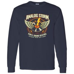
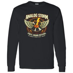
| Fabric Weight | Midweight (5.3 oz) – Heavyweight (6.0 oz Long Sleeve) |
| Material Composition | Solid Colors: 100% Cotton Ash Grey: 99% Cotton / 1% Polyester Sport Grey: 90% Cotton / 10% Polyester Dark Heather: 50% Cotton / 50% Polyester |
| Fit | Classic Unisex Fit (Ladies: Slightly Tapered Missy Fit) |
| Construction | Double-needle stitching Taped neck & shoulders Preshrunk jersey knit Tearaway label |
| Hoodie Material (G185) | 8.0 oz – 50% Cotton / 50% Polyester |
| Available Sizes | S – 5XL (6XL select colors only) |
| Origin | Made with sustainably and fairly grown USA cotton; Printed in USA |
| Print Method | DIGISOFT® Direct-to-Garment (DTG) |
| Brand | Capital T Shirt |
| Fast & Reliable Shipping | All orders are professionally printed and shipped from the USA. |
|---|---|
| Processing Time | Printed on demand within 1–3 business days. |
| Shipping Time | USA: 4–7 business days International: 7–15 business days |
| Shipping Costs | USA Standard: $5.99 International Standard: $9.99 |
| Secure Checkout | Safe & encrypted payment processing. Your information is protected at all times. |
| Returns & Exchanges | We offer a 30-day return policy. View Refunds & Returns Policy |
| Customer Guarantee | We stand behind the quality of every item we print. |

Reviews
There are no reviews yet.