No products in the cart.
Save 20% on orders over $100 with code CT20
New Customer Discount 10% OFF. Enter Coupon Code: CP10


Price range: $21.90 through $44.99
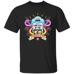
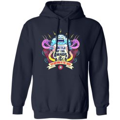
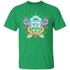
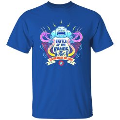
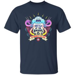
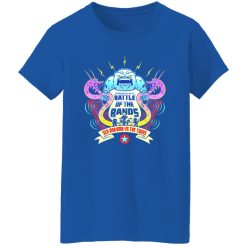
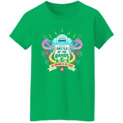
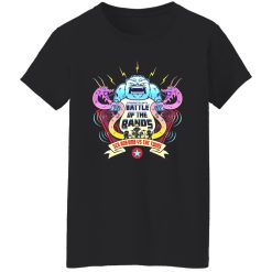
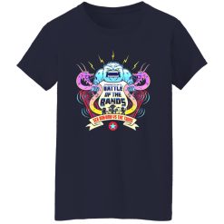
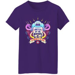
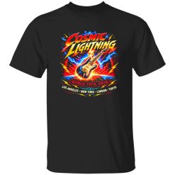
The Battle Of The Bands Sex Bob-omb Vs The Twins Shirt immediately stands out through its visual execution. This isn’t just a graphic layered onto fabric—it’s a print designed to hold sharp contrast, resist breakdown, and maintain clarity even after repeated wear. The intensity of the design demands more than surface-level application, and that’s exactly where this piece performs.
From the first wear, the graphic feels embedded rather than applied. Edges stay crisp, tonal separation remains clean, and the overall composition avoids the washed-out look that often happens with lower-grade prints. If you’re browsing through browse music graphic culture tees, this design sits firmly in the category where print execution defines the product experience.
The core strength of this shirt lies in how the print behaves over time. Instead of fading into dullness or cracking unpredictably, the ink application maintains structure. This is especially important for a design like “Battle Of The Bands,” where contrast between elements creates the entire visual narrative.
After multiple washes, the graphic continues to read clearly from a distance. Lines don’t blur together, and darker tones retain their depth without turning flat. The ink bonds effectively with the fabric surface, creating a stable visual layer that moves naturally with the shirt rather than sitting stiffly on top.
This isn’t a minimal logo or simple text piece. The design relies on layered imagery and bold contrast, which means any degradation becomes immediately noticeable. Strong ink integrity ensures that:
Daily wear introduces stress that quickly reveals whether a shirt is built to last. Movement, washing, and general friction all test how well the print integrates with the garment. In this case, the graphic doesn’t separate from the fabric—it flexes with it.
The surface doesn’t develop the brittle feel that often leads to cracking. Instead, it retains a smooth finish that feels consistent even after extended use. This matters not just for longevity, but for maintaining the original look without unpredictable wear patterns.
There’s also a noticeable stability in how the print reacts to washing. Rather than fading unevenly, it ages in a controlled way—subtle softening instead of sharp degradation. That controlled fade gives the shirt a more natural worn-in character without compromising the design.
What sets this shirt apart is how the base fabric supports the print rather than competing with it. The surface provides enough structure to hold the ink cleanly, but still allows for natural movement. This balance prevents distortion in the graphic when the shirt shifts during wear.
The result is a print that stays aligned with the garment’s shape. It doesn’t warp across the chest or lose proportion after repeated use. Even as the shirt relaxes slightly over time, the graphic maintains its intended positioning and clarity.
This interaction also contributes to comfort. Because the print integrates well with the fabric, it avoids the heavy, rubbery feel that can make some graphic tees uncomfortable during long wear. Instead, the shirt maintains a consistent texture across the surface.
Consistency over time is where performance becomes most noticeable. Many shirts look good initially but degrade quickly under normal conditions. Here, the focus is on preserving the original visual identity of the design.
The Battle Of The Bands graphic continues to deliver the same level of impact after multiple cycles of wear and washing. The design doesn’t lose its edge, and the contrast remains strong enough to stand out without needing perfect lighting or pristine conditions.
This reliability makes the shirt a dependable option for regular rotation. It doesn’t require careful handling or special treatment to maintain its look, which adds to its practicality.
Instead of sudden deterioration, the shirt develops a controlled, gradual wear pattern:
This piece isn’t built as a delicate, occasional-wear item. It’s designed to handle repetition without sacrificing visual quality. Whether worn casually or layered into different looks, the performance remains consistent.
There’s a clear balance between durability and comfort. The print holds up under pressure, but the shirt itself doesn’t feel rigid or restrictive. That balance makes it easier to integrate into daily wear without hesitation.
In a category where many designs rely purely on initial impact, this shirt extends that impact across time. The print remains the focal point—not just when it’s new, but after it’s been worn, washed, and lived in.
That’s ultimately where its value sits: not just in how it looks on day one, but in how reliably it maintains that look over time.
| Product | Battle Of The Bands Sex Bob-omb Vs The Twins Shirt |
|---|---|
| SKU | cc-1049-9961-104999443-1716721619326 |
| Fabric Weight | Midweight (5.3 oz) – Heavyweight (6.0 oz Long Sleeve) |
| Material Composition | Solid Colors: 100% Cotton Ash Grey: 99% Cotton / 1% Polyester Sport Grey: 90% Cotton / 10% Polyester Dark Heather: 50% Cotton / 50% Polyester |
| Fit | Classic Unisex Fit (Ladies: Slightly Tapered Missy Fit) |
| Construction | Double-needle stitching Taped neck & shoulders Preshrunk jersey knit Tearaway label |
| Hoodie Material (G185) | 8.0 oz – 50% Cotton / 50% Polyester |
| Available Sizes | S – 5XL (6XL select colors only) |
| Origin | Made with sustainably and fairly grown USA cotton; Printed in USA |
| Print Method | DIGISOFT® Direct-to-Garment (DTG) |
| Brand | Capital T Shirt |
| Fast & Reliable Shipping | All orders are professionally printed and shipped from the USA. |
|---|---|
| Processing Time | Printed on demand within 1–3 business days. |
| Shipping Time | USA: 4–7 business days International: 7–15 business days |
| Shipping Costs | USA Standard: $5.99 International Standard: $9.99 |
| Secure Checkout | Safe & encrypted payment processing. Your information is protected at all times. |
| Returns & Exchanges | We offer a 30-day return policy. View Refunds & Returns Policy |
| Customer Guarantee | We stand behind the quality of every item we print. |
Reviews
There are no reviews yet.