No products in the cart.
Save 20% on orders over $100 with code CT20


Price range: $21.90 through $44.99
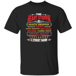
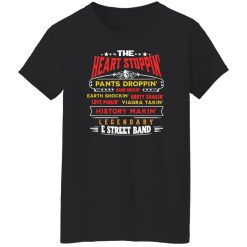
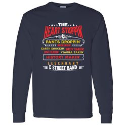
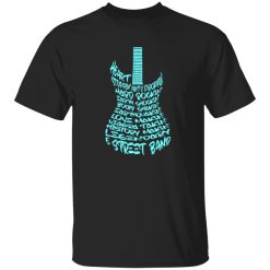
There’s a certain kind of energy that only classic American rock can carry—raw, unfiltered, and built on stories that feel bigger than the stage itself. The E Street Band Heart Stoppin Legendary Rock Typography Shirt draws directly from that lineage, where music wasn’t just performed, it was lived. Before the first chord hits, before the crowd moves, the visual identity already tells you what kind of world you’re stepping into.
Within the broader landscape of rock band shirts, designs like this don’t rely on complexity. They rely on recognition—on typography that feels like it belongs to a specific era, a specific sound, and a specific kind of cultural weight.
Typography in rock culture has never been neutral. It signals tone before sound, attitude before performance. The “Heart Stoppin Legendary Rock” phrasing leans into that tradition—bold, slightly exaggerated, and built to feel immediate rather than polished.
This kind of design doesn’t aim for minimalism. It leans into presence. The weight of the lettering, the spacing, even the implied motion of the words—all of it mirrors the way classic rock builds momentum through repetition and intensity.
There’s a visual rhythm here. The typography doesn’t sit still—it pushes forward, much like the music it references. That’s what gives it staying power. It doesn’t feel decorative. It feels intentional.
What begins on stage doesn’t stay there. Over time, the aesthetics of rock performance bleed into everyday style, and typography-heavy graphics become one of the most direct ways that translation happens.
The E Street Band aesthetic carries a particular kind of American rock identity—one that blends working-class storytelling with arena-scale energy. That duality shows up in the design. It’s grounded, but it’s also expansive.
Wearing a piece like this isn’t about referencing a single moment. It’s about tapping into a broader cultural thread—late-night drives, packed venues, and the kind of songs that stretch longer than expected because no one wants them to end.
That’s why the graphic works outside of performance spaces. It carries enough narrative weight to stand on its own.
Classic rock often risks becoming purely nostalgic, but strong designs avoid that trap by staying visually active. This shirt doesn’t try to replicate the past exactly—it interprets it.
The typography hints at older tour posters and vintage merch, but it doesn’t feel aged in a way that limits it. Instead, it keeps a certain sharpness, making it adaptable across different styling contexts.
This balance is what allows the piece to move between generations. It resonates with those who recognize the roots, while still feeling relevant to those who approach it through modern styling.
That’s the difference between nostalgia and continuity. One looks back. The other keeps moving forward.
Unlike heavily illustrated graphics, typography-driven designs rely on clarity. There’s nothing to decode here—just a direct statement that carries cultural weight because of what it references.
That simplicity is deceptive. It requires precision to feel authentic. Too clean, and it loses character. Too distressed, and it feels forced. The balance here sits in the middle, where the graphic feels lived-in without losing its structure.
This is where visual iconography becomes effective. It doesn’t need supporting imagery because the words themselves carry enough association. They become the symbol.
And in rock culture, symbols don’t need explanation—they need recognition.
Some designs follow trends. Others hold their ground regardless of what’s happening around them. The E Street Band Heart Stoppin Legendary Rock Typography Shirt falls into the latter category.
Its strength comes from alignment. The message, the typography, and the cultural reference all point in the same direction. There’s no disconnect between what it says and how it looks.
That clarity is what gives it longevity. It doesn’t need reinvention because it was built on something already established—a sound, a movement, a way of expressing identity through music.
When you step into it, you’re not just wearing a graphic. You’re stepping into a piece of that ongoing story. And that’s what keeps it relevant, long after trends shift and fade.
| Product | E Street Band Heart Stoppin Legendary Rock Typography Shirt – A Symbol of Rock Legacy |
|---|---|
| SKU | cc-1049-9953-108647049-1775486706220 |
| Fabric Weight | Midweight (5.3 oz) – Heavyweight (6.0 oz Long Sleeve) |
| Material Composition | Solid Colors: 100% Cotton Ash Grey: 99% Cotton / 1% Polyester Sport Grey: 90% Cotton / 10% Polyester Dark Heather: 50% Cotton / 50% Polyester |
| Fit | Classic Unisex Fit (Ladies: Slightly Tapered Missy Fit) |
| Construction | Double-needle stitching Taped neck & shoulders Preshrunk jersey knit Tearaway label |
| Hoodie Material (G185) | 8.0 oz – 50% Cotton / 50% Polyester |
| Available Sizes | S – 5XL (6XL select colors only) |
| Origin | Made with sustainably and fairly grown USA cotton; Printed in USA |
| Print Method | DIGISOFT® Direct-to-Garment (DTG) |
| Brand | Capital T Shirt |
| Fast & Reliable Shipping | All orders are professionally printed and shipped from the USA. |
|---|---|
| Processing Time | Printed on demand within 1–3 business days. |
| Shipping Time | USA: 4–7 business days International: 7–15 business days |
| Shipping Costs | USA Standard: $5.99 International Standard: $9.99 |
| Secure Checkout | Safe & encrypted payment processing. Your information is protected at all times. |
| Returns & Exchanges | We offer a 30-day return policy. View Refunds & Returns Policy |
| Customer Guarantee | We stand behind the quality of every item we print. |


Reviews
There are no reviews yet.