No products in the cart.
Save 20% on orders over $100 with code CT20


Price range: $21.90 through $44.99
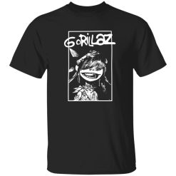
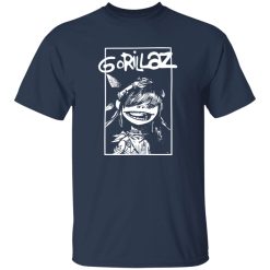
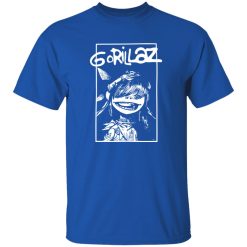
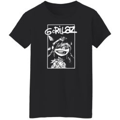
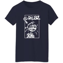
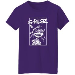
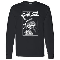
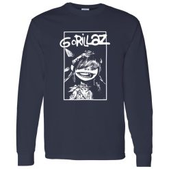
Some graphic shirts stay in the background. This one does the opposite. The Gorillaz Cartoon Character Vintage Alternative Rock Band Artwork Shirt is built for people who want a look with immediate character, the kind of piece that shifts a simple outfit away from generic casual wear and closer to alternative music style with a sharper visual point of view.
On a slow afternoon flipping through vinyl crates, this is the kind of shirt that makes sense before you even think about the rest of the outfit. The artwork carries that animated, offbeat energy that alternative rock fans tend to recognize right away, but the real styling value comes from how naturally it fits into modern streetwear. For shoppers browsing discover classic rock band shirts, pieces like this stand out because they do more than show a band reference. They create a whole silhouette around the print.
That matters in a competitive space like rock band shirts. A design with cartoon character artwork, vintage influence, and alternative rock attitude gives you more room to build a full look without overcomplicating it. Instead of relying on loud accessories or forced layers, the print becomes the centerpiece. The outfit starts there and everything else can either sharpen it or pull back to let it breathe.
Some band graphics are best treated like supporting pieces. This one is not. The visual identity is strong enough to anchor the entire outfit, especially if you lean into its animated edge and slightly distressed vintage attitude. That combination gives the shirt range: it feels expressive without becoming costume-like, and nostalgic without looking stuck in one era.
The strength of this design is the contrast it creates. Cartoon imagery usually brings movement, color memory, and personality. Vintage treatment adds texture and wearability. Alternative rock styling brings edge. When those three elements come together, the result feels more layered than a standard logo tee. You are not just wearing a band shirt. You are wearing a print with built-in visual rhythm, which makes it easier to balance proportions, control contrast, and create an outfit that looks intentional.
That is why this shirt works especially well with restrained styling around it. Let the artwork carry the energy. Keep the rest of the outfit clean, slightly worn-in, or shape-driven. A straight-leg pair of black jeans, relaxed dark trousers, washed denim, or cargos with a muted finish all create enough structure without competing for attention. Footwear can then push the look in different directions: classic skate shoes make it feel younger, worn leather boots make it feel rougher, and clean low-profile sneakers make it feel more city-ready.
The print also supports a more expressive version of alternative fashion because it already gives the outfit an attitude base. That means you can add rings, a chain, layered bracelets, or a vintage cap without making the look feel overloaded. The shirt does the hardest part first: it gives the outfit a point of view.
The best way to style this shirt is to think in terms of silhouette balance rather than matching pieces by theme. Too many people over-style band merch by forcing every item to look equally loud. That usually weakens the effect. A better move is to let one dominant item speak clearly and use the rest of the outfit to control shape, drape, and contrast.
For a daytime look, start with the shirt as the main graphic layer and pair it with relaxed dark denim or faded olive pants. If the fit has a slightly loose drape, that helps the artwork feel more natural and less rigid. Throw on an open overshirt, a washed work jacket, or a lightweight zip hoodie when you want another layer, but keep the outer piece visually quiet. The shirt should still be visible enough to define the outfit. This is where styling intelligence matters in rock band shirts: the goal is not to hide the design under layers, but to frame it.
For a sharper streetwear angle, wear the shirt with wider pants and cleaner footwear. That creates a strong proportion shift that feels current without stripping away the band identity. The contrast between a vintage-looking graphic and a more modern silhouette gives the whole outfit more presence. It reads as deliberate, not accidental. The shirt feels collected rather than thrown on.
At night, the same design can move into a darker, tighter visual language. A black jacket, darker denim, and more minimal accessories make the artwork pop harder. This works especially well for alternative rock styling because it keeps the outfit from becoming too soft or too retro. You still get the nostalgia of the graphic, but the overall look feels contemporary and wearable for concerts, bars, late-night hangs, or city casual settings.
One of the strongest choices here is not over-coordinating color. Let the tones in the print lead naturally, but do not force exact matches. If the artwork carries muted vintage shades, echo them quietly through washed black, charcoal, faded blue, off-white, or dull olive. If you try to build the whole outfit around loud coordinated accents, you risk flattening the shirt into a themed costume. Alternative style usually looks better when it feels discovered rather than assembled from a checklist.
This is also where the vintage element earns its value. A shirt with a worn-in graphic attitude does not need pristine styling around it. Slightly broken-in denim, textured outerwear, or footwear with real character all help the look feel grounded. The outfit becomes more believable. That is important because band styling looks best when it feels lived in, not showroom perfect.
It works best in wardrobes that already lean toward music-driven casual wear, streetwear basics, and expressive everyday outfits.
You do not need to build an entire alternative closet around one shirt like this. In fact, it becomes more useful when it drops into a rotation that already includes neutral bottoms, versatile outer layers, and footwear with a little personality. That is what gives it repeat value. A strong graphic piece can easily become a once-in-a-while wear if it only works in one kind of outfit. This one avoids that problem because its character is clear, but its styling options are broader than they first appear.
Think about the roles it can play. It can be the focal point in a stripped-back outfit. It can sit under an open jacket and act like a visual layer. It can soften a harder outfit with a bit of animated unpredictability, or toughen a more casual fit by giving it subculture weight. That flexibility matters for anyone shopping transactional music apparel with real styling intent, not just collector interest.
There is also a difference between a shirt that simply references a band and one that actually helps shape how the wearer presents themselves. This design belongs in the second category. It carries enough attitude to change the tone of the outfit the moment it is on. That makes it valuable for people who want their rock band shirts to feel connected to their personal style instead of just functioning as fandom merchandise.
Waiting outside a venue before doors open, with headphones around your neck and the evening starting to cool off, this is exactly the kind of piece that feels right in motion. It does not need explaining. It already looks like it belongs in the scene.
That is the difference a strong alternative rock graphic can make. It creates continuity between everyday wear and music culture without forcing either one too hard. The shirt feels expressive enough for a fan, but styled enough for someone who cares about proportion, texture, and visual identity in a more deliberate way.
There are plenty of band shirts that rely only on recognition. This one has more going for it because the artwork carries a distinct visual story. The cartoon character direction gives it movement, the vintage finish gives it depth, and the alternative rock framing gives it edge. That combination is exactly why it earns attention in a crowded category.
From a buying perspective, the appeal is clear. You are getting a graphic shirt that looks expressive on its own, layers well into casual outfits, and avoids the flat feel of more generic music merch. From a styling perspective, it becomes even stronger because it can move between laid-back daytime wear, sharper urban fits, and darker night looks without losing its identity.
That kind of adaptability is not about being universally basic. It is about being visually useful. The best graphic shirts are the ones that keep their point of view while still working across multiple outfit structures. This one does that well. It is bold enough to be memorable, but grounded enough to keep wearing.
For shoppers looking through rock band shirts with a strong commercial eye, that balance matters. You want a design that hits instantly, but also keeps earning its place after the first wear. This shirt does not rely on hype alone. It works because the styling logic is built into the artwork, and that makes it easier to own with confidence.
In the end, the strongest reason to choose it is simple: it brings visual identity to an outfit fast. Not forced. Not overly polished. Just clear, expressive alternative rock energy with enough vintage character to make the whole look feel more complete.
| Product | Gorillaz Cartoon Character Vintage Alternative Rock Band Artwork Shirt |
|---|---|
| SKU | cc-1049-9953-108654555-1775708613972 |
| Fabric Weight | Midweight (5.3 oz) – Heavyweight (6.0 oz Long Sleeve) |
| Material Composition | Solid Colors: 100% Cotton Ash Grey: 99% Cotton / 1% Polyester Sport Grey: 90% Cotton / 10% Polyester Dark Heather: 50% Cotton / 50% Polyester |
| Fit | Classic Unisex Fit (Ladies: Slightly Tapered Missy Fit) |
| Construction | Double-needle stitching Taped neck & shoulders Preshrunk jersey knit Tearaway label |
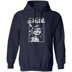
| Hoodie Material (G185) | 8.0 oz – 50% Cotton / 50% Polyester |
| Available Sizes | S – 5XL (6XL select colors only) |
| Origin | Made with sustainably and fairly grown USA cotton; Printed in USA |
| Print Method | DIGISOFT® Direct-to-Garment (DTG) |
| Brand | Capital T Shirt |
| Fast & Reliable Shipping | All orders are professionally printed and shipped from the USA. |
|---|---|
| Processing Time | Printed on demand within 1–3 business days. |
| Shipping Time | USA: 4–7 business days International: 7–15 business days |
| Shipping Costs | USA Standard: $5.99 International Standard: $9.99 |
| Secure Checkout | Safe & encrypted payment processing. Your information is protected at all times. |
| Returns & Exchanges | We offer a 30-day return policy. View Refunds & Returns Policy |
| Customer Guarantee | We stand behind the quality of every item we print. |
Reviews
There are no reviews yet.