No products in the cart.
Save 20% on orders over $100 with code CT20


Price range: $21.90 through $44.99
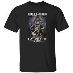
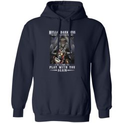
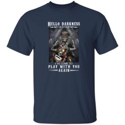
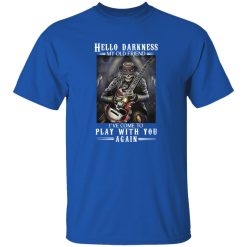
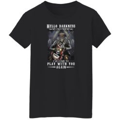
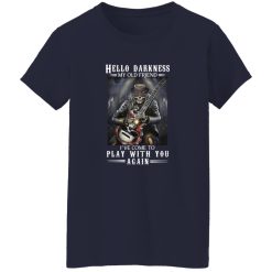
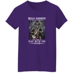
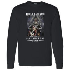
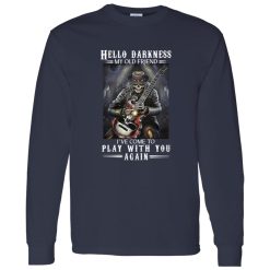
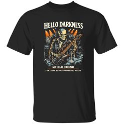
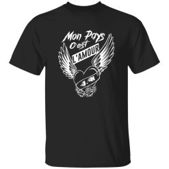
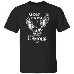
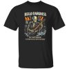
A graphic like this does not work unless the print carries real presence the second you see it. The Hello Darkness My Old Friend Ive Come To Play With You Again Rock N Roll Occult Gothic Skeleton Pla Shirt stands out because the artwork is built around contrast, atmosphere, and dark visual control rather than noise. In a category crowded with generic band-inspired graphics, this kind of occult gothic direction gives the shirt a sharper identity and a more memorable finish on body.
That matters even more in music apparel, where the best pieces are not only about what the phrase says but how the print behaves from a distance, under indoor light, and across repeated wear. If you already gravitate toward dark graphics, cemetery imagery, skeleton artwork, and heavier visual moods, this design lands in the sweet spot between novelty and actual wardrobe use. It reads like something pulled from the edges of underground poster culture instead of a rushed catalog graphic.
The strongest point of this shirt is not simply the phrase. It is the way the phrase works with the skeleton imagery and occult rock framing to create one unified visual hit. A lot of graphic tees lean too hard on text, which makes them feel flat once they are worn outside a product page. Here, the print concept has more dimensional character. The words create tension, but the skeleton art gives the design its staying power.
That print presence changes how the shirt performs in real life. When a graphic has a clear center of gravity, it holds attention without looking overcrowded. The eye knows where to land first. The silhouette of the artwork stays readable. The darker theme feels intentional instead of messy. That is especially important for anyone shopping rock band shirts with a stronger visual identity, because weak layouts tend to lose impact fast once they are off-screen and in actual outfits.
There is also a difference between a design that feels loud and one that feels controlled. This one leans controlled. The occult gothic skeleton language gives it edge, but the artwork still feels wearable. It can live inside the wider world of rock band merch apparel without blending into the same overused skull-and-type treatment that shows up everywhere else.
Good music apparel has to survive more than a first impression. It has to keep its attitude once it becomes part of normal rotation. That is where a design like this earns its place. The visual weight is strong enough for the shirt to act as the focal point of an outfit, but not so chaotic that it becomes difficult to style. The print carries enough darkness to feel distinctive with black denim, washed jeans, or layered outerwear, while the central skeleton concept keeps it anchored and readable.
Think about the difference between a shirt that only works in a product mockup and one that still looks right under street lighting, in a venue line, or during a late-night diner stop after a show. This graphic is built for the second category. The design language translates well into real use because it depends on shape, contrast, and mood rather than tiny details that disappear when viewed at normal distance. The print reads clearly across the chest, which helps the shirt retain character even when worn casually with simple pieces.
That clarity also makes a difference over time. When a shirt is built around an obvious visual concept, it tends to age better in a style sense because it does not rely on trend tricks. Occult imagery, skeleton iconography, and dark rock phrasing already belong to a long-running visual tradition in music culture. They do not need to chase a seasonal look. Instead, they keep the shirt feeling relevant in the same way vintage-inspired tour graphics or darker heavy-rock artwork keep returning to the surface. The result is a piece that feels expressive on day one and still feels coherent after repeated wear.
From a product-performance standpoint, that is the key distinction. This is not only about comfort or basic construction behavior. It is about whether the shirt keeps delivering visual value each time you pull it on. Strong print presence gives it that repeat-wear advantage.
Visual durability is different from literal durability, but it matters just as much. A lot of shirts become forgettable because the graphic has no real emotional pull after the first wear. This one avoids that problem by leaning into a theme with built-in atmosphere.
That combination helps the shirt hold attention longer in your rotation. It feels less disposable because the artwork has an actual point of view. For shoppers comparing multiple rock band shirts, that matters. Pieces with stronger visual intent tend to feel more satisfying after purchase because they deliver more than a one-note joke or a flat logo treatment. They create mood. They say something about taste. They bring a little theater to an otherwise simple outfit.
This design makes the most sense for people who want dark music apparel with a graphic center, not just another black tee with random text. If your taste leans toward occult imagery, gothic poster aesthetics, skeleton art, or underground-adjacent rock visuals, the shirt has a natural fit. It is also a strong option for anyone who wants a graphic that feels expressive without needing aggressive styling to make sense.
In practical terms, it works best for buyers who judge a shirt by how convincingly the print carries the whole piece. That is where this design earns confidence. The artwork has enough attitude to stand on its own, enough readability to stay effective in daily wear, and enough scene credibility to feel at home in the broader rock shirt space. Instead of acting like filler merchandise, it behaves like a graphic tee chosen for its visual pull.
If the goal is to find a gothic skeleton rock shirt that delivers strong print identity, dark tonal consistency, and repeat-wear appeal, this one has a clear reason to be in consideration. It looks bold, but it is the control behind the boldness that makes it work.
| Product | Hello Darkness My Old Friend Gothic Skeleton Rock Shirt |
|---|---|
| SKU | cc-1049-9953-108623072-1774665711964 |
| Fabric Weight | Midweight (5.3 oz) – Heavyweight (6.0 oz Long Sleeve) |
| Material Composition | Solid Colors: 100% Cotton Ash Grey: 99% Cotton / 1% Polyester Sport Grey: 90% Cotton / 10% Polyester Dark Heather: 50% Cotton / 50% Polyester |
| Fit | Classic Unisex Fit (Ladies: Slightly Tapered Missy Fit) |
| Construction | Double-needle stitching Taped neck & shoulders Preshrunk jersey knit Tearaway label |
| Hoodie Material (G185) | 8.0 oz – 50% Cotton / 50% Polyester |
| Available Sizes | S – 5XL (6XL select colors only) |
| Origin | Made with sustainably and fairly grown USA cotton; Printed in USA |
| Print Method | DIGISOFT® Direct-to-Garment (DTG) |
| Brand | Capital T Shirt |
| Fast & Reliable Shipping | All orders are professionally printed and shipped from the USA. |
|---|---|
| Processing Time | Printed on demand within 1–3 business days. |
| Shipping Time | USA: 4–7 business days International: 7–15 business days |
| Shipping Costs | USA Standard: $5.99 International Standard: $9.99 |
| Secure Checkout | Safe & encrypted payment processing. Your information is protected at all times. |
| Returns & Exchanges | We offer a 30-day return policy. View Refunds & Returns Policy |
| Customer Guarantee | We stand behind the quality of every item we print. |


Reviews
There are no reviews yet.