No products in the cart.
Save 20% on orders over $100 with code CT20
New Customer Discount 10% OFF. Enter Coupon Code: CP10


Price range: $22.99 through $44.99
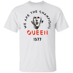
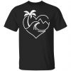
Some songs don’t fade with time. They get louder. “We Are The Champions” defined 1977 for Queen, and this Queen We Are The Champions 1977 shirt turns that era into a clean, high-impact visual you can wear without overstatement.
This isn’t nostalgia printed on fabric. It’s a controlled graphic execution built to hold visual authority whether you choose the T shirt, hoodie, or long sleeve version.
The first thing that matters with any 1977 tribute piece is how the print reads at distance. If the composition collapses visually, the era loses weight. Here, the layout is structured for clarity: strong typographic hierarchy, balanced spacing, and a centered graphic that anchors the chest without overwhelming it.
The “We Are The Champions” reference isn’t cluttered with unnecessary overlays. The design allows negative space to work intelligently, which gives the print breathing room and makes the artwork feel intentional rather than crowded.
Up close, the detailing carries subtle depth. Lines stay defined. Edges remain sharp. The ink integration looks smooth instead of artificially distressed. That’s important for a 1977 reference—vintage influence without forced aging.
This is what separates a serious queen band shirt from generic mass-market prints. It respects the era visually while still fitting modern styling expectations.
A strong graphic only performs if the garment structure supports it. The silhouette across all three options—T shirt, long sleeve, and hoodie—keeps the print stable across movement and repeated wear.
The collar holds its shape instead of stretching into a loose frame. The shoulder line stays clean, which prevents the design from warping. The chest panel remains flat enough to keep the artwork centered even after multiple washes.
That structural consistency does two things:
You’re not buying a single-event shirt. You’re adding something that survives weekly rotation.
In 1977, Queen cemented their dominance on a global scale. “We Are The Champions” became more than a track—it became a victory anthem used in arenas, broadcasts, and championship ceremonies worldwide.
Wearing this shirt signals recognition of that cultural footprint without needing explanation. It’s subtle authority. Anyone familiar with rock history immediately understands the reference.
Inside the broader vintage band tees category, this piece holds weight because it blends era credibility with modern graphic sharpness. It doesn’t look like leftover tour stock. It looks curated.
The T shirt version is streamlined and direct. It keeps the focus on the graphic and works easily with denim, cargos, or tailored streetwear pieces. Clean lines. Clear statement.
The long sleeve option extends the presence slightly, giving you more layering flexibility. It’s especially strong in transitional weather when you want the chest graphic visible but prefer additional coverage.
The hoodie version shifts the energy toward a heavier, relaxed profile. The graphic maintains clarity across the chest while the added structure creates a more dominant silhouette. It pairs well with minimal outerwear or can stand alone as the focal piece.
Each format carries the same identity. Your decision depends on climate, layering habits, and how you prefer the piece to anchor your outfit.
The strength of this design is that it doesn’t demand excessive styling effort. The graphic is bold enough to lead the look, which means the rest of your outfit can stay controlled.
Dark denim sharpens contrast. Neutral cargos keep things understated. Layering under a black or charcoal jacket adds depth without fighting the artwork. Because the composition isn’t overcrowded, accessories like chains or rings enhance the look rather than compete with it.
This increases actual wear frequency. And frequency determines value.
Some band pieces feel fragile—meant for display rather than daily use. This one doesn’t operate that way. The 1977 reference gives it collector appeal, but the construction supports repeat wear.
No delicate handling required. No need to reserve it for special occasions. It moves from casual outings to live shows to weekend rotation without losing clarity.
For buyers operating with strong commercial intent, the decision usually narrows to three factors:
This shirt addresses all three directly.
There’s no artificial urgency here. No exaggerated claims. The strength of the piece comes from execution—balanced graphic design, stable construction, and clear era alignment.
It carries enough visual authority to stand alone, but it’s versatile enough to integrate into a broader music-driven wardrobe. That balance is what keeps it relevant beyond a single season.
If you connect with Queen’s 1977 legacy, if “We Are The Champions” still hits when it plays, and if you prefer band apparel that looks deliberate rather than disposable, this is a direct addition.
The Queen We Are The Champions 1977 shirt doesn’t chase trends. It anchors them in something proven.
Wear the anthem. Keep the print sharp. Let the era speak through structure, not noise.
| Product | Queen We Are The Champions Queen 1977 T Shirts, Hoodies, Long Sleeve |
|---|---|
| SKU | cc-1049-9974-94278565-1623208630882 |
| Fabric Weight | Midweight (5.3 oz) – Heavyweight (6.0 oz Long Sleeve) |
| Material Composition | Solid Colors: 100% Cotton Ash Grey: 99% Cotton / 1% Polyester Sport Grey: 90% Cotton / 10% Polyester Dark Heather: 50% Cotton / 50% Polyester |
| Fit | Classic Unisex Fit (Ladies: Slightly Tapered Missy Fit) |
| Construction | Double-needle stitching Taped neck & shoulders Preshrunk jersey knit Tearaway label |
| Hoodie Material (G185) | 8.0 oz – 50% Cotton / 50% Polyester |
| Available Sizes | S – 5XL (6XL select colors only) |
| Origin | Made with sustainably and fairly grown USA cotton; Printed in USA |
| Print Method | DIGISOFT® Direct-to-Garment (DTG) |
| Brand | Capital T Shirt |
| Fast & Reliable Shipping | All orders are professionally printed and shipped from the USA. |
|---|---|
| Processing Time | Printed on demand within 1–3 business days. |
| Shipping Time | USA: 4–7 business days International: 7–15 business days |
| Shipping Costs | USA Standard: $5.99 International Standard: $9.99 |
| Secure Checkout | Safe & encrypted payment processing. Your information is protected at all times. |
| Returns & Exchanges | We offer a 30-day return policy. View Refunds & Returns Policy |
| Customer Guarantee | We stand behind the quality of every item we print. |


Reviews
There are no reviews yet.