No products in the cart.
Save 20% on orders over $100 with code CT20
New Customer Discount 10% OFF. Enter Coupon Code: CP10


Price range: $21.90 through $44.99
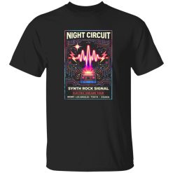
There’s a certain kind of presence that doesn’t ask for attention—it commands it. In the world of rock band shirts, that presence often comes through symbols that feel older than the music itself. The serpent, coiled and deliberate, has always been one of them. It doesn’t just decorate a surface. It defines the attitude behind it.
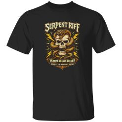
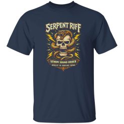
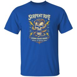
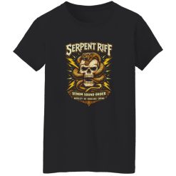
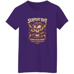
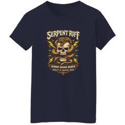
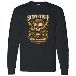
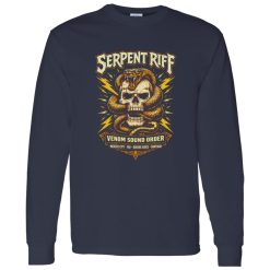
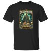
The Serpent Riff Dominion Rock Shirt exists inside that space where visual symbolism and sound-driven identity overlap. It’s not just another graphic tee—it’s a statement rooted in control, rhythm, and a kind of quiet intensity that doesn’t need explanation.
In rock culture, especially across heavier subgenres, imagery isn’t random. The serpent has long been tied to transformation, danger, and dominance. When paired with the concept of “riff”—the backbone of any powerful track—it creates a visual language that feels both aggressive and controlled.
This shirt builds on that tension. The serpent isn’t chaotic—it’s intentional. Every curve, every line feels like it mirrors the pacing of a slow, crushing guitar progression. That’s where the design stands apart. It doesn’t scream. It coils.
Worn in the right context, this kind of imagery signals more than taste in music. It reflects a deeper alignment with the darker, more deliberate side of rock culture—where sound is heavy, and identity is even heavier.
Rock band shirts have always been more than merch. They function as visual shorthand—telling people what you listen to, how you think, and where you stand within the culture. Some lean nostalgic. Others go loud and chaotic. This one sits somewhere else entirely.
The Serpent Riff Dominion Rock Shirt leans into control over chaos. It’s not about explosive visuals or overcrowded graphics. Instead, it channels a focused intensity that aligns more with underground scenes and refined aesthetic taste.
That makes it especially relevant within collections like Capital T Shirt band graphic tees, where the emphasis is on designs that feel authentic rather than mass-produced. It doesn’t try to imitate a band—it feels like it could belong to one.
There’s a restraint in the design that works in its favor. The composition doesn’t overload the eye. Instead, it creates space for the central symbol to carry meaning. That’s a subtle but important distinction—because in modern graphic apparel, restraint often reads as confidence.
It’s the kind of piece that doesn’t compete with everything else you’re wearing. It anchors the look instead.
Not every shirt needs to be styled loudly to stand out. In fact, this one works best when everything else steps back slightly. A darker palette—faded denim, worn black layers, or even minimal outerwear—lets the graphic hold its ground without distraction.
There’s a moment—late evening, just before a show starts—when the crowd hasn’t fully formed yet. People are scattered, conversations are low, and the soundcheck hums in the background. That’s where this shirt fits naturally. Not front-row energy. Not background noise. Somewhere in between.
It’s not about performance. It’s about presence.
The design doesn’t rely on shock value. It builds its identity through form and tone, which makes it easier to integrate into different looks without losing its edge. Whether layered or worn on its own, it maintains a consistent visual weight.
That consistency is what gives it longevity. It doesn’t depend on trends or seasonal aesthetics. It holds its ground across different settings—casual, live events, or even just everyday wear.
At a glance, it might seem like just another dark-themed rock shirt. But the difference shows up in how the elements are controlled. There’s no visual noise. No unnecessary layering. Everything serves the central idea.
That clarity makes the design feel intentional rather than decorative. And in a category where many pieces compete for attention through excess, that kind of discipline becomes a defining trait.
It also speaks to a more mature segment of the audience—those who have moved beyond obvious graphics and are looking for something that feels aligned with their evolving taste.
What makes a shirt stay in rotation isn’t just how it looks—it’s how it feels to wear over time. Not in terms of fabric specs or construction details, but in how it continues to represent something personal.
The Serpent Riff Dominion Rock Shirt holds that kind of staying power. It doesn’t rely on novelty. It builds its value through symbolism, consistency, and alignment with a specific mindset.
For those who see rock not just as music but as a visual and cultural language, this piece fits naturally into that expression. It doesn’t try to explain itself—and that’s exactly why it works.
| Product | Serpent Riff Dominion Rock Shirt |
|---|---|
| SKU | cc-1049-9966-108606851-1774060637888 |
| Fabric Weight | Midweight (5.3 oz) – Heavyweight (6.0 oz Long Sleeve) |
| Material Composition | Solid Colors: 100% Cotton Ash Grey: 99% Cotton / 1% Polyester Sport Grey: 90% Cotton / 10% Polyester Dark Heather: 50% Cotton / 50% Polyester |
| Fit | Classic Unisex Fit (Ladies: Slightly Tapered Missy Fit) |
| Construction | Double-needle stitching Taped neck & shoulders Preshrunk jersey knit Tearaway label |
| Hoodie Material (G185) | 8.0 oz – 50% Cotton / 50% Polyester |
| Available Sizes | S – 5XL (6XL select colors only) |
| Origin | Made with sustainably and fairly grown USA cotton; Printed in USA |
| Print Method | DIGISOFT® Direct-to-Garment (DTG) |
| Brand | Capital T Shirt |
| Fast & Reliable Shipping | All orders are professionally printed and shipped from the USA. |
|---|---|
| Processing Time | Printed on demand within 1–3 business days. |
| Shipping Time | USA: 4–7 business days International: 7–15 business days |
| Shipping Costs | USA Standard: $5.99 International Standard: $9.99 |
| Secure Checkout | Safe & encrypted payment processing. Your information is protected at all times. |
| Returns & Exchanges | We offer a 30-day return policy. View Refunds & Returns Policy |
| Customer Guarantee | We stand behind the quality of every item we print. |


Reviews
There are no reviews yet.