No products in the cart.
Save 20% on orders over $100 with code CT20


Price range: $21.90 through $44.99
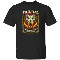
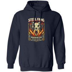
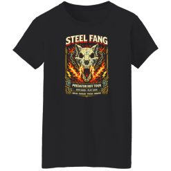
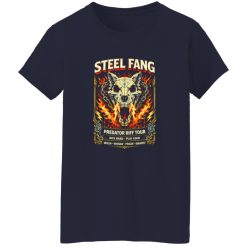
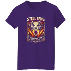
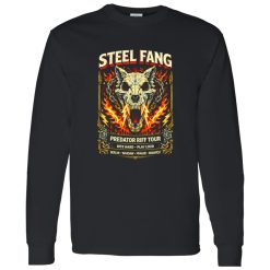
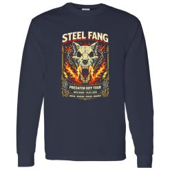
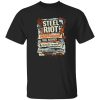
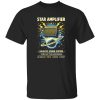
The Steel Fang Hard Rock Predator Shirt needs to do more than show a graphic. For a transactional search with strong buying intent, the real question is whether the shirt delivers the kind of visual impact, print quality, and everyday wear confidence that hard rock apparel should have from the first wear through repeated use. This piece works best when the graphic stays sharp, the surface feel stays comfortable, and the overall structure keeps its presence instead of collapsing into a forgettable basic tee.
That matters even more in music apparel, where the print is the product experience. A hard rock design can look aggressive on screen, but if the ink lays down poorly, the artwork loses depth, edges soften too fast, and the shirt stops feeling like a statement piece. The Steel Fang Hard Rock Predator Shirt stands out because the visual identity depends on strong print execution, not just a loud concept. Anyone browsing broader collections like rock band statement shirts is usually looking for that same balance of graphic force and wearable reliability.
Hard rock shirts live or die by the way the artwork holds its shape on the body. This design direction is built around presence: stronger lines, heavier contrast, and a graphic attitude that should read clearly from across a room, not just up close on a product page. That means print execution is not a secondary detail. It is the entire difference between a shirt that feels intentional and one that feels disposable.
On a piece like the Steel Fang Hard Rock Predator Shirt, the artwork has to retain edge definition. Predator-style imagery, fang motifs, aggressive linework, and bold contrast all depend on separation between dark masses, highlight zones, and contour details. When those areas stay visually disciplined, the shirt looks clean and controlled rather than muddy. That gives the graphic a more premium read even when the overall mood is raw, loud, and aggressive.
A strong music tee should also avoid that overly slick, artificial finish that can make the print feel disconnected from the garment. The better outcome is a surface presence that feels integrated into the shirt rather than laminated on top of it. That creates a more natural visual weight, especially under daylight, venue lighting, or layered styling with flannel, denim, or leather. Instead of flashing harshly, the graphic reads with depth.
This is where performance becomes part of style. The shirt does not just need to display the design. It needs to carry that design through real use: walking through the city, wearing it under a jacket, washing it after repeated rotation, and pulling it back on without feeling like the artwork already lost its authority. That is the kind of product behavior serious buyers actually notice.
The easiest trap in product copy is talking about a shirt as if it only exists in a flat studio image. In real wear, performance shows up differently. The graphic has to stay readable once the fabric moves, once the body stretches the chest area slightly, and once the shirt is worn for hours instead of seconds. A hard rock shirt with poor print behavior can look strong when laid flat, then immediately lose confidence once it is actually on someone.
The Steel Fang Hard Rock Predator Shirt works best when the print still feels composed during normal movement. That includes how the artwork sits across the torso, how it responds when layered under outerwear, and how it maintains visual control instead of breaking into a patchy or overly stressed appearance. Shirts in this category should feel ready for regular rotation, not like novelty pieces that only look good the first time out of the package.
There is also a comfort side to performance that matters more than many buyers admit. A graphic shirt can have the right look and still become annoying if the print feels stiff, heavy, or overly sealed off from the fabric. Better print behavior keeps the shirt easier to wear across longer stretches of the day. That matters whether the setting is casual daytime use, a night out, a local show, or just the kind of repeated off-duty styling where your best tees end up doing most of the work.
One subtle test is how the shirt feels after that first full day of wear. If the graphic still looks centered, feels integrated, and does not turn the front panel into a rigid block, the product is doing its job. That kind of control gives the piece more range. It can stay the focal point of an outfit without demanding that the rest of the fit compensate for poor shirt behavior.
A short real-world moment says a lot here. You throw it on before heading out, catch your reflection in low evening light, and the graphic still reads immediately. Not shiny in a cheap way. Not flat in a lifeless way. Just sharp, grounded, and ready. That is the difference between a music tee that feels like merch filler and one that earns repeat wear.
For a high-intent shopper, long-term value is not about squeezing technical language into the page. It is about whether the shirt can keep its visual identity over time. Hard rock apparel often gets chosen because it brings more energy than a plain tee and more attitude than a generic graphic shirt. If that energy fades too fast, the value drops with it.
The Steel Fang Hard Rock Predator Shirt is strongest when the graphic ages with character rather than simple deterioration. Those are not the same thing. Good aging means the design keeps its form, contrast, and recognizable structure even as the shirt becomes more lived-in. Poor aging means the image loses hierarchy, weakens at the edges, and starts feeling visually thin. Buyers may not describe the difference in technical terms, but they see it instantly when they open the closet and decide what still feels worth wearing.
This is especially important for darker, harder-edged designs. Predator-inspired hard rock artwork often leans on forceful shapes and assertive visual tension. If that tension softens too quickly, the shirt stops feeling dangerous and starts feeling diluted. The goal is not sterile perfection forever. The goal is to keep the graphic convincing. That means enough visual stability to let the shirt develop personality without losing authority.
Repeated wear also changes what people value in a music shirt. At first, the artwork drives the decision. Later, the deciding factor becomes trust. You reach for the piece because you know how it behaves. You know the print still reads well. You know it works with black denim, distressed layers, neutral outerwear, or cleaner streetwear combinations that need one aggressive centerpiece. Performance creates that trust.
That last point matters more than it seems. In a crowded category, buyers are not only comparing design concepts. They are comparing how confidently each shirt will hold up once it becomes part of real life. A great product photo may win the click, but product performance wins the repeat wear. That is what separates a shirt that feels collectible from one that feels temporary.
The Steel Fang Hard Rock Predator Shirt makes the most sense for buyers who want strong graphic presence without gambling on a shirt that only works visually for a week. It fits shoppers who care about design impact, but who also pay attention to whether a piece earns a place in real rotation. That includes people building out a hard rock wardrobe, upgrading from weaker novelty graphics, or simply looking for one shirt that brings sharper attitude than a standard band-inspired tee.
It also stands out because the design concept naturally asks more from the product. A predator-themed hard rock graphic is supposed to feel controlled, dangerous, and visually deliberate. If the print quality is weak, that concept collapses. If the execution is solid, the design becomes far more persuasive. The artwork feels intentional, the shirt looks more expensive than a generic loud graphic, and the overall product lands with more confidence.
From a buying perspective, that creates clarity. You are not choosing this shirt because it is merely different. You are choosing it because it offers a stronger combination of visual aggression, wearable comfort, and lasting presence than many graphic tees competing for the same attention. It gives you a statement piece, but one grounded in product behavior rather than empty styling language.
That is ultimately why this shirt works in a high-competition category. It answers the practical question behind the aesthetic one. Yes, the design is bold. Yes, the attitude is there. But beyond that, the Steel Fang Hard Rock Predator Shirt makes sense because the print presence, wearability, and long-term visual stability all support the exact reason someone searches for a hard rock statement shirt in the first place.
When a graphic tee can hold its edge, stay comfortable, and keep looking convincing after real use, the decision becomes much easier. This is the kind of shirt that earns its place not only through artwork, but through the way that artwork keeps performing every time you put it on.
| Product | Steel Fang Hard Rock Predator Shirt |
|---|---|
| SKU | cc-1049-9953-108621517-1774607419425 |
| Fabric Weight | Midweight (5.3 oz) – Heavyweight (6.0 oz Long Sleeve) |
| Material Composition | Solid Colors: 100% Cotton Ash Grey: 99% Cotton / 1% Polyester Sport Grey: 90% Cotton / 10% Polyester Dark Heather: 50% Cotton / 50% Polyester |
| Fit | Classic Unisex Fit (Ladies: Slightly Tapered Missy Fit) |
| Construction | Double-needle stitching Taped neck & shoulders Preshrunk jersey knit Tearaway label |
| Hoodie Material (G185) | 8.0 oz – 50% Cotton / 50% Polyester |
| Available Sizes | S – 5XL (6XL select colors only) |
| Origin | Made with sustainably and fairly grown USA cotton; Printed in USA |
| Print Method | DIGISOFT® Direct-to-Garment (DTG) |
| Brand | Capital T Shirt |
| Fast & Reliable Shipping | All orders are professionally printed and shipped from the USA. |
|---|---|
| Processing Time | Printed on demand within 1–3 business days. |
| Shipping Time | USA: 4–7 business days International: 7–15 business days |
| Shipping Costs | USA Standard: $5.99 International Standard: $9.99 |
| Secure Checkout | Safe & encrypted payment processing. Your information is protected at all times. |
| Returns & Exchanges | We offer a 30-day return policy. View Refunds & Returns Policy |
| Customer Guarantee | We stand behind the quality of every item we print. |


Reviews
There are no reviews yet.