No products in the cart.
Save 20% on orders over $100 with code CT20


Price range: $21.90 through $44.99
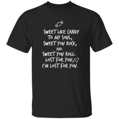
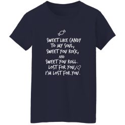
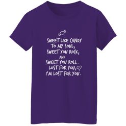
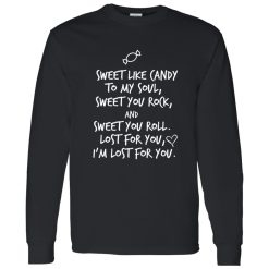
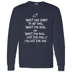
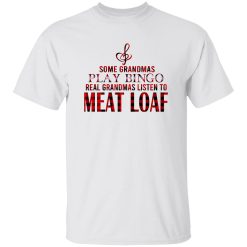
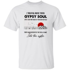
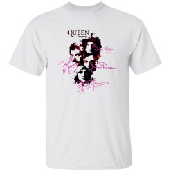
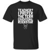
Some shirts don’t just sit in your wardrobe—they say something before you even speak. The Sweet Like Candy To My Soul Sweet You Rock Roll Shirt lands exactly in that space, where music taste and personal identity start to overlap. It’s not loud in a forced way, but it carries a tone that feels familiar if you’ve ever connected to rock beyond just sound.
There’s a certain pull to graphics like this. Not overly aggressive, not overly polished—just enough emotion wrapped in attitude. That balance is what makes it wearable across different moments without losing its core meaning.
Rock culture has always lived somewhere between rebellion and feeling. This design leans into the emotional side without losing its edge. The phrase itself feels almost nostalgic, but not in a way that’s stuck in the past—it carries forward into how people dress now.
Wearing something like this isn’t about representing a specific era or band alone. It’s about aligning with a broader sense of music-driven identity. You’re not just referencing rock—you’re absorbing part of its language into how you show up daily.
That’s why pieces like this continue to stay relevant. They don’t rely on trend cycles. They sit in that middle ground between expressive and effortless.
The visual presence here is more about tone than dominance. It doesn’t demand attention aggressively—it builds it gradually. That changes how the rest of the outfit interacts with it.
You don’t need to build complexity around this shirt. A simple pairing—dark denim, neutral layers, or even slightly faded textures—allows the graphic to hold focus naturally. Over-styling would dilute what makes it work.
There’s also flexibility in how far you want to push the look. Keep it clean for a more minimal presence, or lean slightly into worn textures and layered pieces if you want to echo more of that rock energy. Either way, the shirt stays consistent.
There’s something about the wording that feels personal without being specific. It reads almost like a lyric, something that could belong to a memory rather than a moment. That’s what makes it resonate differently compared to purely graphic-heavy designs.
This is where the identity angle becomes clearer. It’s not just about how the shirt looks—it’s about how it feels when worn. There’s a subtle connection between music, memory, and expression that gets carried through the design.
It doesn’t need explanation when someone sees it. The tone is already there.
Not every graphic tee adapts well. Some are locked into a specific aesthetic. This one moves more freely because it doesn’t lean too hard into a single visual lane.
You can keep it stripped down—clean lines, minimal layers—or push it slightly toward a more expressive rock-inspired outfit. The shirt doesn’t resist either direction.
That adaptability is what makes it practical beyond first impression. It’s easy to reach for because it doesn’t require a full styling reset every time you wear it.
There’s a difference between wearing something because it looks good and wearing something because it feels aligned. This falls into the second category.
In a space like Capital T Shirt band fan shirts, pieces like this stand out not because they’re louder—but because they connect more directly. The message isn’t overworked. The design isn’t overbuilt.
It fits into your wardrobe the same way music fits into your routine—naturally, without needing justification.
And once it’s there, it doesn’t feel like just another shirt. It feels like something you chose for a reason.
| Product | Sweet Like Candy To My Soul Sweet You Rock Roll Shirt – Identity-Driven Rock Style |
|---|---|
| SKU | cc-1049-9953-108628798-1774869176072 |
| Fabric Weight | Midweight (5.3 oz) – Heavyweight (6.0 oz Long Sleeve) |
| Material Composition | Solid Colors: 100% Cotton Ash Grey: 99% Cotton / 1% Polyester Sport Grey: 90% Cotton / 10% Polyester Dark Heather: 50% Cotton / 50% Polyester |
| Fit | Classic Unisex Fit (Ladies: Slightly Tapered Missy Fit) |
| Construction | Double-needle stitching Taped neck & shoulders Preshrunk jersey knit Tearaway label |
| Hoodie Material (G185) | 8.0 oz – 50% Cotton / 50% Polyester |
| Available Sizes | S – 5XL (6XL select colors only) |
| Origin | Made with sustainably and fairly grown USA cotton; Printed in USA |
| Print Method | DIGISOFT® Direct-to-Garment (DTG) |
| Brand | Capital T Shirt |
| Fast & Reliable Shipping | All orders are professionally printed and shipped from the USA. |
|---|---|
| Processing Time | Printed on demand within 1–3 business days. |
| Shipping Time | USA: 4–7 business days International: 7–15 business days |
| Shipping Costs | USA Standard: $5.99 International Standard: $9.99 |
| Secure Checkout | Safe & encrypted payment processing. Your information is protected at all times. |
| Returns & Exchanges | We offer a 30-day return policy. View Refunds & Returns Policy |
| Customer Guarantee | We stand behind the quality of every item we print. |
Reviews
There are no reviews yet.