No products in the cart.
Save 20% on orders over $100 with code CT20


Price range: $21.90 through $44.99
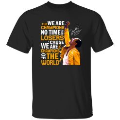
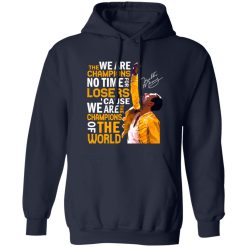
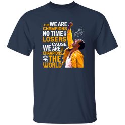
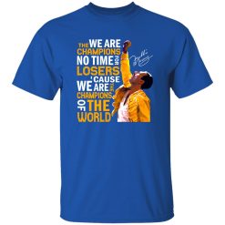
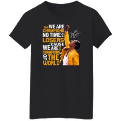
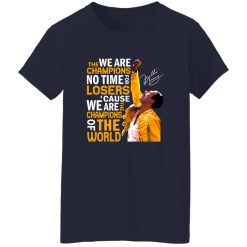
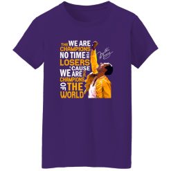
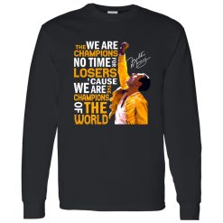
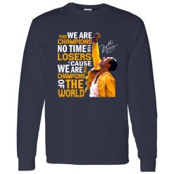
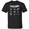
Some shirts work as background pieces. Others take over the whole outfit the second you put them on. The Queen Freddie Mercury We Are The Champions No Time For Losers Cause We Are The Champions Shirt belongs to the second category, because it carries a line, an attitude, and a performance legacy that already feels larger than everyday basics.
That is exactly why it works so well inside the world of rock band shirts. It does not need complicated styling to feel intentional. The graphic already has presence, so the smarter move is to build around it with balance, shape, and a little restraint rather than trying to compete with it.
For anyone who likes music apparel that says something before a word is spoken, this kind of piece fits naturally into outfits that lean expressive, nostalgic, and visually sharp without feeling forced.
A Queen graphic linked to Freddie Mercury and “We Are The Champions” carries more than logo value. It brings performance memory into the outfit. That changes the way the shirt reads on the body. Instead of acting like simple casual wear, it behaves more like a centerpiece, which means the rest of the styling should support its energy rather than overwhelm it.
The strongest approach is to treat it as the visual anchor. Straight-leg black denim, washed charcoal jeans, relaxed workwear pants, or even cleaner dark trousers all give the print room to lead. That is where rock styling becomes more intelligent. You are not just wearing a band reference. You are controlling silhouette and contrast so the shirt stays dominant in the look.
The drape matters too. A shirt like this looks best when it falls naturally rather than clinging too tightly or disappearing inside oversized layers. That slight ease through the body helps the graphic stay readable, especially when the design carries bold lyrical text and a legendary performance association.
Visually, the best image-pack impression comes from a broken-in black or faded dark tee base, a print that feels bold from a distance, and a silhouette that lands somewhere between relaxed and structured. It should look like the kind of shirt that catches attention under venue lights, in daylight on the street, or half-layered under a jacket with the graphic still clearly visible.
The easiest mistake with iconic music graphics is adding too much around them. With this shirt, the better move is controlled contrast. Let the message and Freddie Mercury connection do the expressive work, then keep the surrounding outfit grounded.
Start with the shirt untucked or with a light front tuck. Pair it with straight or slightly relaxed denim, then add low-profile sneakers or worn boots. A faded overshirt, vintage-wash denim jacket, or lightweight zip layer works better than anything too polished. The outfit should feel lived in, not heavily assembled.
This is where styling intelligence matters. Instead of building with loud accessories, you keep texture variation subtle. Soft cotton against slightly rigid denim. Distressed print against cleaner footwear. Dark tones against one lighter layer if needed. That is enough to create depth.
For broader outfit inspiration inside the same category, it fits naturally alongside other explore band concert tees looks that combine statement graphics with easy daily wearability.
At night, the shirt can shift without changing its identity. Swap the casual outer layer for black denim, a cropped leather jacket, or a darker overshirt with more structure. Keep the pants slim-straight or relaxed but not sloppy. Boots, darker sneakers, or even slightly heavier soles make the outfit feel sharper without pulling attention away from the chest graphic.
The best version of this look is confident, not theatrical. You do not need stagewear references to echo Freddie Mercury’s presence. What matters is the attitude of the silhouette: clean lines, strong top-half focus, and enough contrast to make the shirt feel deliberate.
There is also a practical reason this works. Lyrics-based Queen graphics already create movement across the front of the shirt, so adding complicated prints, loud jewelry stacks, or competing outerwear usually weakens the outfit. Simplicity lets the visual message hit harder.
Rock fashion has shifted. It is no longer only about looking aggressively rebellious. Now it often works through recognition, curation, and confidence. A shirt tied to Queen and Freddie Mercury sits at a strong intersection of classic rock memory and current graphic-led style, which is why it feels relevant beyond nostalgia alone.
That matters for people building outfits around music culture instead of trend-chasing. The shirt can live inside multiple style directions without losing credibility. It works with vintage-inspired layering, cleaner streetwear, darker minimalist wardrobes, and casual concert-ready fits. The graphic carries enough cultural weight to hold its own in each setting.
There is a small moment that explains the appeal clearly: walking downtown with headphones on before meeting friends, the shirt visible beneath an open jacket, denim settling naturally, no extra effort required. That kind of look does not feel costumed. It feels aligned. The shirt is doing what the best rock band shirts always do, turning music reference into visual identity without needing explanation.
That is why the piece has more range than people sometimes expect. It can feel vintage-adjacent without pretending to be archival. It can feel expressive without looking chaotic. And because Queen remains so visually and culturally recognized, the design signals taste immediately.
If someone wants a graphic tee that stays quiet, this is probably not the right direction. But if the goal is to wear something with instant recognition, strong lyrical energy, and real styling payoff, it makes sense.
It also helps that a shirt like this does not demand complicated decision-making. Because the message and imagery already deliver impact, you can keep the rest of the outfit straightforward. That creates the kind of styling confidence people actually use in real life.
The fit conversation matters here too, but only in terms of visual balance. A little breathing room usually helps the print sit better and keeps layering easier. Too fitted can make a statement shirt feel cramped. Too oversized can blur the graphic and reduce its presence. The sweet spot is a silhouette that feels relaxed, clean, and wearable across different settings.
In the end, this shirt stands out because it offers more than fan recognition. It gives the wearer a ready-made focal point, a strong cultural signal, and an easy route into outfits that feel grounded in music without looking generic. That is the real strength of a well-chosen Queen graphic. It does not just decorate the outfit. It defines it.
| Product | Queen Freddie Mercury We Are The Champions No Time For Losers Cause We Are The Champions Shirt |
|---|---|
| SKU | cc-1049-9953-108624889-1774750826780 |
| Fabric Weight | Midweight (5.3 oz) – Heavyweight (6.0 oz Long Sleeve) |
| Material Composition | Solid Colors: 100% Cotton Ash Grey: 99% Cotton / 1% Polyester Sport Grey: 90% Cotton / 10% Polyester Dark Heather: 50% Cotton / 50% Polyester |
| Fit | Classic Unisex Fit (Ladies: Slightly Tapered Missy Fit) |
| Construction | Double-needle stitching Taped neck & shoulders Preshrunk jersey knit Tearaway label |
| Hoodie Material (G185) | 8.0 oz – 50% Cotton / 50% Polyester |
| Available Sizes | S – 5XL (6XL select colors only) |
| Origin | Made with sustainably and fairly grown USA cotton; Printed in USA |
| Print Method | DIGISOFT® Direct-to-Garment (DTG) |
| Brand | Capital T Shirt |
| Fast & Reliable Shipping | All orders are professionally printed and shipped from the USA. |
|---|---|
| Processing Time | Printed on demand within 1–3 business days. |
| Shipping Time | USA: 4–7 business days International: 7–15 business days |
| Shipping Costs | USA Standard: $5.99 International Standard: $9.99 |
| Secure Checkout | Safe & encrypted payment processing. Your information is protected at all times. |
| Returns & Exchanges | We offer a 30-day return policy. View Refunds & Returns Policy |
| Customer Guarantee | We stand behind the quality of every item we print. |

Reviews
There are no reviews yet.