No products in the cart.
Save 20% on orders over $100 with code CT20


Price range: $21.90 through $44.99
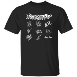
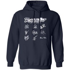
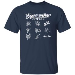
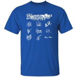
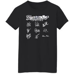
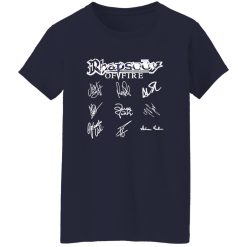
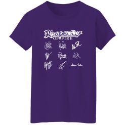
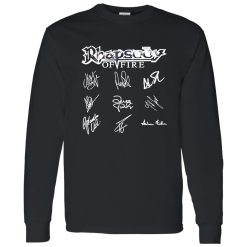
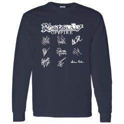
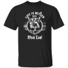
The Rhapsody Of Fire Signatures Shirt stands out most when you judge it by what actually matters in long-term music apparel performance: how the graphic reads at a glance, how the print behaves after repeated wear, and whether the shirt still feels sharp once it leaves the product page and becomes part of real life. For buyers comparing premium-feeling band merch, this piece works best as a print-first option with strong visual control rather than a throwaway novelty tee.
That matters even more in a category as crowded as classic rock band shirts, where many designs look strong on-screen but lose their edge once the graphic starts feeling stiff, muddy, or overly flat in person. A signature-heavy design only works when the execution keeps every line readable and the overall composition balanced from a normal viewing distance, not just in a zoomed-in product image.
Not every music shirt depends on print precision to the same degree. Some designs rely on a huge central logo, a distressed block type treatment, or a rough collage aesthetic that can absorb a little visual chaos. A signatures shirt is different. The appeal comes from recognition, line detail, and the sense that the artwork carries a more personal connection to the band rather than just generic tour-style branding.
Because of that, the performance value of this shirt starts with visual discipline. The graphic needs enough definition to keep individual signatures from blending into each other, but it also has to avoid looking overly glossy, plastic-heavy, or digitally harsh. The best result sits in a narrow middle ground: crisp enough to preserve the shapes, soft enough to feel integrated into the garment rather than sitting on top of it like a rigid sticker.
That balance affects the entire wearing experience. When a print reads clearly without looking overworked, the shirt feels cleaner, more intentional, and easier to style. It carries the presence of band merchandise, but it does not collapse into the cheap visual language that makes some graphic tees feel disposable after two washes and one night out.
A strong music print keeps edge clarity, tonal control, and surface balance working together. On a design like this, that means the autograph-style detailing should still look deliberate from up close, while the full graphic should remain legible from several feet away. If either part fails, the shirt loses value fast. Too soft, and the signatures blur into noise. Too hard, and the graphic can feel heavy, inflexible, and less premium on body.
The Rhapsody Of Fire Signatures Shirt works best for buyers who care about that middle zone. It is not just about whether the artwork is cool. It is about whether the visual weight of the print stays controlled enough to feel wearable over time.
Performance in music apparel is never just about the first unboxing moment. A shirt can look dramatic once, then flatten out after normal use. What gives this design stronger purchase logic is how its value proposition extends past the initial graphic reveal and into repeat wear scenarios.
First, the print format has natural staying power because signatures create a layered visual field rather than relying on one oversized central hit. That gives the shirt more texture in how it is perceived. Under indoor lighting, the design can read with a tighter, sharper presence. In daylight, it can feel more relaxed and integrated, which helps the shirt avoid that overproduced look that sometimes makes band merchandise feel too loud for everyday styling. The visual character stays active without becoming exhausting.
Second, the shirt benefits from the kind of graphic concept that ages better than trend-based novelty artwork. Signature prints are less dependent on meme energy, seasonal references, or short-term hype cycles. That does not automatically guarantee longevity, but it does improve the performance ceiling. If the print application is clean and the hand feel stays controlled, the shirt has a better chance of remaining relevant in rotation instead of becoming a one-week impulse buy.
Third, wear comfort is tied closely to how the graphic settles into the shirt. A good band tee should move with the body naturally enough that you stop thinking about it after a few minutes. That comes down less to marketing language and more to lived experience: whether the chest area feels breathable enough during longer wear, whether the print area becomes distracting under layering, and whether the shirt still hangs with a clean line instead of feeling front-heavy. This design is best positioned as a piece that should feel visually present without turning physically cumbersome.
That matters in actual music-life use cases. Think about the difference between wearing it for a quick coffee run versus a long evening that includes walking, sitting, venue lines, or a late drive home. Shirts that over-prioritize graphic punch can become annoying across those transitions. Shirts with better print behavior keep their character without constantly reminding you that there is a large image sitting across the chest. That quieter kind of performance is often what separates a shirt you admire from a shirt you actually keep wearing.
There is also a visual comfort factor. Because the design language leans on signatures rather than an overloaded collage, the shirt has room to breathe. It can pair easily with dark denim, black layers, or simple outerwear without forcing the rest of the outfit to compete. That is not a styling argument for trendiness. It is a performance argument for repeat usability. A shirt that is easier to wear more often gives better value, even before you start thinking about long-term print endurance.
The strongest confidence signal is that the design concept naturally rewards cleaner print execution. When the concept and the application method align, the product feels more coherent. That coherence is what many buyers are actually responding to when they say a band shirt feels premium, even if they never use that exact word.
For Image Pack value, this shirt should be understood through how it looks and feels in motion rather than through isolated product specs. The most compelling version of a signatures design has a surface that appears smooth but not slick, with ink that catches light gently instead of bouncing it back with a glossy glare. The print should feel resolved, not rubbery. On-body, the graphic should sit with enough body to hold definition while still looking like it belongs to the garment.
That sensory impression matters because customers do notice finish quality, even when they describe it in simple terms. They notice when a graphic looks deep instead of flat. They notice when darker tones hold their richness rather than turning chalky. They notice when fine lines stay believable rather than fuzzing out into a low-confidence blur. Those details shape trust before anyone ever talks about wash cycles or construction language.
A well-executed Rhapsody Of Fire Signatures Shirt should also create a specific silhouette effect. The graphic becomes the focal field, but the shirt itself still needs to drape cleanly enough that the print does not look stretched or boxed-in. That gives the whole piece a more composed appearance. From the front, it reads sharp and intentional. From slight angles, it should still maintain structure without the artwork breaking visually across the torso in a distracting way.
Another important performance layer is how the shirt develops character over time. Not every buyer wants a band tee to remain frozen in brand-new condition forever. In music apparel, there is often value in a shirt softening into itself while the graphic keeps enough integrity to stay recognizable. That is different from premature breakdown. Good aging creates depth. Bad aging creates visual fatigue. A shirt like this should move toward the former: a more lived-in feel with the signatures still carrying readable shape and presence.
For transactional buyers, that is the key point. You are not just picking a Rhapsody Of Fire design because the band name resonates. You are judging whether the shirt has enough execution quality to justify staying in your regular rotation. This one makes the most sense for shoppers who care about print presence, readable detail, and a cleaner performance profile than the average impulse-purchase music tee.
In a crowded band-merch space, that kind of product clarity matters. The best-performing graphic shirts are not always the loudest. They are the ones that continue to look right, feel wearable, and hold their visual identity after the first wave of excitement fades. That is where the Rhapsody Of Fire Signatures Shirt has its clearest advantage.
| Product | Rhapsody Of Fire Signatures Shirt |
|---|---|
| SKU | cc-1049-9953-108624893-1774750883228 |
| Fabric Weight | Midweight (5.3 oz) – Heavyweight (6.0 oz Long Sleeve) |
| Material Composition | Solid Colors: 100% Cotton Ash Grey: 99% Cotton / 1% Polyester Sport Grey: 90% Cotton / 10% Polyester Dark Heather: 50% Cotton / 50% Polyester |
| Fit | Classic Unisex Fit (Ladies: Slightly Tapered Missy Fit) |
| Construction | Double-needle stitching Taped neck & shoulders Preshrunk jersey knit Tearaway label |
| Hoodie Material (G185) | 8.0 oz – 50% Cotton / 50% Polyester |
| Available Sizes | S – 5XL (6XL select colors only) |
| Origin | Made with sustainably and fairly grown USA cotton; Printed in USA |
| Print Method | DIGISOFT® Direct-to-Garment (DTG) |
| Brand | Capital T Shirt |
| Fast & Reliable Shipping | All orders are professionally printed and shipped from the USA. |
|---|---|
| Processing Time | Printed on demand within 1–3 business days. |
| Shipping Time | USA: 4–7 business days International: 7–15 business days |
| Shipping Costs | USA Standard: $5.99 International Standard: $9.99 |
| Secure Checkout | Safe & encrypted payment processing. Your information is protected at all times. |
| Returns & Exchanges | We offer a 30-day return policy. View Refunds & Returns Policy |
| Customer Guarantee | We stand behind the quality of every item we print. |

Reviews
There are no reviews yet.