No products in the cart.
Save 20% on orders over $100 with code CT20
New Customer Discount 10% OFF. Enter Coupon Code: CP10


Price range: $21.90 through $44.99
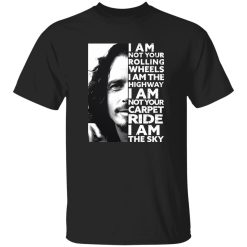
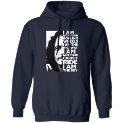
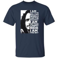
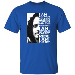
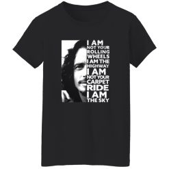
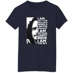
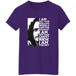
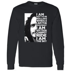
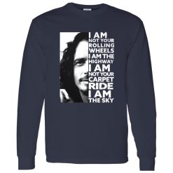
The audioslave highway shirt captures one of the most powerful lyrical declarations in modern rock: “I Am Not Your Rolling Wheels, I Am The Highway.” This isn’t a subtle graphic—it’s a statement piece. Because of that, ink integrity becomes the defining performance factor. When typography carries emotional weight, the print must remain sharp, bold, and structurally stable over time.
At Capital T Shirt, this Audioslave design is built to preserve line clarity, tonal depth, and surface cohesion through repeated wear. A lyric-driven shirt should age with presence, not lose its authority after a few washes.
Large, high-contrast text demands precise print execution. With this design, the lettering isn’t decorative background detail—it is the centerpiece. Every word must remain legible and visually balanced across the chest panel.
Ink integrity refers to how well the pigment bonds to the fabric surface without becoming brittle or overly rigid. When curing is properly calibrated, the ink sits integrated within the cotton fibers rather than forming a thick plastic overlay. This reduces the likelihood of premature cracking along fold lines and high-movement zones.
As the shirt flexes with body movement, the print flexes as well. That flexibility maintains crisp letter edges while preventing separation between ink and fabric. The result is a graphic that keeps its edge instead of fracturing into uneven segments.
Graphic art can tolerate slight texture shifts. Text cannot. If letters distort, blur, or crack heavily, readability suffers. This shirt is engineered so bold typography retains structural clarity across daily rotation and repeated washing.
Ink performance begins with the garment base. The cotton foundation used in this Audioslave piece provides a balanced surface—smooth enough for sharp line application yet substantial enough to anchor pigment without oversaturation.
When ink is too heavily layered, it stiffens the chest panel. When it’s too thin, it fades rapidly. This shirt avoids both extremes. The print integrates into the fabric, allowing natural drape while maintaining strong contrast between text and background.
That balance supports long-term cohesion. Even after repeated laundering, the ink layer maintains uniform texture instead of developing scattered stress fractures across high-tension areas such as the upper chest or shoulder fold.
Ink integrity doesn’t operate in isolation. The shirt’s structural composition plays a major role in preserving graphic proportion. If the garment twists or shrinks unevenly, typography alignment can distort—even when print bonding remains strong.
This design is cut for balanced shoulder positioning and chest symmetry. As the fabric relaxes over time, the graphic remains centered rather than drifting off-axis. Collar structure supports vertical alignment, preventing torque that can subtly warp large block text.
Long sleeve and hoodie variations follow similar construction logic. Heavier fabrics introduce additional tension during wear, particularly around cuffs and hem zones. Reinforced seam stability helps maintain print alignment so the message continues to read clearly.
The strength of this shirt lies in controlled ink bonding and balanced fabric support. It protects the message visually while maintaining comfort and flexibility for everyday wear.
Within the broader category of rock band shirts, lyric-driven graphics hold a distinct position. They aren’t abstract art—they’re declarations. That means performance standards must match the emotional weight behind the words.
The Audioslave Highway design stands apart by focusing on durability without sacrificing softness. Many mass-produced lyric tees emphasize fast production over print precision. Over time, that shortcut reveals itself through cracking text and fading contrast.
This edition is structured for high-intent buyers who expect lasting clarity. When someone searches specifically for an audioslave highway shirt, they’re seeking authenticity and quality—not novelty. The construction must support that expectation.
By emphasizing ink integrity rather than surface distressing, this piece reinforces Capital T Shirt’s authority within music apparel. It delivers visual stability that matches the strength of the lyric itself.
Transactional buyers want certainty. You should be able to add this shirt to regular rotation without hesitation. Wash it, layer it, wear it to shows, or integrate it into everyday street styling—the graphic remains readable and structurally cohesive.
Cold washing and moderate drying preserve contrast and flexibility. Over time, minor softening enhances comfort without degrading letter sharpness. The shirt develops a lived-in feel while keeping the message intact.
Hoodies and long sleeves extend that same reliability into colder seasons. The ink finish is calibrated to remain flexible even across thicker fabric bases, ensuring typography retains alignment and definition.
No. The print is engineered for flexibility and strong ink bonding, reducing early cracking. When properly cared for, the lettering maintains edge clarity and structural cohesion through repeated washing and everyday wear.
Turn the shirt inside out, wash in cold water with mild detergent, and avoid excessive heat during drying. This minimizes surface friction and helps preserve contrast, flexibility, and ink stability over time.
Yes, the same ink integrity standards apply. However, the bonding process accounts for thicker fabric tension to ensure the typography remains flexible and aligned across heavier material.
The shirt is designed to maintain strong contrast rather than fade rapidly. Minor softening may occur with normal wear, but the lyric remains clear and visually balanced when cared for properly.
The Audioslave I Am The Highway design is built for fans who understand the weight behind the words. It delivers clarity, structural balance, and dependable ink performance—so the statement stays powerful long after the first wear.
| Product | Audioslave I Am Not Your Rolling Wheels I Am The Highway Shirt |
|---|---|
| SKU | cc-1049-9953-108557619-1772539557037 |
| Fabric Weight | Midweight (5.3 oz) – Heavyweight (6.0 oz Long Sleeve) |
| Material Composition | Solid Colors: 100% Cotton Ash Grey: 99% Cotton / 1% Polyester Sport Grey: 90% Cotton / 10% Polyester Dark Heather: 50% Cotton / 50% Polyester |
| Fit | Classic Unisex Fit (Ladies: Slightly Tapered Missy Fit) |
| Construction | Double-needle stitching Taped neck & shoulders Preshrunk jersey knit Tearaway label |
| Hoodie Material (G185) | 8.0 oz – 50% Cotton / 50% Polyester |
| Available Sizes | S – 5XL (6XL select colors only) |
| Origin | Made with sustainably and fairly grown USA cotton; Printed in USA |
| Print Method | DIGISOFT® Direct-to-Garment (DTG) |
| Brand | Capital T-Shirts |
| Fast & Reliable Shipping | All orders are professionally printed and shipped from the USA. |
|---|---|
| Processing Time | Printed on demand within 1–3 business days. |
| Shipping Time | USA: 4–7 business days International: 7–15 business days |
| Shipping Costs | USA Standard: $5.99 International Standard: $9.99 |
| Secure Checkout | Safe & encrypted payment processing. Your information is protected at all times. |
| Returns & Exchanges | We offer a 30-day return policy. View Refunds & Returns Policy |
| Customer Guarantee | We stand behind the quality of every item we print. |


Reviews
There are no reviews yet.