No products in the cart.
Save 20% on orders over $100 with code CT20


Price range: $21.90 through $44.99
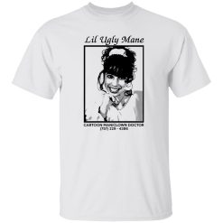
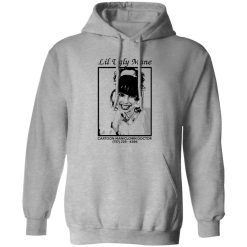
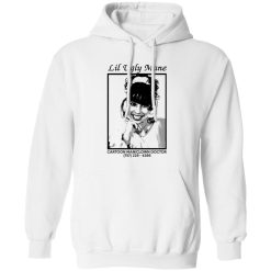
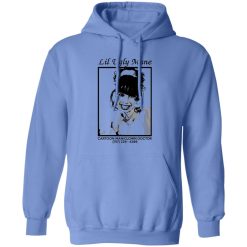
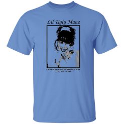
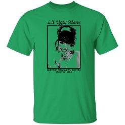
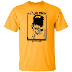
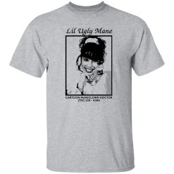
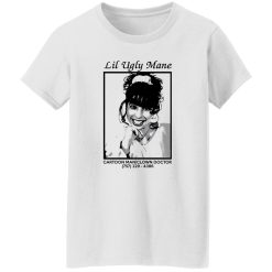
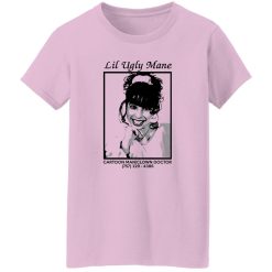
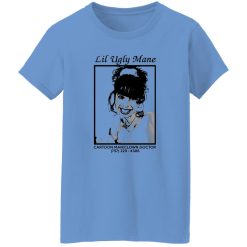
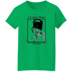
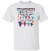
The visual impact hits first. A distorted cartoon figure, somewhere between satire and unease, printed with deliberate intensity across a surface that feels built to last. The Lil Ugly Mane Cartoon Man Clown Doctor Shirt doesn’t rely on subtlety—it leans into graphic presence and holds that energy through repeated wear, not just the first impression.
For those navigating the space between underground rap and experimental rock aesthetics, this piece operates as more than merch. It’s a print-driven garment designed to maintain clarity, edge definition, and tonal depth long after the first wash cycle.
What defines this shirt is not just the artwork, but how that artwork behaves over time. The Cartoon Man Clown Doctor graphic relies on sharp contrasts and layered tones—elements that typically degrade quickly if printing execution falls short. Here, the ink application is calibrated to preserve those contrasts, ensuring the unsettling character remains visually intact rather than fading into flatness.
Instead of cracking prematurely or bleeding into the base fabric, the print settles into a stable surface layer. The result is a graphic that keeps its structure even as the garment softens with wear. That balance—between flexibility and hold—is where long-term print integrity becomes noticeable.
Under repeated washing, the image doesn’t collapse into distortion. Edges stay defined, the darker tones resist washout, and lighter accents maintain their separation. This matters for designs rooted in visual tension, where even minor degradation changes the entire mood of the piece.
Durability here isn’t framed through raw specification—it’s experienced through consistency. The shirt maintains its shape through everyday rotation, resisting the kind of stretching or warping that disrupts how the graphic sits on the body.
That consistency becomes more apparent over time. After multiple wears, the structure holds its alignment, meaning the print doesn’t twist or misplace across the torso. The fabric adapts slightly, softening without losing its form, which allows the graphic to remain centered and readable.
This is where performance intersects with visual design. A strong print loses its value if the garment underneath shifts unpredictably. In this case, the stability of the shirt supports the artwork, rather than competing with it.
There’s a difference between a shirt that looks good on arrival and one that performs across real use. This design sits firmly in the second category. The moment it enters regular rotation—layered under jackets, worn through long days, washed repeatedly—the performance characteristics become clear.
Picture a late evening, walking through dimly lit streets with headphones on, the graphic catching fragments of light as you move. It doesn’t blur or fade into the background. Instead, it maintains a presence—sharp enough to stand out, stable enough to feel intentional.
That’s the outcome of controlled ink application paired with a structure that doesn’t collapse under wear. The shirt adapts to movement without distorting the design, which is essential for graphics built around precise visual storytelling.
For those exploring more pieces within this category, the broader selection of find rock band graphic tees reflects similar attention to how print and garment performance intersect.
At a glance, the appeal is visual. Over time, the confidence comes from how the shirt behaves. The material doesn’t feel fragile, nor does it overcompensate with stiffness. Instead, it strikes a balance that allows for daily wear without degradation anxiety.
That balance shows up in small ways. The collar holds its shape without tightening uncomfortably. The body doesn’t twist after drying. The print doesn’t feel like a separate layer sitting on top—it integrates into the garment in a way that feels intentional.
This is particularly relevant for high-contrast graphic designs like this one. When the base material remains stable, the print can do its job fully. There’s no distraction from warping or uneven wear patterns.
Not every graphic demands long-term precision. But this one does. The unsettling cartoon aesthetic depends on clarity—on the viewer being able to read the distortion exactly as intended. If the print fades unevenly or cracks too early, the entire concept weakens.
That’s why the focus on ink integrity isn’t just technical—it’s conceptual. Maintaining the original visual tension over time is what allows the shirt to keep its identity, rather than becoming a generic faded graphic.
This shirt sits at the intersection of underground influence and performance reliability. It doesn’t rely on nostalgia or mainstream familiarity. Instead, it builds its identity through visual disruption and then supports that identity with construction that holds up under pressure.
For buyers operating with a transactional mindset—looking for something that delivers immediately and continues to deliver over time—the value becomes clear quickly. The graphic commands attention, and the garment ensures that attention doesn’t diminish after a few wears.
There’s no need for excessive reinforcement or exaggerated claims. The performance speaks through consistency: the same look, the same structure, the same presence, wear after wear.
In a category where many designs lose impact after minimal use, this piece maintains its edge. That reliability becomes the deciding factor—not just how it looks today, but how it continues to look weeks and months into rotation.
| Product | Lil Ugly Mane Cartoon Man Clown Doctor Shirt |
|---|---|
| SKU | cc-1049-9974-105000403-1716743961882 |
| Fabric Weight | Midweight (5.3 oz) – Heavyweight (6.0 oz Long Sleeve) |
| Material Composition | Solid Colors: 100% Cotton Ash Grey: 99% Cotton / 1% Polyester Sport Grey: 90% Cotton / 10% Polyester Dark Heather: 50% Cotton / 50% Polyester |
| Fit | Classic Unisex Fit (Ladies: Slightly Tapered Missy Fit) |
| Construction | Double-needle stitching Taped neck & shoulders Preshrunk jersey knit Tearaway label |
| Hoodie Material (G185) | 8.0 oz – 50% Cotton / 50% Polyester |
| Available Sizes | S – 5XL (6XL select colors only) |
| Origin | Made with sustainably and fairly grown USA cotton; Printed in USA |
| Print Method | DIGISOFT® Direct-to-Garment (DTG) |
| Brand | Capital T Shirt |
| Fast & Reliable Shipping | All orders are professionally printed and shipped from the USA. |
|---|---|
| Processing Time | Printed on demand within 1–3 business days. |
| Shipping Time | USA: 4–7 business days International: 7–15 business days |
| Shipping Costs | USA Standard: $5.99 International Standard: $9.99 |
| Secure Checkout | Safe & encrypted payment processing. Your information is protected at all times. |
| Returns & Exchanges | We offer a 30-day return policy. View Refunds & Returns Policy |
| Customer Guarantee | We stand behind the quality of every item we print. |

Reviews
There are no reviews yet.