No products in the cart.
Save 20% on orders over $100 with code CT20


Price range: $21.90 through $44.99
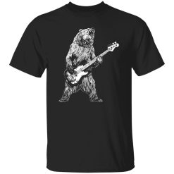
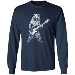
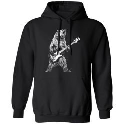
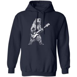
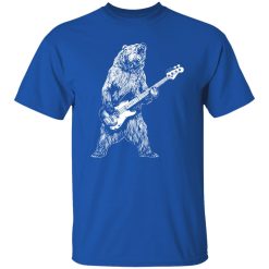
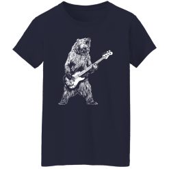
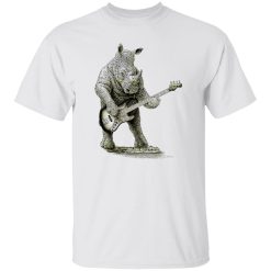
Playful concept meets performance clarity in the Bear Playing Bass Guitar Shirt—a design that instantly stands out without sacrificing wearability. This is not just another novelty print. It’s built around how the graphic holds up, how it feels over time, and how consistently it performs through real daily use.
From the first wear, the print reads clean and expressive, with the bear character and bass guitar illustration maintaining sharp edges and balanced contrast. Positioned naturally within the shop music graphic illustration tees collection, it reflects a growing demand for character-driven music visuals that stay visually strong long after purchase.
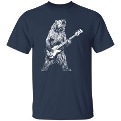
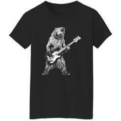
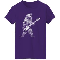
The defining strength of this shirt is its print execution. The bear graphic is designed to feel alive on fabric, not flat or overly processed. Ink application sits cleanly across the surface, allowing fine details—like string lines on the bass or texture in the fur illustration—to remain visible without bleeding or fading into the background.
Instead of relying on heavy layering, the print achieves clarity through controlled ink distribution. That means the design doesn’t crack visually after a few wears or feel stiff against the body. It stays flexible, moving with the shirt rather than resisting it.
Even under different lighting—daylight, indoor, or stage lighting—the illustration maintains readability. The visual balance ensures the bear and instrument remain the focal point without becoming overly saturated or dull.
Print quality isn’t proven on day one—it shows over time. With this shirt, the ink integrity is designed to handle repeated wear cycles without losing its core structure. That means edges remain defined, colors retain their tone, and the overall graphic doesn’t degrade into a washed-out version of itself.
Washing and movement are where most graphic tees fail. Here, the print adapts rather than breaks. The surface doesn’t develop excessive micro-cracking, and the illustration avoids that common faded patch effect where high-contact areas lose depth.
This matters especially for a design like a bear playing bass guitar, where character detail is part of the appeal. Losing that clarity would strip away the personality of the piece. Instead, the print continues to deliver the same visual identity after multiple wears.
Performance isn’t just about the print—it’s about how the entire shirt behaves when worn. The structure supports the graphic instead of distorting it. That means the image doesn’t warp awkwardly across the chest or stretch unevenly when moving.
The fabric feel is soft enough for daily use, but with enough structure to keep the print area stable. This balance prevents that sagging effect where graphics lose alignment over time. Instead, the shirt maintains a consistent silhouette that keeps the artwork centered and readable.
Short answer: it feels easy to wear. But more importantly, it keeps looking right while you do.
This design works because it doesn’t overcomplicate its role. It’s expressive, but still easy to integrate into everyday outfits. Whether you’re heading out casually or just want something with personality, it holds its place without trying too hard.
There’s a moment—standing in line at a small venue, bass tones humming faintly from inside—where shirts like this make sense. Not as a statement piece forced into the scene, but as something that naturally belongs there.
That’s where performance meets context. The print doesn’t feel out of place. It feels intentional.
Character-based music designs can easily feel gimmicky if they rely only on concept. What separates this piece is how the execution supports the idea. The bear with a bass guitar isn’t just visually fun—it’s technically stable, readable, and built to last.
These details aren’t immediately visible in a product photo, but they define the long-term experience. The shirt doesn’t just look good—it continues to perform.
For anyone drawn to music-inspired graphics with a bit of personality, this piece delivers both visual impact and reliability. It holds its identity without fading into something generic, and it stays consistent where it matters most—over time.
| Product | Bear playing bass guitar Shirt |
|---|---|
| SKU | cc-1049-9953-105150107-1718507533008 |
| Fabric Weight | Midweight (5.3 oz) – Heavyweight (6.0 oz Long Sleeve) |
| Material Composition | Solid Colors: 100% Cotton Ash Grey: 99% Cotton / 1% Polyester Sport Grey: 90% Cotton / 10% Polyester Dark Heather: 50% Cotton / 50% Polyester |
| Fit | Classic Unisex Fit (Ladies: Slightly Tapered Missy Fit) |
| Construction | Double-needle stitching Taped neck & shoulders Preshrunk jersey knit Tearaway label |
| Hoodie Material (G185) | 8.0 oz – 50% Cotton / 50% Polyester |
| Available Sizes | S – 5XL (6XL select colors only) |
| Origin | Made with sustainably and fairly grown USA cotton; Printed in USA |
| Print Method | DIGISOFT® Direct-to-Garment (DTG) |
| Brand | Capital T Shirt |
| Fast & Reliable Shipping | All orders are professionally printed and shipped from the USA. |
|---|---|
| Processing Time | Printed on demand within 1–3 business days. |
| Shipping Time | USA: 4–7 business days International: 7–15 business days |
| Shipping Costs | USA Standard: $5.99 International Standard: $9.99 |
| Secure Checkout | Safe & encrypted payment processing. Your information is protected at all times. |
| Returns & Exchanges | We offer a 30-day return policy. View Refunds & Returns Policy |
| Customer Guarantee | We stand behind the quality of every item we print. |


Reviews
There are no reviews yet.