No products in the cart.
Save 20% on orders over $100 with code CT20


Price range: $21.90 through $44.99
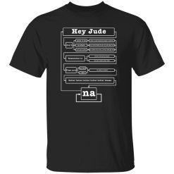
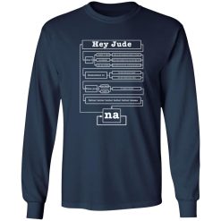
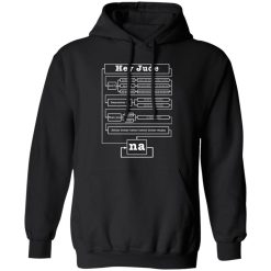
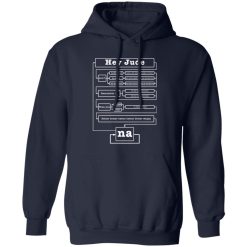
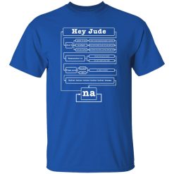
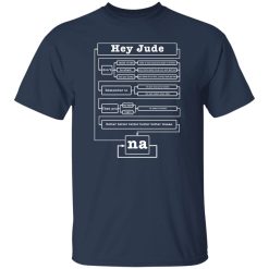
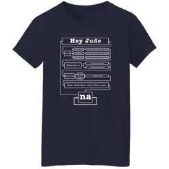
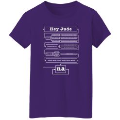
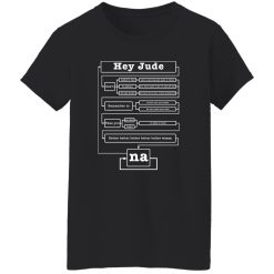
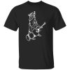
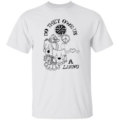
Some prints fade into the background after a few washes. Others hold their presence—visually steady, emotionally intact. The Hey Jude shirt belongs to the second category, where print clarity and long-term wear matter as much as the cultural weight behind it.
This isn’t just about a familiar phrase placed on fabric. It’s about how that phrase holds its tone over time—how the ink sits, how the lines remain sharp, and how the overall graphic continues to feel intentional after repeated wear cycles.
At the core of this tee is its ink performance. The design isn’t applied as a surface-level graphic that cracks or flakes under stress. Instead, it integrates into the fabric in a way that maintains both visual clarity and structural cohesion.
In real use, this means the typography stays defined. Edges don’t blur after washing, and tonal contrast remains consistent even after exposure to heat, motion, and repeated wear. The print feels like part of the shirt—not something sitting on top of it.
This level of print integrity matters more than it seems. A design like “Hey Jude” relies on simplicity. When the text loses sharpness, the entire piece loses its impact. Here, the minimalism is protected through precision execution.
There’s a noticeable difference between a graphic that degrades and one that evolves subtly. With this shirt, the ink doesn’t peel or stiffen. Instead, it softens slightly over time while maintaining legibility—giving it a more lived-in feel without sacrificing clarity.
That balance is what keeps the shirt wearable long after the first few washes. It doesn’t age out—it settles in.
Beyond the print, the fabric supports the overall performance. The material has enough structure to hold the graphic in place visually, while remaining soft enough to move naturally with the body.
As you wear it, the shirt doesn’t twist or distort in a way that disrupts the design alignment. The front panel stays stable, allowing the print to remain centered and readable without shifting awkwardly.
That consistency becomes more noticeable over time. After multiple wears, the shirt doesn’t collapse into a shapeless form. Instead, it retains a clean silhouette that continues to support the graphic presentation.
This is where performance connects directly to style. A print can be strong, but if the garment loses structure, the overall look falls apart. Here, both elements are aligned.
In everyday use, the shirt adapts easily. It doesn’t feel heavy or restrictive, but it also doesn’t feel thin or temporary. There’s a balance that makes it suitable for extended wear—whether layered or worn on its own.
The softness increases slightly with each wash, but without losing its original shape. That progression adds to the overall experience rather than diminishing it.
One of the biggest failure points for graphic tees is how they respond to washing. Colors fade unevenly, prints crack, and the entire piece starts to look worn in the wrong way.
With this Hey Jude shirt, the wash behavior is controlled. The print maintains its contrast, and the base fabric holds its tone without turning dull or patchy. Even after repeated cycles, the design remains visually coherent.
This consistency is especially important for a minimalist graphic. Because there are no complex visuals to distract from imperfections, any flaw becomes immediately visible. That’s why stability in both ink and fabric is essential here.
These aren’t just technical benefits—they directly affect how often you reach for the shirt. When it continues to look right, it stays in rotation longer.
Within the broader space of music graphic design shirts, this piece stands out through restraint and execution rather than complexity.
Many designs rely on layered visuals or heavy graphics to create impact. This one does the opposite. It depends on clarity, balance, and consistency—qualities that only work if the production supports them.
That makes it a different kind of choice. It’s not about visual overload. It’s about precision. And that precision holds up over time, which is where real value comes in.
This isn’t for someone looking for loud, high-contrast artwork. It’s for someone who understands the weight of simplicity—who wants a piece that feels considered rather than overstated.
It fits into a rotation where consistency matters. Where a shirt isn’t just worn once, but becomes part of a longer cycle.
That’s where the performance pays off. Not in the first impression—but in how it continues to deliver after ten, twenty, or thirty wears.
Over time, every shirt reveals what it’s really made of. Some lose their shape, their print, or their relevance. Others maintain their presence in quieter ways.
The Hey Jude shirt is built for that second path. The print holds. The fabric supports. The overall structure remains intact.
It doesn’t try to reinvent itself—it simply continues to perform.
That’s what makes it a reliable piece. Not because it stands out immediately, but because it stays consistent when most others start to fade.
If you’re choosing based on longevity rather than short-term appeal, this is where the difference becomes clear.
| Product | Hey Jude Music Graphic Tee – Print Quality That Holds Its Story |
|---|---|
| SKU | cc-1049-9953-105154679-1718603159048 |
| Fabric Weight | Midweight (5.3 oz) – Heavyweight (6.0 oz Long Sleeve) |
| Material Composition | Solid Colors: 100% Cotton Ash Grey: 99% Cotton / 1% Polyester Sport Grey: 90% Cotton / 10% Polyester Dark Heather: 50% Cotton / 50% Polyester |
| Fit | Classic Unisex Fit (Ladies: Slightly Tapered Missy Fit) |
| Construction | Double-needle stitching Taped neck & shoulders Preshrunk jersey knit Tearaway label |
| Hoodie Material (G185) | 8.0 oz – 50% Cotton / 50% Polyester |
| Available Sizes | S – 5XL (6XL select colors only) |
| Origin | Made with sustainably and fairly grown USA cotton; Printed in USA |
| Print Method | DIGISOFT® Direct-to-Garment (DTG) |
| Brand | Capital T Shirt |
| Fast & Reliable Shipping | All orders are professionally printed and shipped from the USA. |
|---|---|
| Processing Time | Printed on demand within 1–3 business days. |
| Shipping Time | USA: 4–7 business days International: 7–15 business days |
| Shipping Costs | USA Standard: $5.99 International Standard: $9.99 |
| Secure Checkout | Safe & encrypted payment processing. Your information is protected at all times. |
| Returns & Exchanges | We offer a 30-day return policy. View Refunds & Returns Policy |
| Customer Guarantee | We stand behind the quality of every item we print. |


Reviews
There are no reviews yet.