No products in the cart.
Save 20% on orders over $100 with code CT20


Price range: $21.90 through $44.99
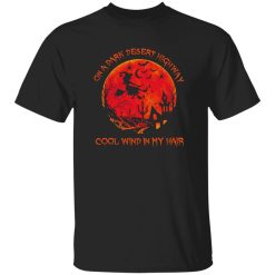
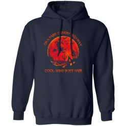
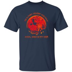
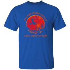
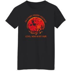
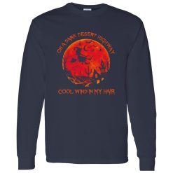
Some graphic shirts get attention for a second and disappear the moment the outfit changes. The On A Dark Desert Highway Witch shirt works differently. It has the kind of print presence that carries the whole look, giving rock-inspired apparel a sharper identity while still feeling easy to wear in everyday settings. For anyone browsing music-driven graphics with stronger visual impact, it sits naturally alongside band fan tees without fading into the background.
The strongest part of this shirt is not simply that it features a witch graphic or that it leans into dark desert imagery. It is the way the artwork creates immediate visual authority from a distance. In rock apparel, plenty of designs rely on familiar symbols, but not every print knows how to hold the front of the shirt with enough confidence to feel intentional. This one does.
The desert-night mood gives the design a cinematic edge, while the witch-and-broom motif pushes it away from generic novelty territory and closer to something that feels scene-aware. That matters in Rock Band Shirts because shoppers in this category are rarely looking for plain decoration. They want a graphic that suggests attitude, atmosphere, and some form of cultural recognition. A shirt like this performs well because the art does not feel passive. It projects a point of view.
That visual assertiveness also helps the shirt function across different styling situations. Under a jacket, the graphic still keeps enough character to anchor the outfit. Worn on its own, it carries enough energy that the rest of the look can stay simple. Good print execution is not just about color on fabric. It is about whether the design holds its structure visually once it is on a body, in motion, under daylight, or in lower evening light. This design is built for that kind of visible impact.
Performance in a graphic tee is not only about durability in the abstract. It is about whether the shirt keeps delivering the same visual payoff after repeat wear, repeat washing, and different outfit pairings. The reason this design stands out is that its artwork concept has enough depth to remain interesting after the first impression. That is an underrated part of product performance.
In practical wear, a strong music-inspired graphic needs to do three things well. First, it has to read clearly from normal viewing distance. Second, it has to maintain enough detail up close so it does not flatten into a cheap-looking block. Third, it has to feel stable as part of the shirt rather than like an afterthought placed on top of it. This design naturally supports those expectations because the composition is built around a central image with recognizable mood and silhouette, rather than scattered details that lose impact as soon as the shirt moves.
That clarity becomes especially important for customers shopping in the mid-tier to premium range. They are not only buying a phrase or a reference. They are buying how that reference lives on the garment. A good rock graphic should still feel deliberate while walking through a venue line, flipping through records in a store, or throwing on a layer after dark when the temperature drops. The shirt has to keep its visual authority without asking for constant adjustment.
There is also a difference between a design that looks loud online and one that wears well in person. Many graphics appear dramatic on a product page but feel visually unstable once worn because the composition has no real center. Here, the dark highway and witch concept gives the print a clear emotional axis. That makes it easier for the shirt to keep its identity over time rather than becoming another novelty piece that only works once.
Rock-themed shirts compete in a crowded visual category. Skulls, lightning, tour references, occult motifs, faded retro treatments, and oversized statement graphics all fight for the same attention. What separates a stronger product from a forgettable one is whether it translates those familiar signals into a design that feels focused instead of assembled from clichés.
The On A Dark Desert Highway Witch shirt performs well because it uses recognizable rock-adjacent imagery without becoming visually generic. Desert imagery has movement. A witch introduces mystique. Brooms add silhouette character. Together, those elements create a graphic that reads as atmospheric rather than random. That is where this product earns its place. It does not depend only on one joke, one trend, or one overly literal band-reference aesthetic. It leans into mood, and mood tends to age better than gimmick.
That gives the shirt an advantage for shoppers who want rock style without wearing something that feels too obvious or overexplained. Some people want direct artist merchandise. Others want apparel that still carries music-culture energy but leaves more room for interpretation. This design sits in that second lane. It is expressive, but not rigid. It feels like part of the wider rock visual language while still keeping enough individuality to stand on its own.
There is a quick moment outside a venue when people are still gathering, the line is forming, and everyone is reading each other’s shirts before the doors open. This is the kind of graphic that works in that moment because it gives off attitude immediately, without needing explanation.
Not every rock shirt needs to solve the same problem. Some are for collectors. Some are for pure nostalgia. Some are there to make casual outfits feel less flat. This one makes the most sense for shoppers who want a graphic tee with stronger print identity and a little more visual darkness than the standard music-shirt formula.
It works especially well for buyers who care about three things:
From a buying perspective, that matters because informational and commercial intent often overlap in this category. Shoppers want to understand what makes a shirt visually compelling before they commit. They are not just checking whether the title sounds cool. They are assessing whether the design will actually deliver when worn. This one offers a clear answer: it is a graphic-first piece with enough visual conviction to justify being the main feature of the outfit.
It also suits people who like their music apparel to feel a little less expected. Instead of relying on the safest possible imagery, it brings in eerie desert atmosphere and witch symbolism in a way that stays wearable. That balance is hard to get right. Too subtle, and the shirt feels forgettable. Too exaggerated, and it becomes costume-like. This design lands in a stronger middle ground.
The best-performing rock shirts are the ones that keep their identity after the novelty wears off. That is the real value test. The On A Dark Desert Highway Witch shirt succeeds because it offers more than a phrase printed on fabric. It gives the wearer a defined visual mood, a strong central graphic, and enough attitude to compete in a crowded category without feeling forced.
For shoppers comparing options in Rock Band Shirts, this piece has a clear advantage: it delivers immediate print presence, wearable dark-culture energy, and enough stylistic flexibility to stay relevant beyond one season or one specific outfit. That combination is what gives a graphic tee staying power.
| Product | On A Dark Desert Highway Witch Cool Wind In My Hair Cool Witch With Brooms |
|---|---|
| SKU | cc-1049-9953-108624868-1774750508979 |
| Fabric Weight | Midweight (5.3 oz) – Heavyweight (6.0 oz Long Sleeve) |
| Material Composition | Solid Colors: 100% Cotton Ash Grey: 99% Cotton / 1% Polyester Sport Grey: 90% Cotton / 10% Polyester Dark Heather: 50% Cotton / 50% Polyester |
| Fit | Classic Unisex Fit (Ladies: Slightly Tapered Missy Fit) |
| Construction | Double-needle stitching Taped neck & shoulders Preshrunk jersey knit Tearaway label |
| Hoodie Material (G185) | 8.0 oz – 50% Cotton / 50% Polyester |
| Available Sizes | S – 5XL (6XL select colors only) |
| Origin | Made with sustainably and fairly grown USA cotton; Printed in USA |
| Print Method | DIGISOFT® Direct-to-Garment (DTG) |
| Brand | Capital T Shirt |
| Fast & Reliable Shipping | All orders are professionally printed and shipped from the USA. |
|---|---|
| Processing Time | Printed on demand within 1–3 business days. |
| Shipping Time | USA: 4–7 business days International: 7–15 business days |
| Shipping Costs | USA Standard: $5.99 International Standard: $9.99 |
| Secure Checkout | Safe & encrypted payment processing. Your information is protected at all times. |
| Returns & Exchanges | We offer a 30-day return policy. View Refunds & Returns Policy |
| Customer Guarantee | We stand behind the quality of every item we print. |


Reviews
There are no reviews yet.