No products in the cart.
Save 20% on orders over $100 with code CT20


Price range: $21.90 through $44.99
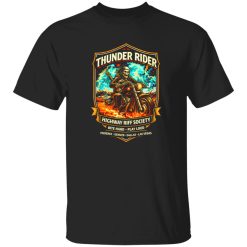
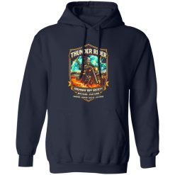
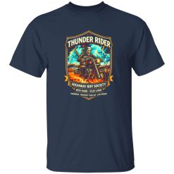
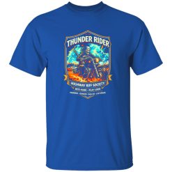
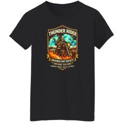
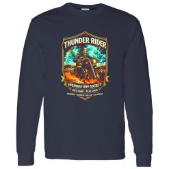
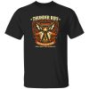
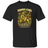
Some shirts fill space in a closet. Others become part of how someone wants to be seen. The Thunder Rider Highway Rock Shirt belongs to the second category, especially for people who do not treat music apparel like background clothing. In the world of rock band shirts, the strongest pieces are never just about graphics alone. They carry a point of view, a little edge, and a clear sense of taste that feels personal the second you put them on.
That is what gives this design its pull. It speaks to the kind of wearer who likes the road-worn energy of rock culture but still wants a shirt that feels current, sharp, and easy to reach for outside of one specific moment. Whether it lands in a rotation of dark denim, broken-in jackets, or laid-back everyday layers, it reads as identity first and product second. That distinction matters.
The Thunder Rider Highway Rock Shirt works because it taps into a familiar rock language without feeling flat or overdesigned. A lot of graphic apparel tries too hard to announce itself. The better pieces do something subtler. They suggest movement, grit, and attitude in a way that feels lived-in rather than forced. This is where strong rock band shirts separate themselves from disposable novelty tees.
The visual energy behind a highway-driven rock graphic carries its own emotional weight. It hints at motion, touring culture, late-night drives, venue parking lots, faded posters, and the kind of music that sounds best when it is played loud enough to take over the room. Even without leaning on heavy-handed symbolism, that atmosphere comes through in the overall impression of the shirt. The result is a piece that feels expressive without becoming costume-like.
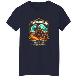
It also helps that this kind of design is easy to read from a distance. For Image Pack visibility, that matters more than many stores realize. The graphic needs to hold shape in thumbnails, but it also needs to reward a closer look. A good rock shirt does both. It creates presence from far away, then reveals texture, contrast, and detail up close. The Thunder Rider Highway Rock Shirt fits that visual logic well, giving it stronger appeal for shoppers who respond first with the eye and justify the decision after.
People do not usually search for rock shirts because they need another basic tee. They search because they want something that matches how they see themselves. That is especially true in a category like this, where clothing often works as a quiet signal. It says something about taste, references, mood, and cultural alignment before a single word is spoken.
The appeal here is not only rebellion in the loudest sense. It is recognition. Some wearers want a shirt that feels like it belongs with old records, dim club lights, cracked leather, and a little distance from polished mainstream style. Others want that same visual energy, but translated into an outfit that still feels clean and wearable in daily life. The best identity-driven product pages understand both impulses. They do not reduce the shirt to a slogan, and they do not bury it in vague lifestyle copy either.
The Thunder Rider Highway Rock Shirt lands in a sweet spot between statement and ease. It gives enough attitude to make a plain outfit feel intentional, but it does not demand a full performance around it. That makes it more useful. A shirt with real identity should not be difficult to wear. It should do its work naturally.
On a late evening record store run, this is the kind of piece that fits without trying. It feels right under soft streetlight, with headphones on, one hand flipping through vinyl sleeves and the other holding a coffee that has gone half cold.
One reason strong graphic pieces last longer in a wardrobe is that they create direction. A plain tee can disappear into an outfit. A good rock shirt gives the whole look a center of gravity. That does not mean everything else has to compete with it. In fact, the opposite is usually true. The more confident the graphic presence, the simpler the rest of the outfit can be.
This shirt works well when the surrounding pieces stay grounded. Dark jeans, washed black denim, workwear-inspired pants, or slightly relaxed layers all make sense because they let the graphic do the talking. If someone wants a sharper look, the shirt can sit under an open overshirt or structured jacket without losing its character. If the goal is something easier and more lived-in, it pairs naturally with worn denim and sneakers that already carry some history. That flexibility matters because it broadens the shirt’s role beyond a single mood.
Fit also matters, not in a technical chart-heavy way, but in the way the shirt falls on the body and holds visual balance. Rock graphics tend to look best when they do not feel overly tight or overly exaggerated. A natural drape makes the artwork feel more authentic, less staged. The overall impression should be easy, not strained. That is part of why pieces in this lane stay relevant: they feel like they belong to a real wardrobe rather than a short-lived trend cycle.
For shoppers exploring Capital T Shirt band t shirts, this design makes sense because it carries that same balance of edge and wearability that defines the strongest entries in the category. It does not rely on gimmick. It relies on tone.
Some product pages fail because they describe a shirt as if the customer can already feel it in hand. In reality, online apparel has to earn trust visually first. That is where this design has an advantage. It suggests a bold front-facing presence, but the impact is not only about scale. It is about the relationship between print mood, silhouette, and overall finish.
For an Image Pack context, the shirt needs to project immediately. The strongest impression here comes from the way a highway-rock concept tends to create forward motion in the eye. The graphic likely reads with strong contrast against the garment, giving it that classic music-apparel effect where the print feels anchored rather than floating. The surface impression should feel substantial, with artwork that looks integrated into the shirt instead of pasted onto it. In photos, that kind of print presence creates depth. In person, it gives the piece more authority.
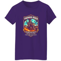
There is also a drape consideration that affects aesthetic impact. Shirts in this category look better when they hang with enough structure to frame the graphic cleanly, while still feeling relaxed enough for everyday wear. That balance helps the piece photograph well across flat lays, model shots, and close-up detail images. It also makes the shirt easier to imagine in daily use, which is often the real conversion trigger for commercial-intent shoppers.
Most importantly, the Thunder Rider Highway Rock Shirt does not ask the wearer to explain it. The design language already does enough. It suggests confidence, movement, and a little grit. That is why it stands out in a crowded category. Not because it is louder than everything else, but because it feels more resolved.
For someone building a wardrobe around music-driven pieces, that difference is worth paying attention to. A rock shirt should feel like something you chose on purpose, not something you grabbed because it was there. This one has the kind of visual identity and everyday usability that make it easier to keep wearing, easier to style, and easier to remember after the first impression fades. In a category full of forgettable options, that is exactly the point.
| Product | Thunder Rider Highway Rock Shirt |
|---|---|
| SKU | cc-1049-9953-108622721-1774660490181 |
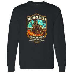
| Fabric Weight | Midweight (5.3 oz) – Heavyweight (6.0 oz Long Sleeve) |
| Material Composition | Solid Colors: 100% Cotton Ash Grey: 99% Cotton / 1% Polyester Sport Grey: 90% Cotton / 10% Polyester Dark Heather: 50% Cotton / 50% Polyester |
| Fit | Classic Unisex Fit (Ladies: Slightly Tapered Missy Fit) |
| Construction | Double-needle stitching Taped neck & shoulders Preshrunk jersey knit Tearaway label |
| Hoodie Material (G185) | 8.0 oz – 50% Cotton / 50% Polyester |
| Available Sizes | S – 5XL (6XL select colors only) |
| Origin | Made with sustainably and fairly grown USA cotton; Printed in USA |
| Print Method | DIGISOFT® Direct-to-Garment (DTG) |
| Brand | Capital T Shirt |
| Fast & Reliable Shipping | All orders are professionally printed and shipped from the USA. |
|---|---|
| Processing Time | Printed on demand within 1–3 business days. |
| Shipping Time | USA: 4–7 business days International: 7–15 business days |
| Shipping Costs | USA Standard: $5.99 International Standard: $9.99 |
| Secure Checkout | Safe & encrypted payment processing. Your information is protected at all times. |
| Returns & Exchanges | We offer a 30-day return policy. View Refunds & Returns Policy |
| Customer Guarantee | We stand behind the quality of every item we print. |

Reviews
There are no reviews yet.