No products in the cart.
Save 20% on orders over $100 with code CT20


Price range: $21.90 through $44.99
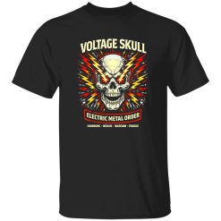
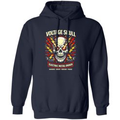
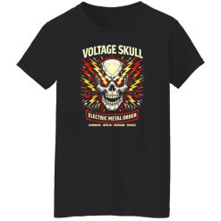
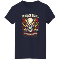
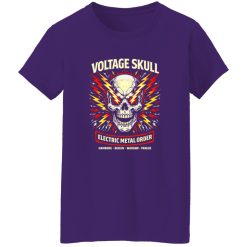
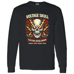
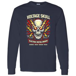
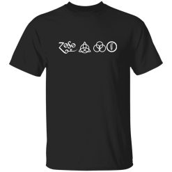
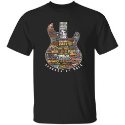
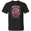
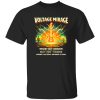
The first thing you notice isn’t just the graphic—it’s how it holds attention. The Voltage Skull Legion Rock Shirt isn’t built to fade into the background. It’s designed to carry visual weight, the kind that immediately anchors an outfit and keeps it grounded in rock culture. This is where bold print execution meets wearable identity, without overcomplicating the experience.
Within the broader space of vintage band shirts, pieces like this stand out not because they try too hard, but because they commit fully to a visual direction. The skull motif, reinforced with structured linework and controlled contrast, delivers a graphic that feels intentional rather than decorative.
Print quality isn’t just about sharpness—it’s about how the design behaves over time. The Voltage Skull Legion graphic is built with depth in mind, meaning the darker tones don’t flatten out after repeated wear. Instead, they retain dimension, allowing highlights and shadows within the skull artwork to stay visible even as the shirt breaks in.
This matters because high-contrast designs often lose clarity when the ink isn’t properly balanced. Here, the execution keeps edges defined without feeling stiff. The result is a print that feels integrated into the fabric rather than sitting on top of it.
A strong design can fail if the ink doesn’t support it. In this case, the layering technique ensures that even the finer details—like cracks, contours, and texture inside the skull—remain legible from a distance. That’s what gives the shirt its visual authority.
There’s a difference between something that looks good on display and something that holds up in motion. The Voltage Skull Legion Rock Shirt leans toward the latter. It’s structured enough to keep its shape through regular use, but flexible enough to move naturally without stiffness.
The fabric doesn’t collapse under the weight of the print, which is critical for graphic-heavy designs. Instead, it supports the artwork while still allowing airflow and comfort. Over time, the shirt softens slightly, but the print remains stable—no cracking patterns that disrupt the original look.
This balance is what keeps it wearable across different situations. Whether layered under a jacket or worn on its own, the shirt maintains a consistent silhouette that doesn’t distort the design.
Some graphic tees peak early—sharp at first, then quickly lose their edge. This one is designed differently. The performance angle here is long-term visual stability. The more it’s worn, the more it settles into a lived-in feel without sacrificing its core identity.
This isn’t about over-engineering. It’s about consistency. A shirt like this should look as intentional on the tenth wear as it did on the first.
There’s a subtle shift that happens after multiple wears—the fabric relaxes, the print integrates further, and the overall look becomes more natural. With the Voltage Skull Legion design, that aging process works in its favor. Instead of looking worn out, it develops a slightly muted edge that enhances the vintage feel.
That’s where it aligns with the broader appeal of rock apparel. The goal isn’t perfection—it’s character. The shirt doesn’t chase a polished finish. It leans into a controlled evolution, where each wear adds to the overall presence rather than taking away from it.
And that’s what makes it reliable. Not just in how it looks on day one, but in how it continues to perform over time.
| Product | Voltage Skull Legion Rock Shirt – Built for Bold Rock Identity |
|---|---|
| SKU | cc-1049-9953-108622855-1774663556918 |
| Fabric Weight | Midweight (5.3 oz) – Heavyweight (6.0 oz Long Sleeve) |
| Material Composition | Solid Colors: 100% Cotton Ash Grey: 99% Cotton / 1% Polyester Sport Grey: 90% Cotton / 10% Polyester Dark Heather: 50% Cotton / 50% Polyester |
| Fit | Classic Unisex Fit (Ladies: Slightly Tapered Missy Fit) |
| Construction | Double-needle stitching Taped neck & shoulders Preshrunk jersey knit Tearaway label |
| Hoodie Material (G185) | 8.0 oz – 50% Cotton / 50% Polyester |
| Available Sizes | S – 5XL (6XL select colors only) |
| Origin | Made with sustainably and fairly grown USA cotton; Printed in USA |
| Print Method | DIGISOFT® Direct-to-Garment (DTG) |
| Brand | Capital T Shirt |
| Fast & Reliable Shipping | All orders are professionally printed and shipped from the USA. |
|---|---|
| Processing Time | Printed on demand within 1–3 business days. |
| Shipping Time | USA: 4–7 business days International: 7–15 business days |
| Shipping Costs | USA Standard: $5.99 International Standard: $9.99 |
| Secure Checkout | Safe & encrypted payment processing. Your information is protected at all times. |
| Returns & Exchanges | We offer a 30-day return policy. View Refunds & Returns Policy |
| Customer Guarantee | We stand behind the quality of every item we print. |
Reviews
There are no reviews yet.