No products in the cart.
Save 20% on orders over $100 with code CT20


Price range: $21.90 through $44.99
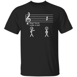
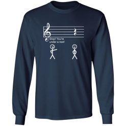
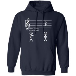
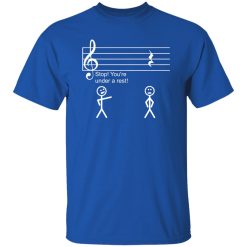
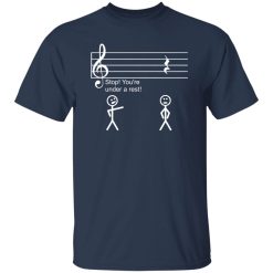
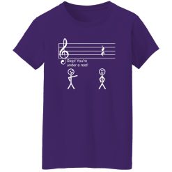
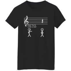
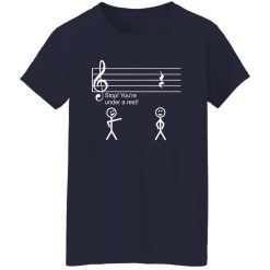
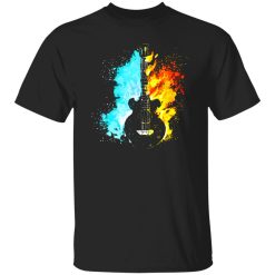
A minimalist music note shirt only works if the print holds its clarity over time. With a design this simple, there’s nowhere for inconsistency to hide—every line, every curve, every edge has to stay sharp. That’s where performance becomes more important than complexity. This piece is built around that idea: visual restraint supported by reliable print execution.
Unlike heavily layered graphics, a single music note depends on precision. The finish needs to feel clean at first glance, but more importantly, it has to remain stable after repeated wear. This shirt bridges that gap between simplicity and durability, giving the design the consistency it demands.
The strength of a minimalist music note shirt lies entirely in how well the print is executed. There’s no distraction, no layered artwork—just a focused visual element that has to stay intact. Here, the ink application is tuned for precision, creating edges that feel crisp without appearing overly rigid.
Over time, that clarity matters more than initial impact. The surface doesn’t crack into visible lines, and the note shape doesn’t lose definition after washing. Instead, the print maintains a balanced finish—slightly softened with wear, but never degraded. It evolves subtly, not dramatically.
Minimal graphics expose flaws quickly. A bold, complex design can hide imperfections, but a single note cannot. That’s why the ink behavior is controlled carefully—ensuring even distribution, stable adhesion, and resistance to distortion during movement.
This results in a print that feels integrated into the shirt rather than sitting on top of it. The outcome is visual consistency that holds up whether the shirt is worn casually or layered into a more styled outfit.
Daily wear tests more than just fabric—it tests how well the design survives real use. This shirt is structured to handle that repetition. The print remains flexible enough to move naturally with the fabric, reducing the chance of early cracking or fading.
After multiple wash cycles, the graphic retains its original presence. It doesn’t wash out into a dull silhouette, nor does it become overly distressed. Instead, it settles into a slightly lived-in look while preserving its core identity.
That balance is what makes it dependable. You’re not replacing it after a few wears, and you’re not adjusting how you use it to protect the print. It performs without requiring extra care.
This isn’t a shirt that demands attention—it supports it. The minimalist music note design works because it stays visually stable across different contexts. Whether worn alone or layered, the print maintains its integrity without overpowering the rest of the outfit.
That consistency makes it easy to integrate into a broader wardrobe. It doesn’t fade into irrelevance after a few uses, and it doesn’t become visually inconsistent over time. Instead, it remains a reliable anchor piece within music music graphic clothing collections.
Every shirt changes over time. The difference here is how controlled that change feels. Instead of breaking down unevenly, the print ages in a way that keeps the design recognizable. The note remains distinct, the lines stay readable, and the overall look continues to reflect its original intent.
This controlled aging gives the shirt longevity—not just physically, but visually. It doesn’t become outdated or worn-out looking. It simply becomes more natural, more integrated into your everyday rotation.
That’s the advantage of focusing on performance from the start. The design may be minimal, but the execution ensures it lasts far beyond its first impression.
| Product | Minimalist Music Note Shirt – Clean Design, Lasting Print Performance |
|---|---|
| SKU | cc-1049-9953-105153751-1718596619352 |
| Fabric Weight | Midweight (5.3 oz) – Heavyweight (6.0 oz Long Sleeve) |
| Material Composition | Solid Colors: 100% Cotton Ash Grey: 99% Cotton / 1% Polyester Sport Grey: 90% Cotton / 10% Polyester Dark Heather: 50% Cotton / 50% Polyester |
| Fit | Classic Unisex Fit (Ladies: Slightly Tapered Missy Fit) |
| Construction | Double-needle stitching Taped neck & shoulders Preshrunk jersey knit Tearaway label |
| Hoodie Material (G185) | 8.0 oz – 50% Cotton / 50% Polyester |
| Available Sizes | S – 5XL (6XL select colors only) |
| Origin | Made with sustainably and fairly grown USA cotton; Printed in USA |
| Print Method | DIGISOFT® Direct-to-Garment (DTG) |
| Brand | Capital T Shirt |
| Fast & Reliable Shipping | All orders are professionally printed and shipped from the USA. |
|---|---|
| Processing Time | Printed on demand within 1–3 business days. |
| Shipping Time | USA: 4–7 business days International: 7–15 business days |
| Shipping Costs | USA Standard: $5.99 International Standard: $9.99 |
| Secure Checkout | Safe & encrypted payment processing. Your information is protected at all times. |
| Returns & Exchanges | We offer a 30-day return policy. View Refunds & Returns Policy |
| Customer Guarantee | We stand behind the quality of every item we print. |


Reviews
There are no reviews yet.