No products in the cart.
Save 20% on orders over $100 with code CT20


Price range: $21.90 through $44.99
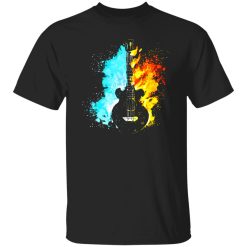
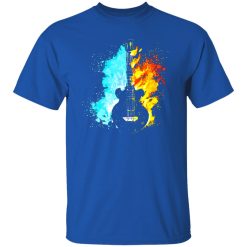
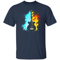
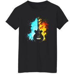
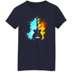
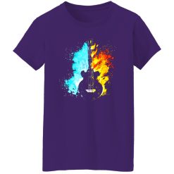
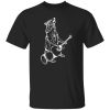
There’s a moment in music where contrast becomes identity—when distortion meets clarity, when aggression softens into melody. The guitar, more than any instrument, carries that duality. The Guitar Fire and Water Art Shirt captures that exact tension visually, translating sound into a graphic that feels both volatile and controlled. It’s not just imagery—it’s a reflection of how music moves between extremes.
Within the broader landscape of Capital T Shirt music graphic shirts, this piece stands out by focusing on contrast rather than nostalgia or band allegiance. It’s about the language of music itself—the push and pull that defines every memorable riff.
In music culture, fire and water aren’t just elements—they’re metaphors. Fire represents distortion, intensity, and raw energy. Water carries flow, clarity, and emotional depth. When these forces intersect in a single visual, they echo the structure of a great guitar-driven track.
This shirt doesn’t rely on a specific band reference. Instead, it taps into something broader—the universal experience of hearing a guitar shift from aggressive to atmospheric in a single passage. That transition is what defines modern music aesthetics, especially across rock, alternative, and experimental scenes.
The artwork positions the guitar as the central mediator between these forces. It becomes both the source of chaos and the instrument of control. That dual role resonates with anyone who understands music beyond surface level.
Graphic tees in the music space often lean on logos or tour nostalgia. This design takes a different path. It belongs to a category where visual storytelling replaces literal reference—where the shirt becomes a symbolic extension of the listener’s taste rather than a direct nod to a specific act.
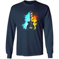
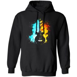
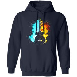
The fire and water motif operates as a form of visual iconography. It communicates without text, relying on contrast, motion, and energy balance. The guitar silhouette anchors the composition, ensuring that even abstract elements remain grounded in music culture.
This kind of visual language has become increasingly relevant in contemporary styling. It allows wearers to express alignment with music culture without being confined to a single genre or era. Instead of signaling fandom, it signals understanding.
There’s a quiet confidence in that approach. It doesn’t need explanation—it invites interpretation.
On-body, the design shifts from static artwork to dynamic presence. The interplay of visual elements creates movement across the chest area, drawing attention without overwhelming the silhouette.
The print feels integrated rather than applied. It follows the natural drape of the shirt, allowing the artwork to adapt subtly depending on posture and light. This creates a layered visual effect—at a distance, it reads as bold contrast; up close, it reveals texture and depth.
That adaptability matters in real-world wear. Whether under soft indoor lighting or direct daylight, the design maintains clarity without flattening. The darker base anchors the composition, while the contrasting elements provide just enough visual lift to avoid monotony.
There’s also a tactile dimension to the experience. The surface of the print carries a slight variation that mirrors the visual theme—smooth transitions alongside sharper edges. It reinforces the idea that the shirt isn’t just seen, but felt.
Imagine stepping out of a late-night venue, the echo of a final guitar note still lingering. The air is cool, the energy hasn’t fully settled. That in-between moment—half intensity, half calm—is exactly where this shirt lives.
It works in spaces where music remains part of the atmosphere, even when no stage is present. Urban streets, casual meetups, or quiet headphone walks—it adapts without losing its identity.
The strength of the design lies in its ability to hold attention without demanding it. It becomes a centerpiece when needed, but it doesn’t rely on volume to make an impression.
This balance mirrors the cultural shift in music fashion. Expression is no longer about loud branding—it’s about controlled presence. The Guitar Fire and Water Art Shirt aligns with that shift, offering a visual language that feels current without chasing trends.
Within the music apparel space, differentiation often comes down to narrative. This shirt doesn’t tell a story through text—it builds one through contrast. That approach allows it to sit comfortably across multiple subcultures without losing specificity.
It resonates with listeners who value the structure of sound as much as the identity of the artist. People who pay attention to transitions, tone shifts, and emotional layering will recognize something familiar in its design.
At the same time, it remains accessible. You don’t need to dissect music theory to appreciate it—you just need to feel the tension between extremes.
That’s what gives it longevity. Trends may shift, but contrast as a concept remains constant in both music and style.
Every graphic tee communicates something, even when it’s subtle. The difference lies in whether that message is surface-level or layered. This design leans toward the latter.
It doesn’t ask for recognition—it rewards it. The more you engage with it, the more it reveals. That makes it a strong choice for those who see clothing as an extension of how they experience music, not just how they consume it.
In a category filled with references, the Guitar Fire and Water Art Shirt offers interpretation. And that distinction is what makes it feel personal rather than generic.
Because sometimes, the most accurate way to represent music isn’t through a name—it’s through the tension it creates.
| Product | Guitar Fire and Water Art Shirt – Sound, Contrast, and Visual Energy |
|---|---|
| SKU | cc-1049-9953-105154586-1718602491549 |
| Fabric Weight | Midweight (5.3 oz) – Heavyweight (6.0 oz Long Sleeve) |
| Material Composition | Solid Colors: 100% Cotton Ash Grey: 99% Cotton / 1% Polyester Sport Grey: 90% Cotton / 10% Polyester Dark Heather: 50% Cotton / 50% Polyester |
| Fit | Classic Unisex Fit (Ladies: Slightly Tapered Missy Fit) |
| Construction | Double-needle stitching Taped neck & shoulders Preshrunk jersey knit Tearaway label |
| Hoodie Material (G185) | 8.0 oz – 50% Cotton / 50% Polyester |
| Available Sizes | S – 5XL (6XL select colors only) |
| Origin | Made with sustainably and fairly grown USA cotton; Printed in USA |
| Print Method | DIGISOFT® Direct-to-Garment (DTG) |
| Brand | Capital T Shirt |
| Fast & Reliable Shipping | All orders are professionally printed and shipped from the USA. |
|---|---|
| Processing Time | Printed on demand within 1–3 business days. |
| Shipping Time | USA: 4–7 business days International: 7–15 business days |
| Shipping Costs | USA Standard: $5.99 International Standard: $9.99 |
| Secure Checkout | Safe & encrypted payment processing. Your information is protected at all times. |
| Returns & Exchanges | We offer a 30-day return policy. View Refunds & Returns Policy |
| Customer Guarantee | We stand behind the quality of every item we print. |


Reviews
There are no reviews yet.